AETHER MOBILE: PART 1
In 2015 I joined a IoT startup called Aether which created a smart speaker called the Aether Cone. The speaker utilized voice input as it's a method of interaction. Through machine learning the cone, over time, learned a user's taste and preferences. Thus, allowing the cone to recommend relevant content specific to time in day based on users behavior. The overarching goal of the Aether cone was to give users access to music, news, podcasts, as well as other services without differing a user to a phone. The mission was to provide a powerful yet passive experience that enabled to remain in the context of what they were doing.
An iOS app was created as a companion experience to the Aether cone. The mobile experiences was to be an access point for broadcasting a variety of data such as, currently played content, surfacing content and network or device errors. Additionally the app was to be the access point for managing and troubleshooting devices.
PROJECT
The goal of the project was to enable a simple and powerful mobile experience that was to be a companion app to the Aether cone. The overall ambition was to create a mobile app that enabled user access to information when needed while differing users to the Aether cone. The long term goal was to create an app that would scale beyond the music type consumption model and accommodate a variety of IoT services.
Objectives
The aether app should be easy and intuitive to learn and should be able to scale for services beyond music.
Improve device management and multi-device syncing.
Offer easy access of FAQ directly from the mobile.
My Role
I lead the redesign of the Aether mobile app. I collaborated with engineering, support and project management to identify and address issues affecting usability and learnability of the mobile app. I also ensured UX consistency between the mobile app and hardware device.
ISSUES & INSIGHTS
After gathering feedback from users, the support team, engineering and conducting an audit of the app I found the experience unintuitive and difficult to use do to unorthodox interactions and mapping. The mobile experience didn’t adhere to design patterns thats customers have come to expect from a music experience. The overall impression of the app was negative do to the usability issues. In some cases, users avoided the app altogether and opted to utilize the speaker via bluetooth.
Unorthodox mapping
Unorthodox mapping of key screens for a music experience proved unintuitive. Swiping left and right created much confusion as it didn’t adhere to existing patterns users expected from a music experience. User testing found that context was easily lost when users inadvertently swiped the screen.
Inconsistent Access Points
The access point for editing devices shifted position on the screen once in the edit mode. Once in the edit context no clear affordances were provided to indicate how users where to edit the devices. No clear messaging or affordances where provided when looking to access a devices details or settings.
Typographic Issues
The app had typographic issues when dealing with long string titles. The large type with light weight although, aesthetically pleasing, worked with titles that had short line measures. With long line measures the type created visual tension and affected overall legibility.
Unintuitive gestures
To skip a track it involved a subtle swipe up gesture that would progressively disclose the “Play Next Track” affordance. Only then could the user skip to the next track. A swipe down gesture disclosed a previously played track list. A long swipe up hid the list. These gestures proved to be unintuitive and failed users expectations as it didn’t adhere to any existing mental models for skipping to next or previous tracks. Further, the interaction on the Aether cone followed a more conventional interaction pattern.
Drag and Drop for Grouping Devices
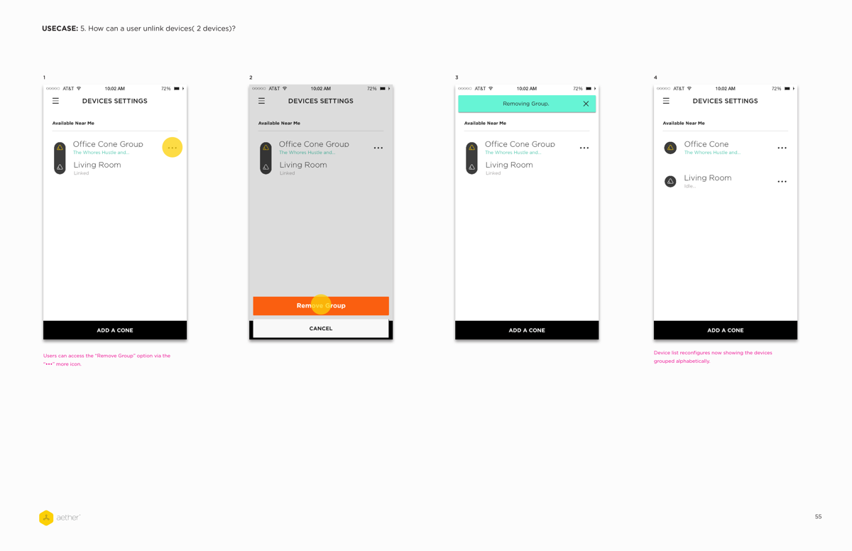
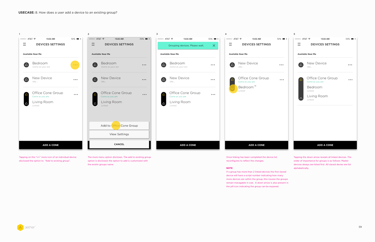
Through users feedback the drag n drop gesture action proved to be problematic. The success rate for device syncing dropped as the number of devices exceed 2. High margin of error of users accidentally dropping a device on the wrong device for pairing was observed. Ungrouping devices by pressing and holding on a group was also undiscoverable. No affordance was given to show users how to ungroup devices.
Device Context
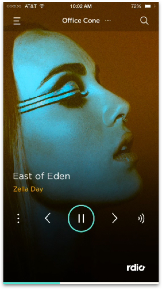
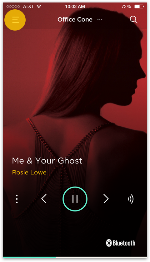
With multiple devices setup, there was no indicator on the now playing screen to indicate which device was being streamed to. In order to access the currently streaming device, user had to swipe left to disclose the device drawer. Additionally, access the device draw to toggle between devices was ineffective. User should have easy and clear access to their devices.
The Redesign
The intent for the mobile app was to be a complementary experience for the Aether Cone. It was imperative that the app be easy for users to master. The objectives of the redesign was to level set the app by leveraging design patterns users understood to improve overall usability. Reorganize the app so that digital and IoT services could scale. Show breathe of content to give user context what to ask for and surface FAQ’s for easy troubleshooting.
Main Navigation
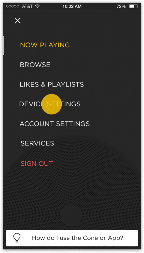
The main navigation redesign utilized channels (now playing, browse, services, account etc.) to facilitate easy access to content, management of devices and services.
Browse Section
After reading voice logs it was quickly apparent users didn’t know what sort of content they could request. A browse section was introduced to give users access to the breadth of content that was offered once the device was set up.
Likes & Playlist
Since the Aether Cone leveraged the Rdio music service users expected access to the playlist which they meticulously curated. Not having access to playlist was a pain point and facilitating this was a means to increase user retention.
Device Settings
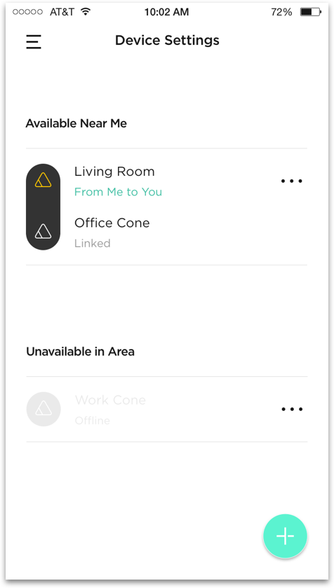
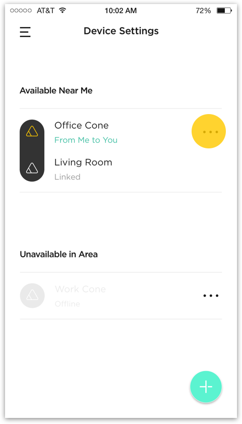
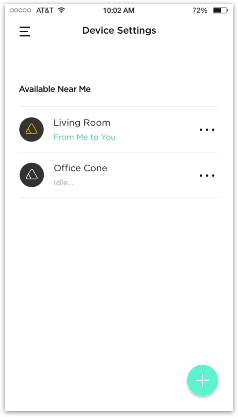
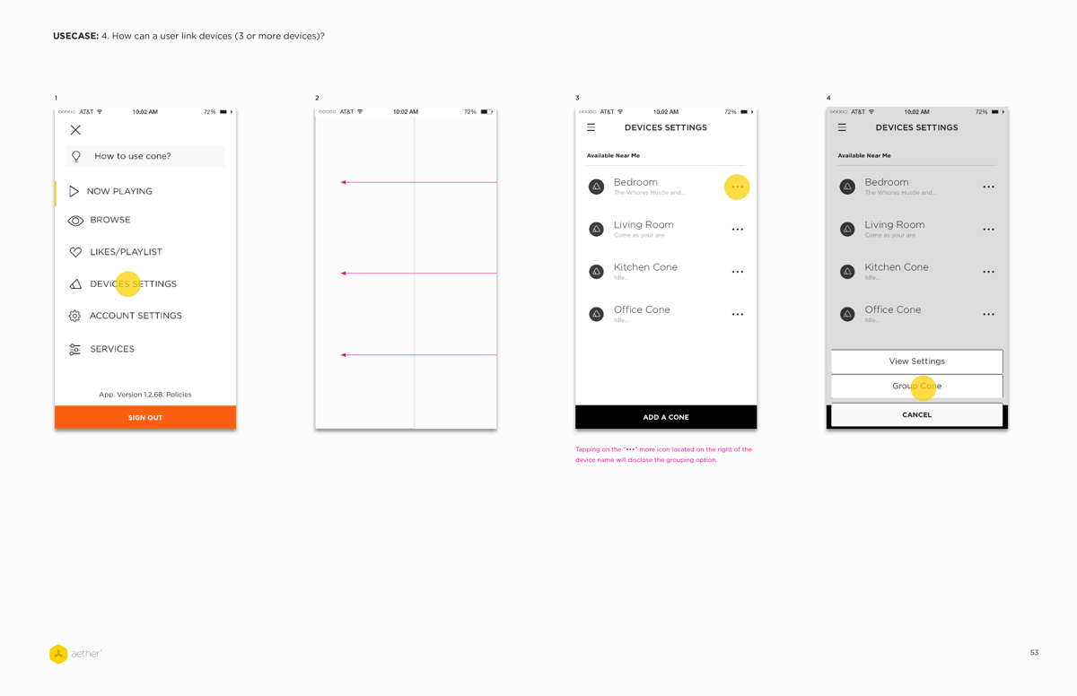
We found that users, on average, tended to set up a device and leave them in a dedicated area in their homes. Grouping devices followed the same patterns. Moving the device list to a dedicated channel was done to mitigate the risk of users accidentally changing the grouping or deleting devices.
Services
As more services were integrated into the experience having a dedicated channel was needed. Introducing a dedicated services channel would help facilitate management of present and future services.
Easy Toggling Between Devices
Swiping left to access the device drawer to toggle between device was undiscoverable for first time users. The original design offered no devices status in the now playing screen. Surfacing the current device status in the header within the now playing screen achieve 2 things:
Users now had context to which device they were controlling.
This enabled the ability to surface a device list to toggle between devices while keeping users within the now playing context
FAQ Access Point
One of the major pain points for users was getting quick access to FAQ’s. In the event of a network failure or the Cone showed a LED pattern the only means to getting information was via the web. Surfacing FAQ’s within the main navigation was intended to offer user easy access to all information regarding the app or hardware device.
SYnc device workflow
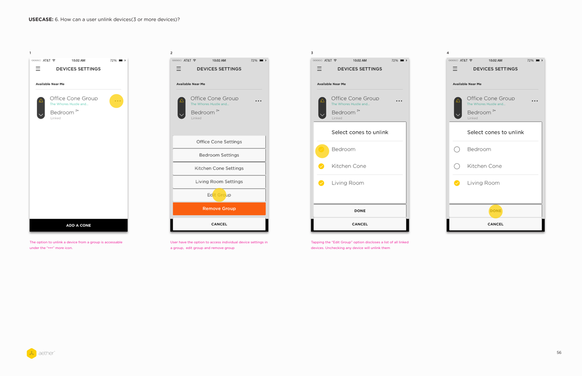
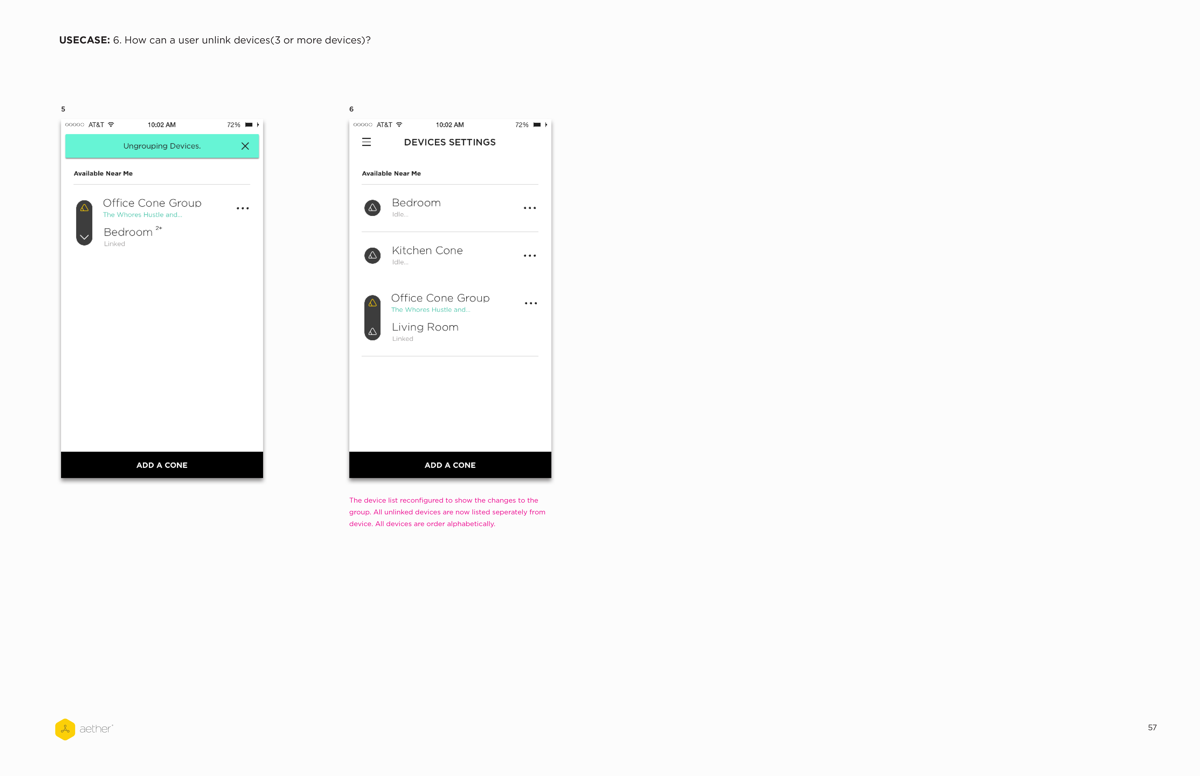
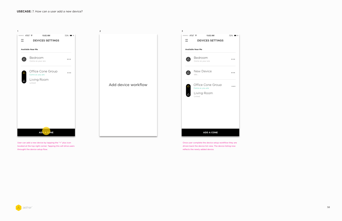
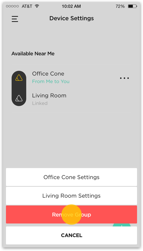
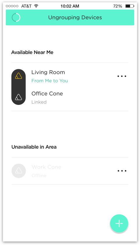
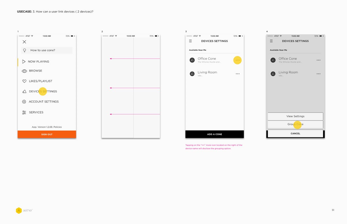
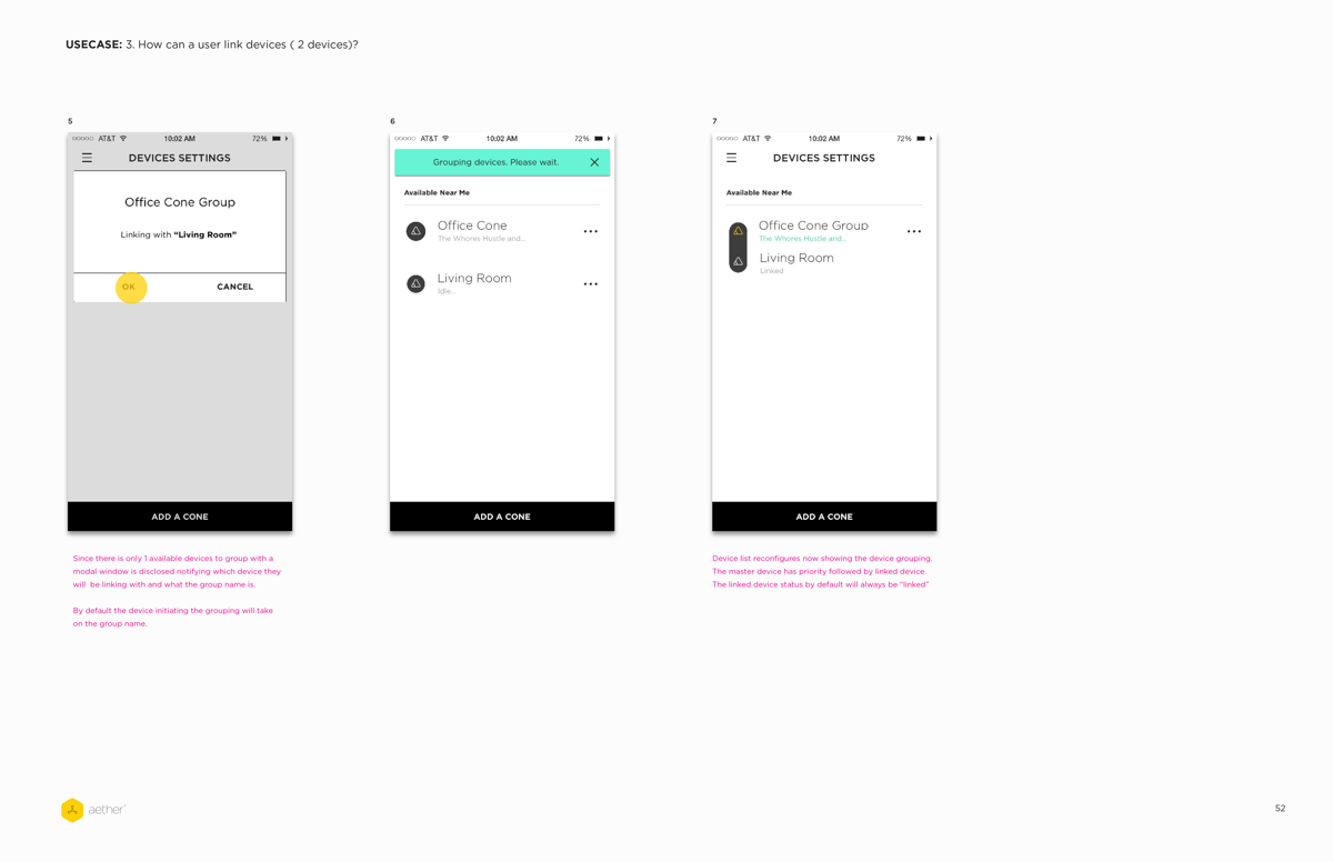
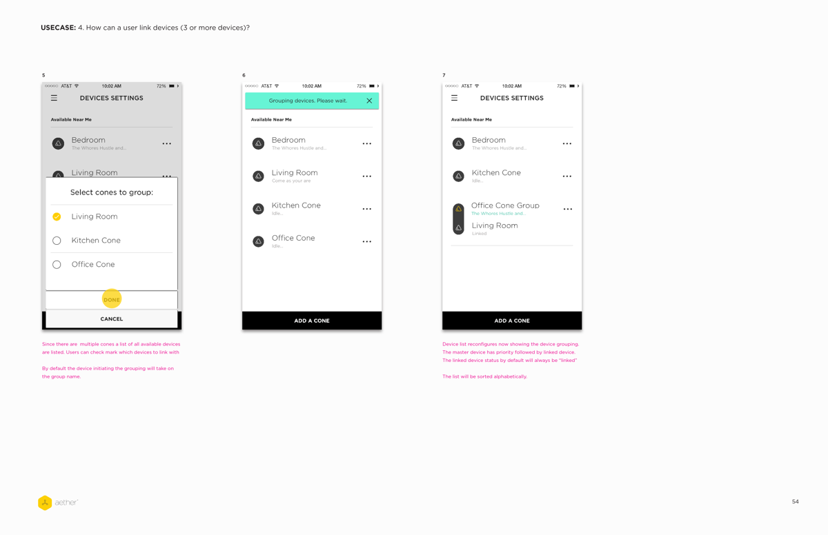
The placement of the “•••” more icon within the device listing was done to improve discoverability of the sync device action. Additionally, actions such as device settings and ungrouping devices would also be housed. A direct path for syncing devices was utilized to mitigate unintentional device syncing that was observed with the drag n drop interaction.
Synch Device Workflow

Ungroup Devices Workflow
