Huawei (EAMES Project) Part 3
In Portland, Oregon, I conducted test sessions for the launcher concept with a sample size of six Android users, aged between 24 to 44. The main objective was to obtain qualitative feedback on the launcher concept, and the users were asked to complete tasks related to core features such as the lock screen, notification shade, system bar, settings shade, app tray, and new features like gesture-based navigation and itinerary center. Based on the tests, below are the findings and recommendations that were included in the final deliverable for handoff to HQ.

Test session image captures
Objectives for prototypes:
Evaluate the gesture based navigation introduced with Android Q
Measure affordances implemented on new home screen.
Evaluate discoverability and learnability of redesigned notification and settings features
Get feedback on a new itinerary feature as replacement for the minus one screen.
Evaluate AI opportunities through having the users complete a task.
Prototype test criteria
Key Areas
Homescreen
Notification Shade
Settings Shade
App Tray
Itinerary Section
Qualitative Metrics
Time on task.
Observer user errors.
Measure subjective satisfaction (ie. ease of use)
Gesture Based Navigation
Gesture based navigation findings
The use of a tab affordance with an up chevron icon improved the usability of the gesture navigation in the Eames prototype. The iconography of the classic 3-button navigation was leveraged to reduce confusion with this new UI. All users tested encountered minimal friction with this feature.
The final findings was to recommend :
Utilize classic 3 button navigation iconography to reduce user recall.
Emphasize functionality through contextually relevant iconography. For instance, use tab affordance reinforced with a chevron on the home screen for first-time users. Use a mix of classic iconography and newly introduced swipe affordances for in-app and system views to ensure low user recall.
Move the entry point for the assistant to the search bar to simplify the home button's functionality. This improves the discoverability of the assistant while simplifying the overall gesture-based navigation functionality.

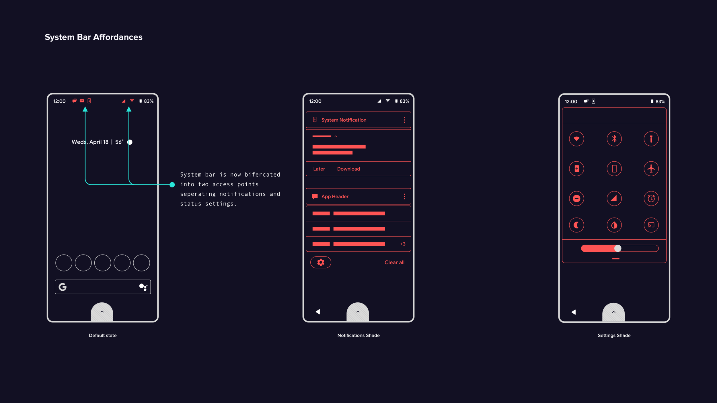
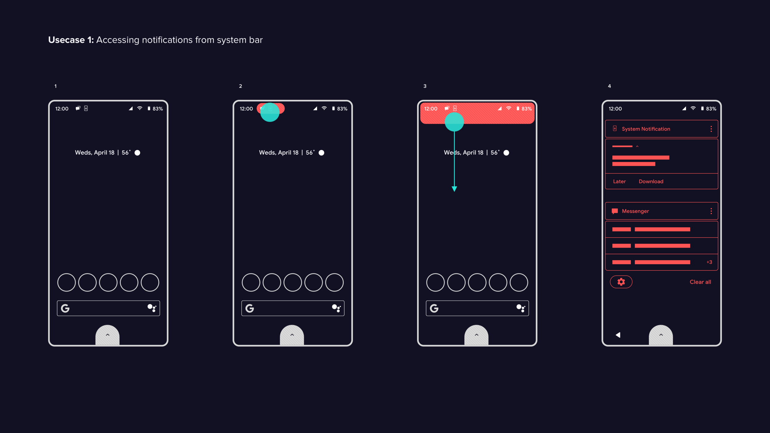
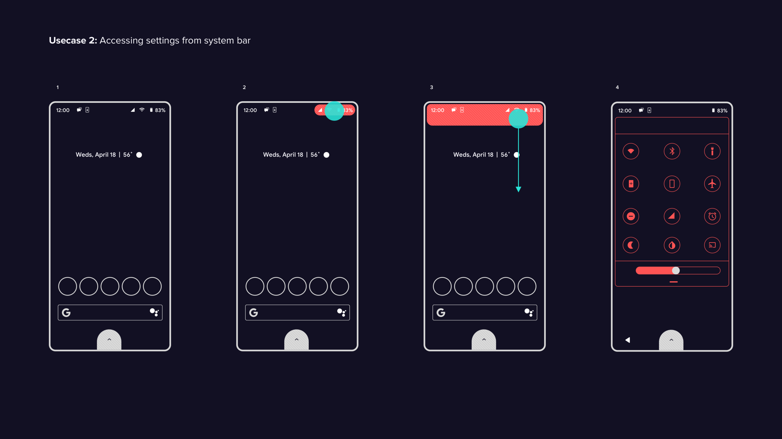
System Bar Redesign
System bar test findings:
In general, half of the users found it challenging to access settings and notifications via the system bar. This difficulty may have been due to the Android version or the customizations made by OEMs. Although users quickly grasped the benefits of separating settings and notifications, they initially struggled to locate the entry points on the system bar. One test subject suggested adding an indicator to highlight the entry points for settings and notifications on the system bar. Overall, with the introduction of the notch in Pixel 3 phones, users will likely need time to adapt to the new design pattern.
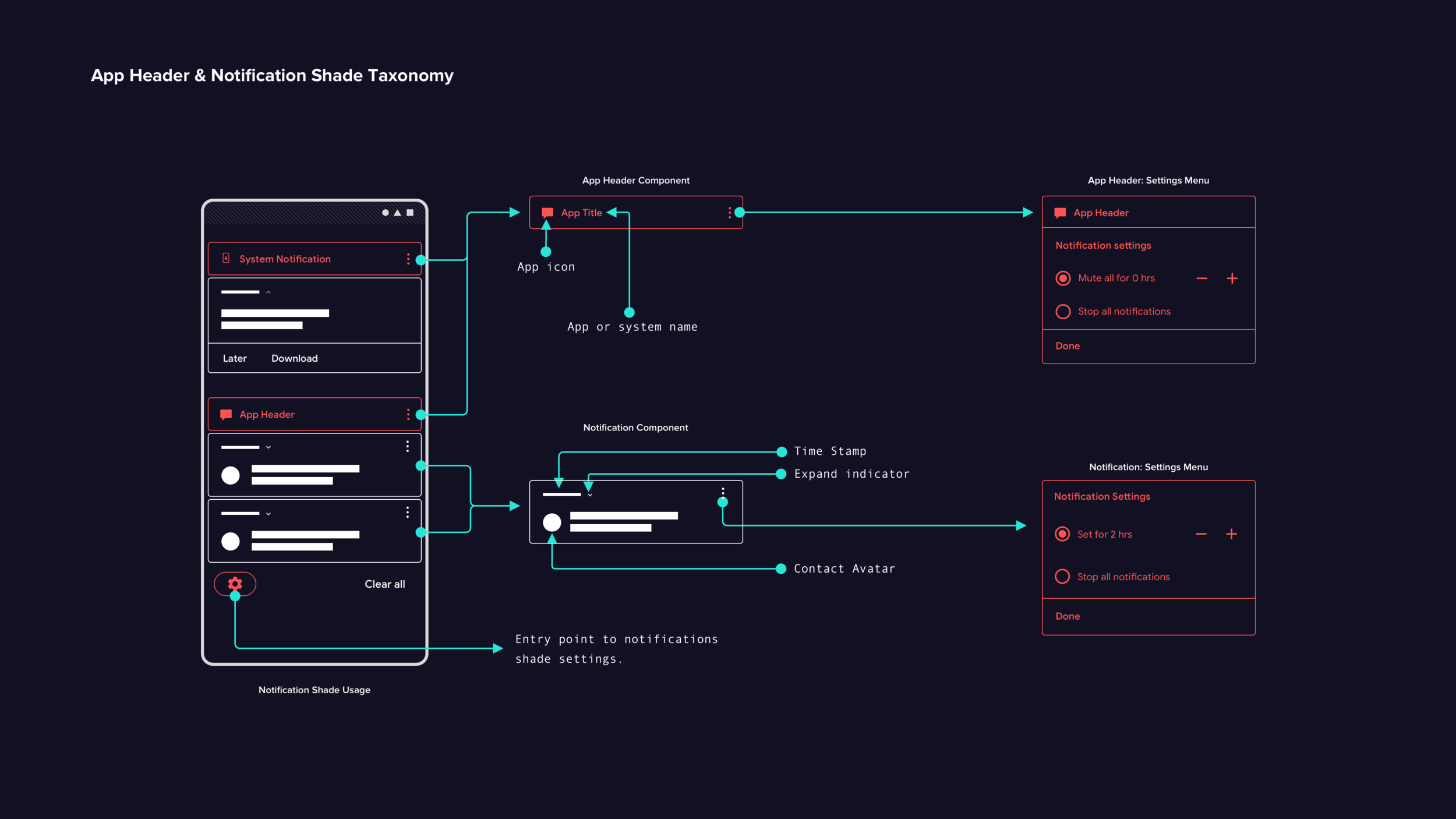
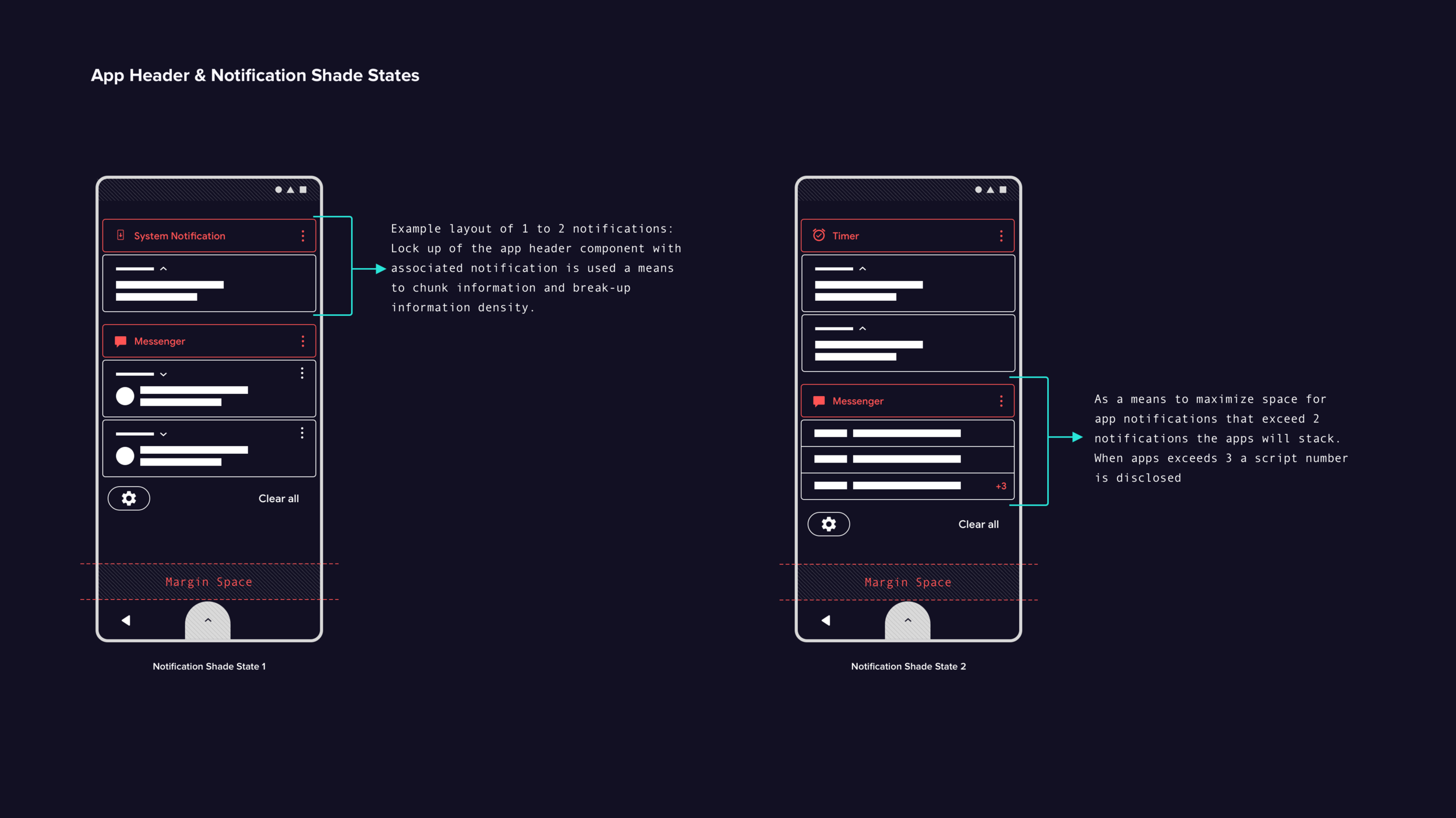
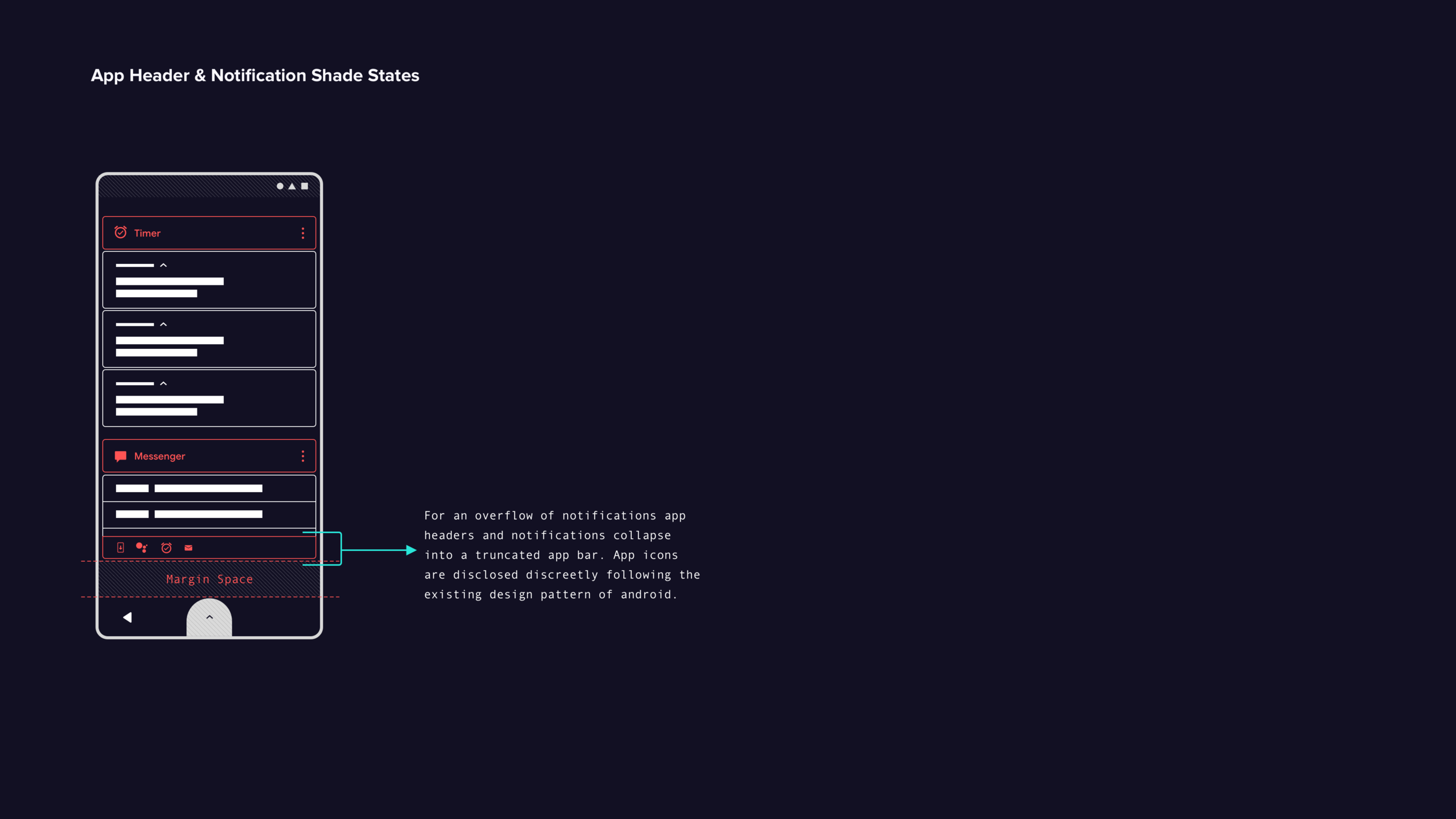
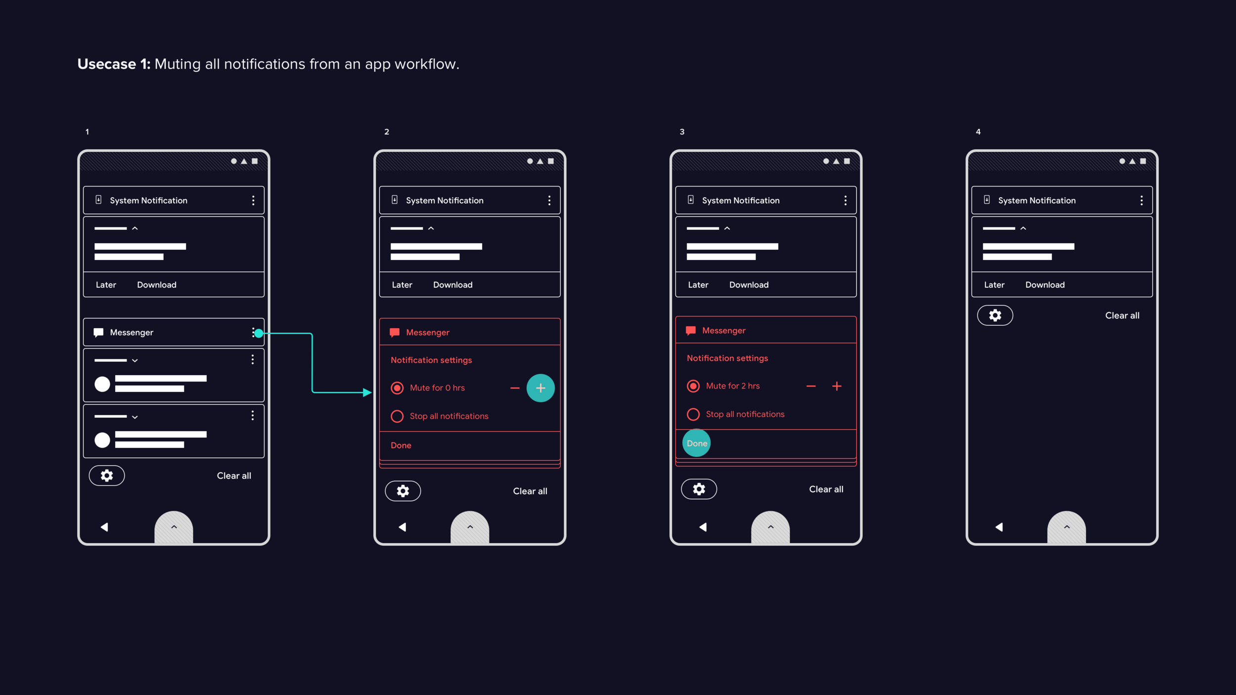
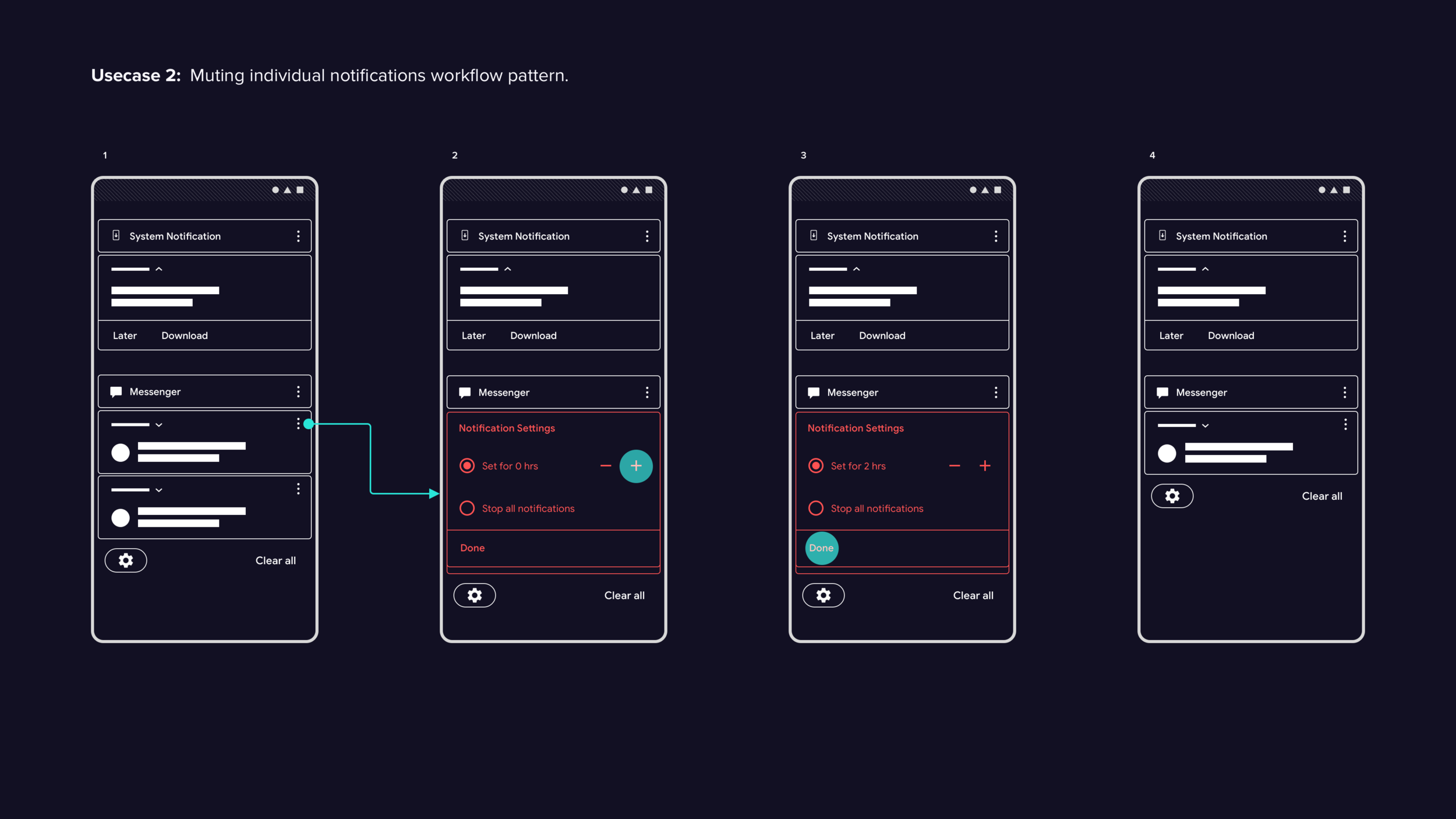
Notification Shade
Notification shade findings
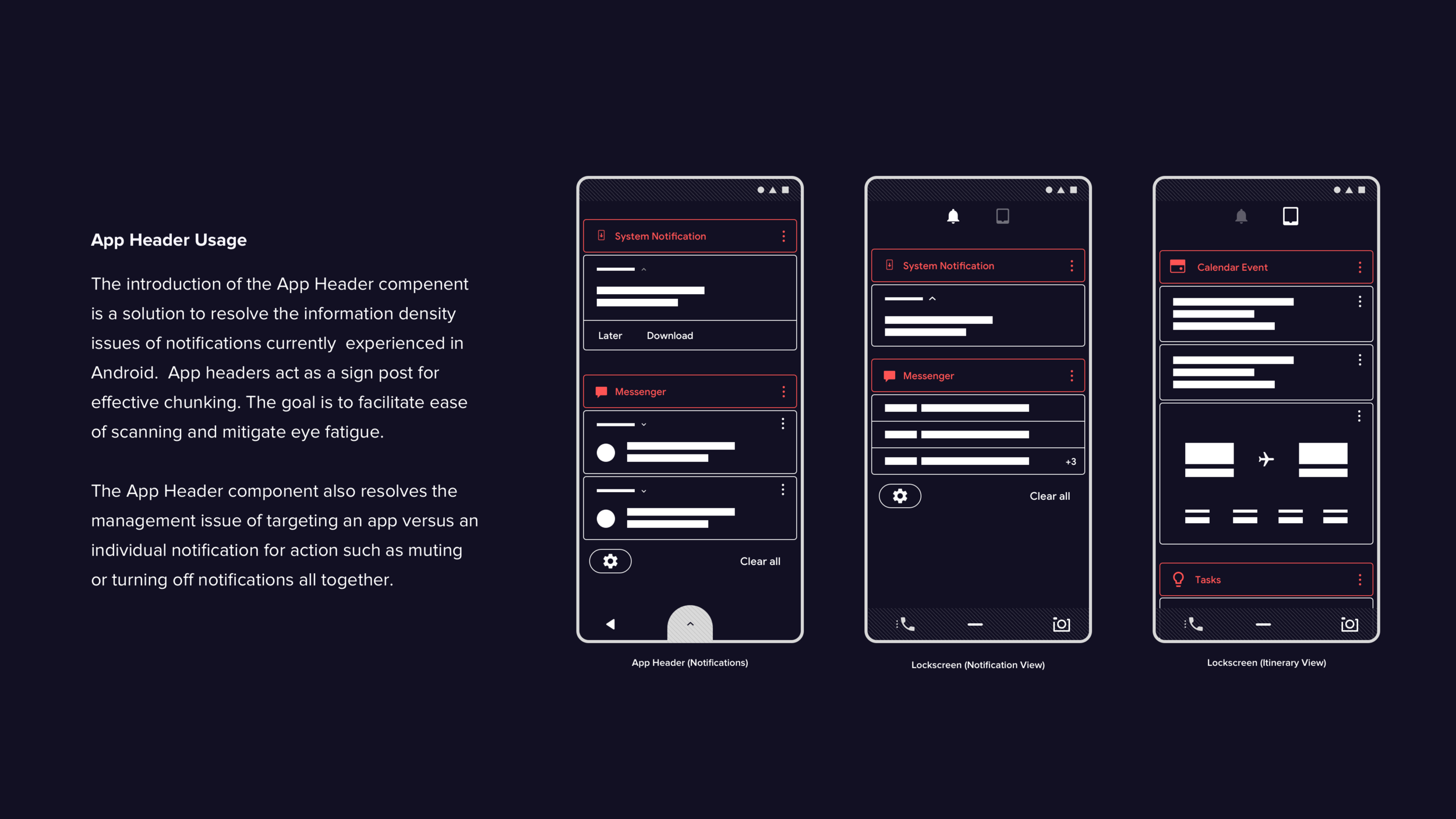
Based on user interviews, I identified key areas of focus for notification handling, including information density, content priority, and the discoverability of quick actions like muting. These insights informed the design of a revised feature, which I then tested using a Framer prototype..
Test findings:
Test participants easily grasped the concept of the app header component, which helped organize notifications and address the issue of information density in the current Android design.
During the task of muting individual notifications or apps, most participants struggled and expressed unawareness of the muting feature. The diverse design patterns implemented by OEMs also hindered the discoverability of the feature.
The swipe gesture for accessing the mute feature was not easily discoverable for participants.
Once discovered, muting was completed quickly and accurately by participants.
Final recommendations
The utilization of app headers to chunk and organize notifications was effective in enhancing usability and discoverability. To further improve the user experience, an overflow icon for multiple actions should be added. Additionally, notification actions should be available on both app headers and individual notifications to avoid confusion between muting all notifications and specific ones. Balancing clear and distinct affordances for notification actions with established design patterns at a 20/80 ratio is recommended for optimal discoverability and learnability.
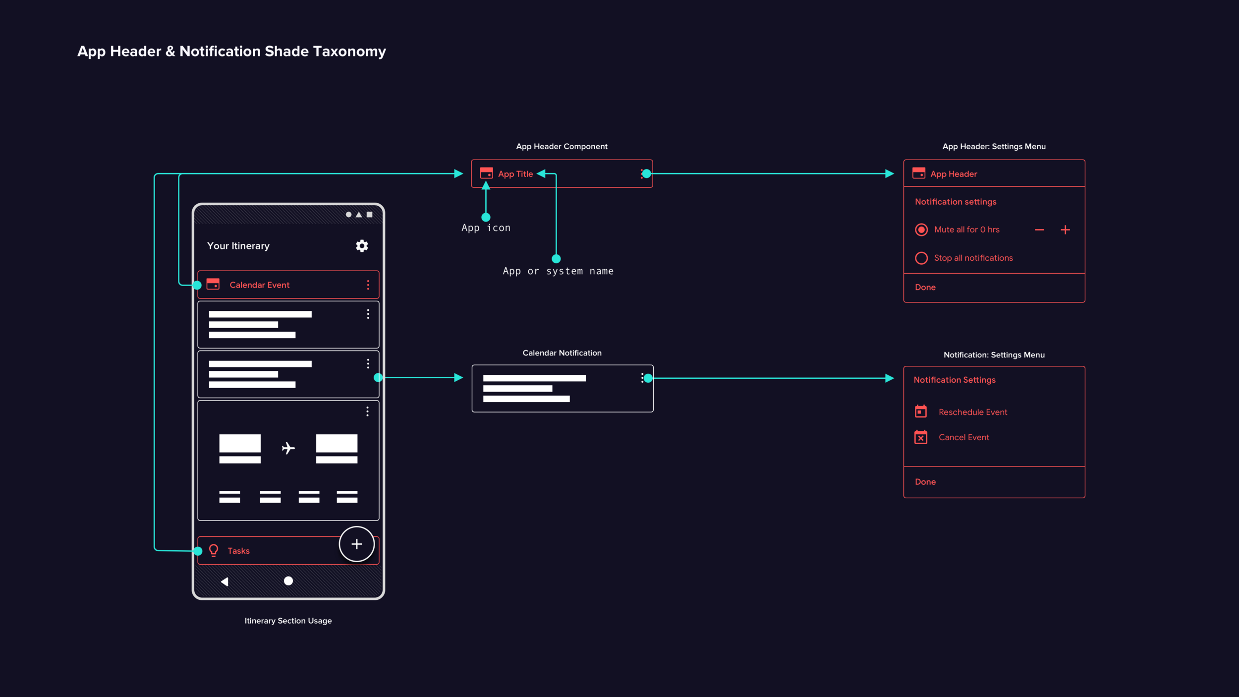

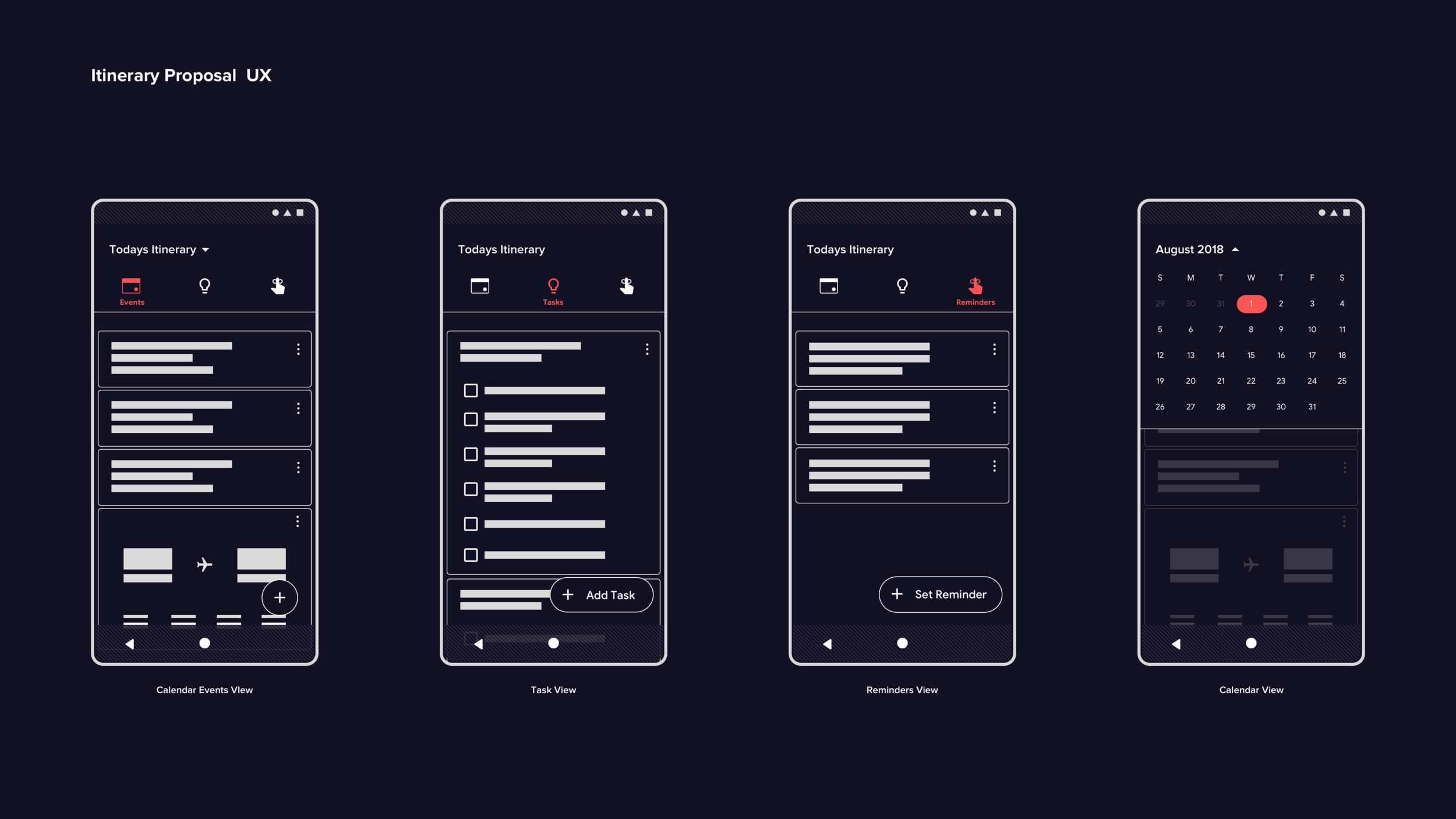
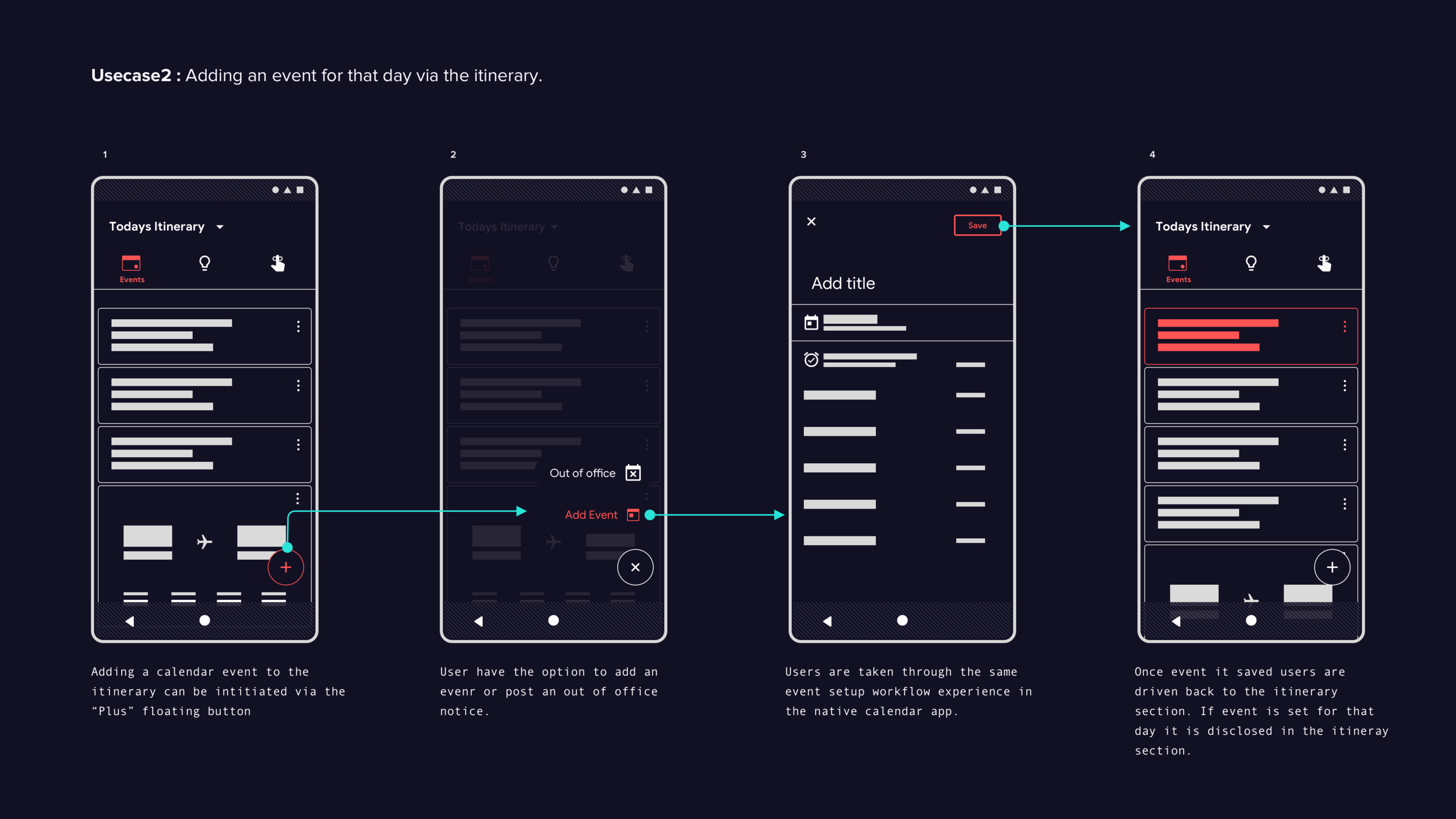
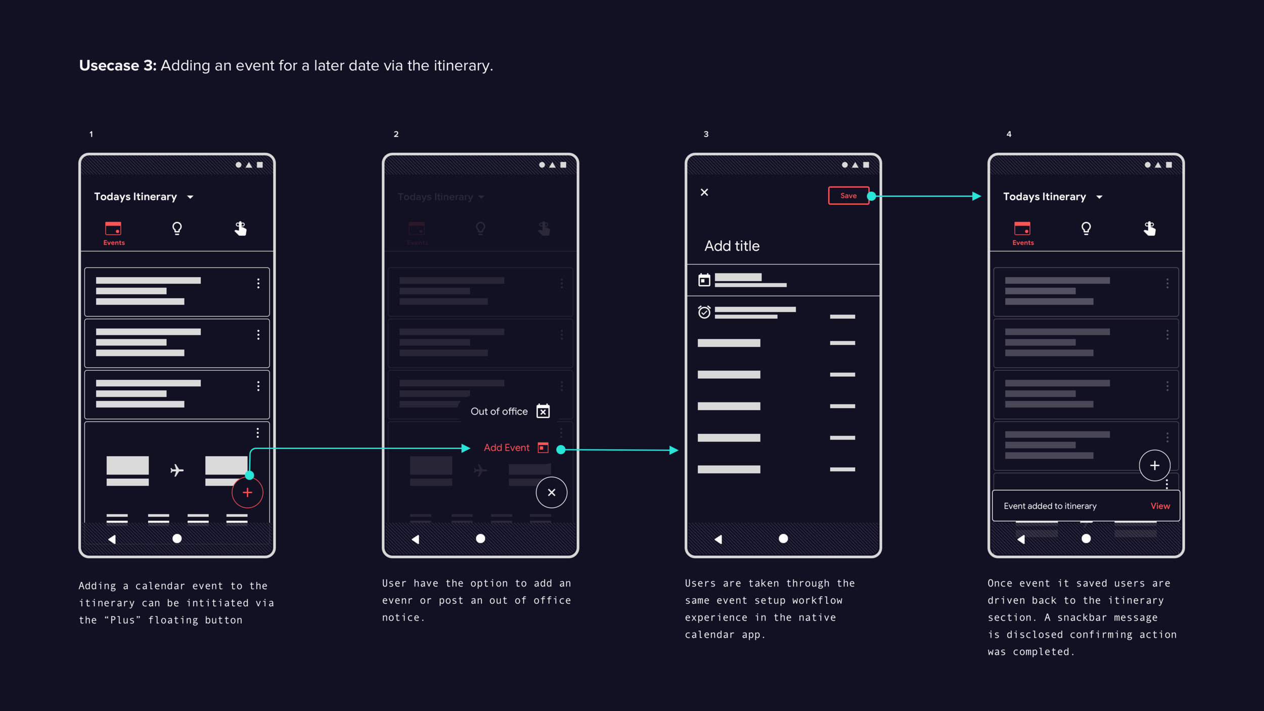
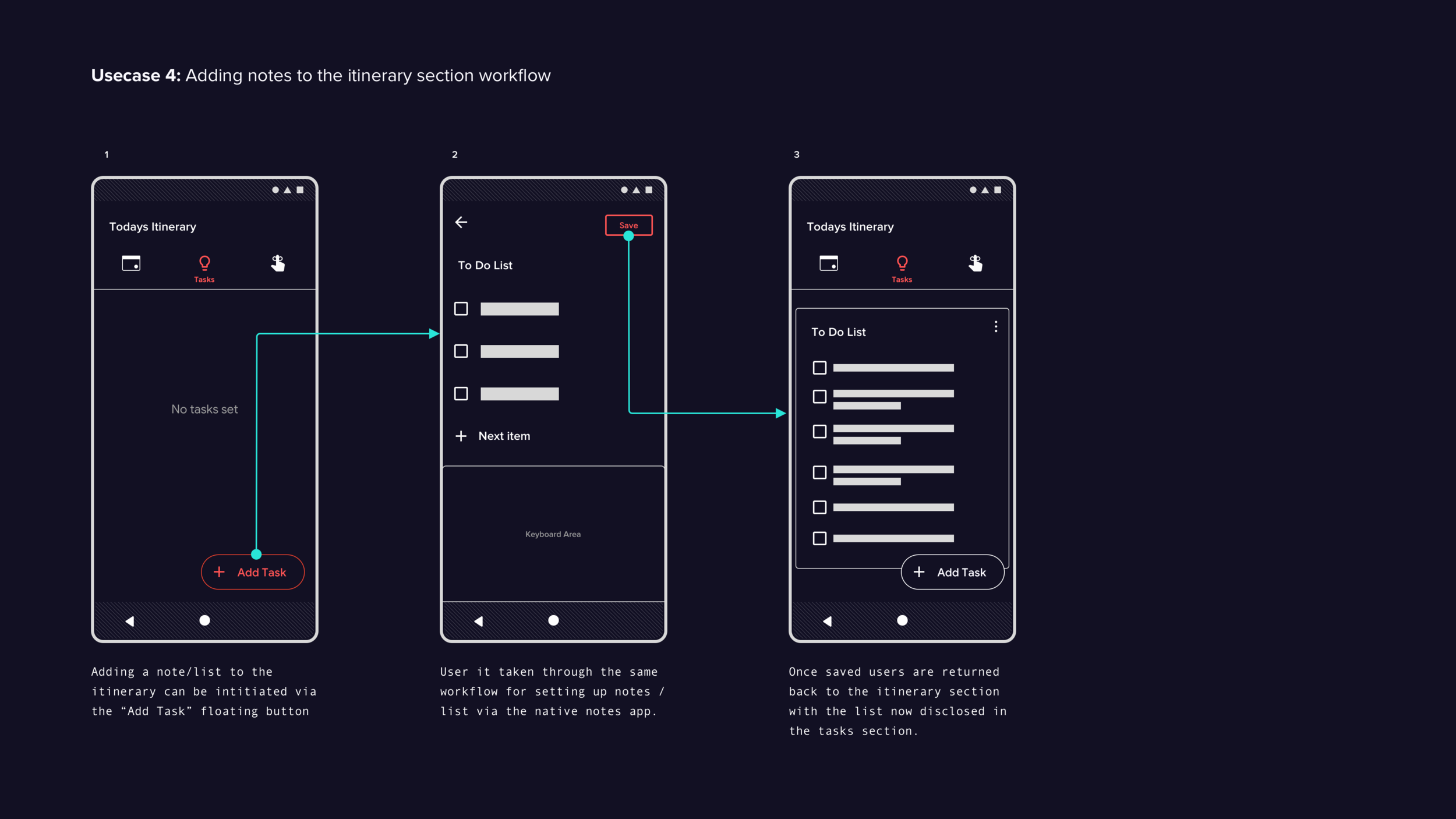
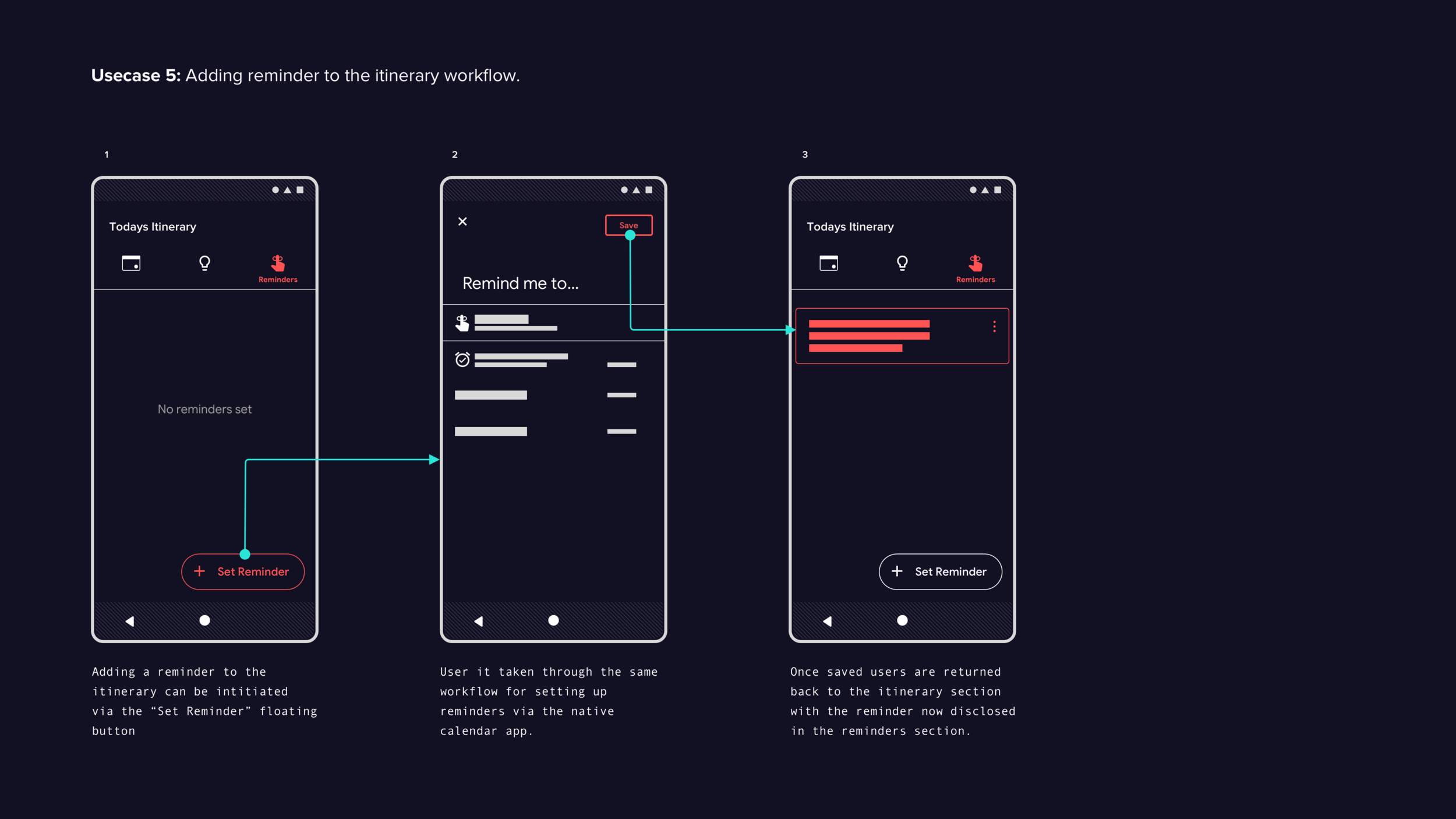
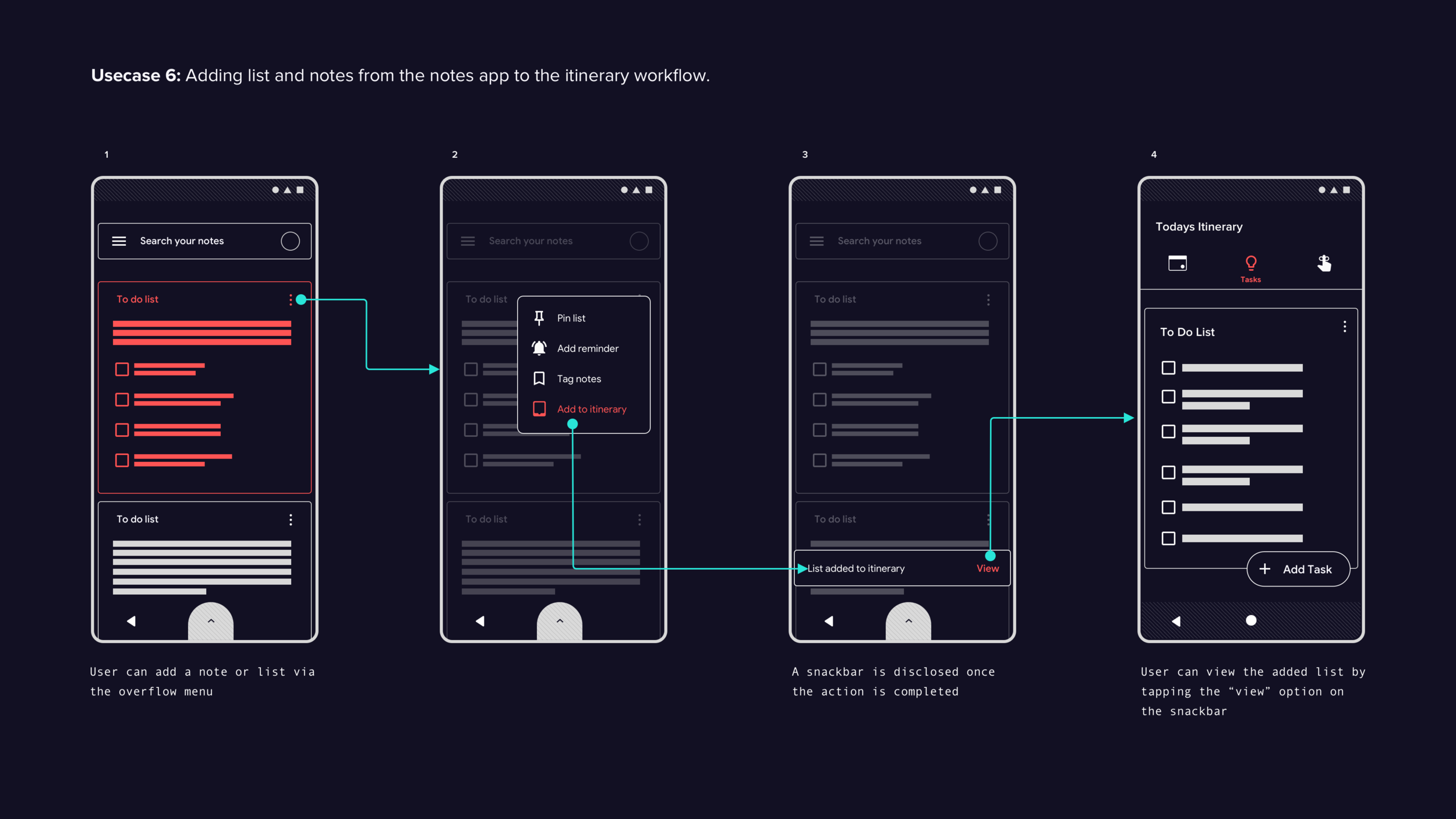
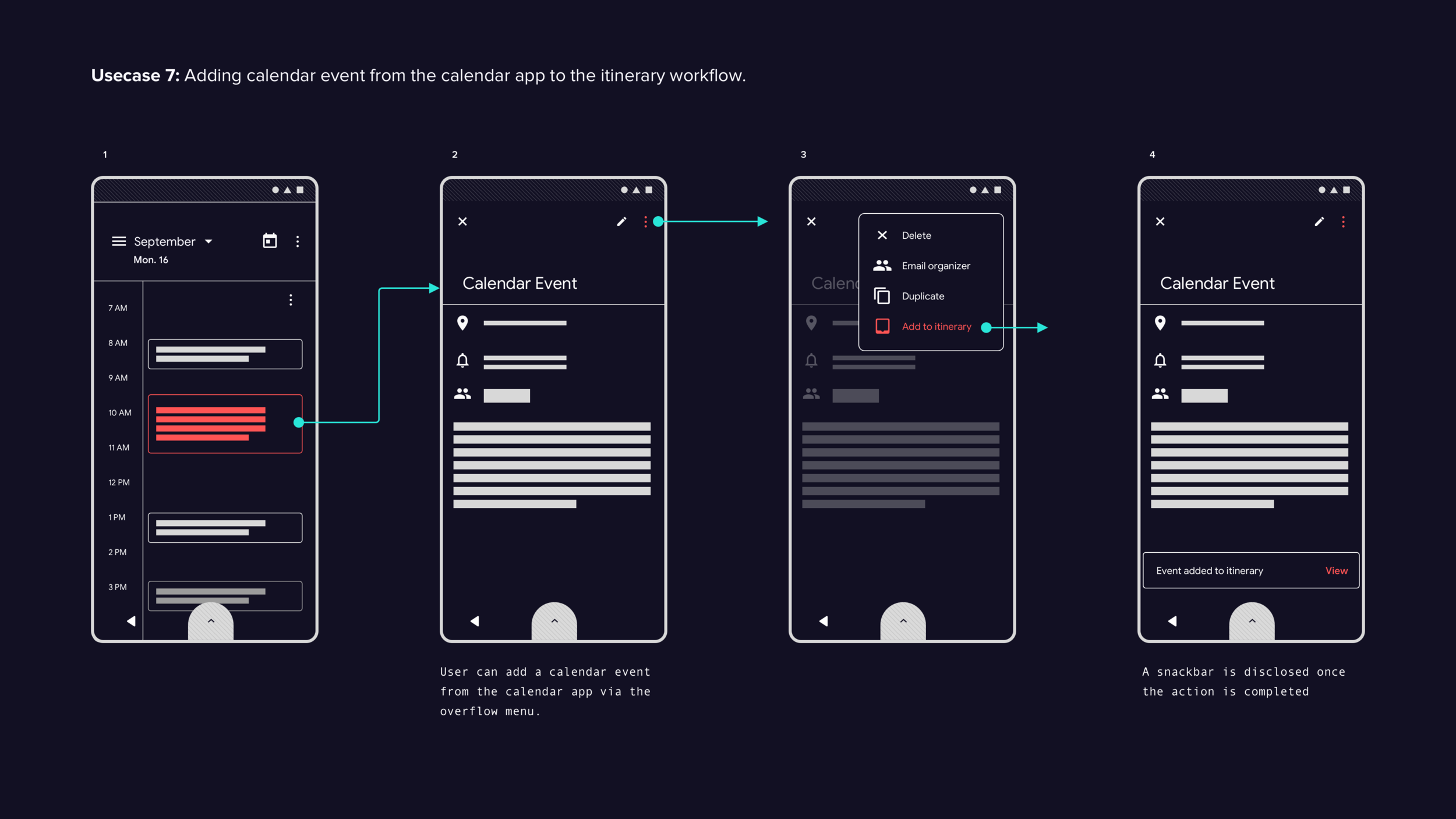
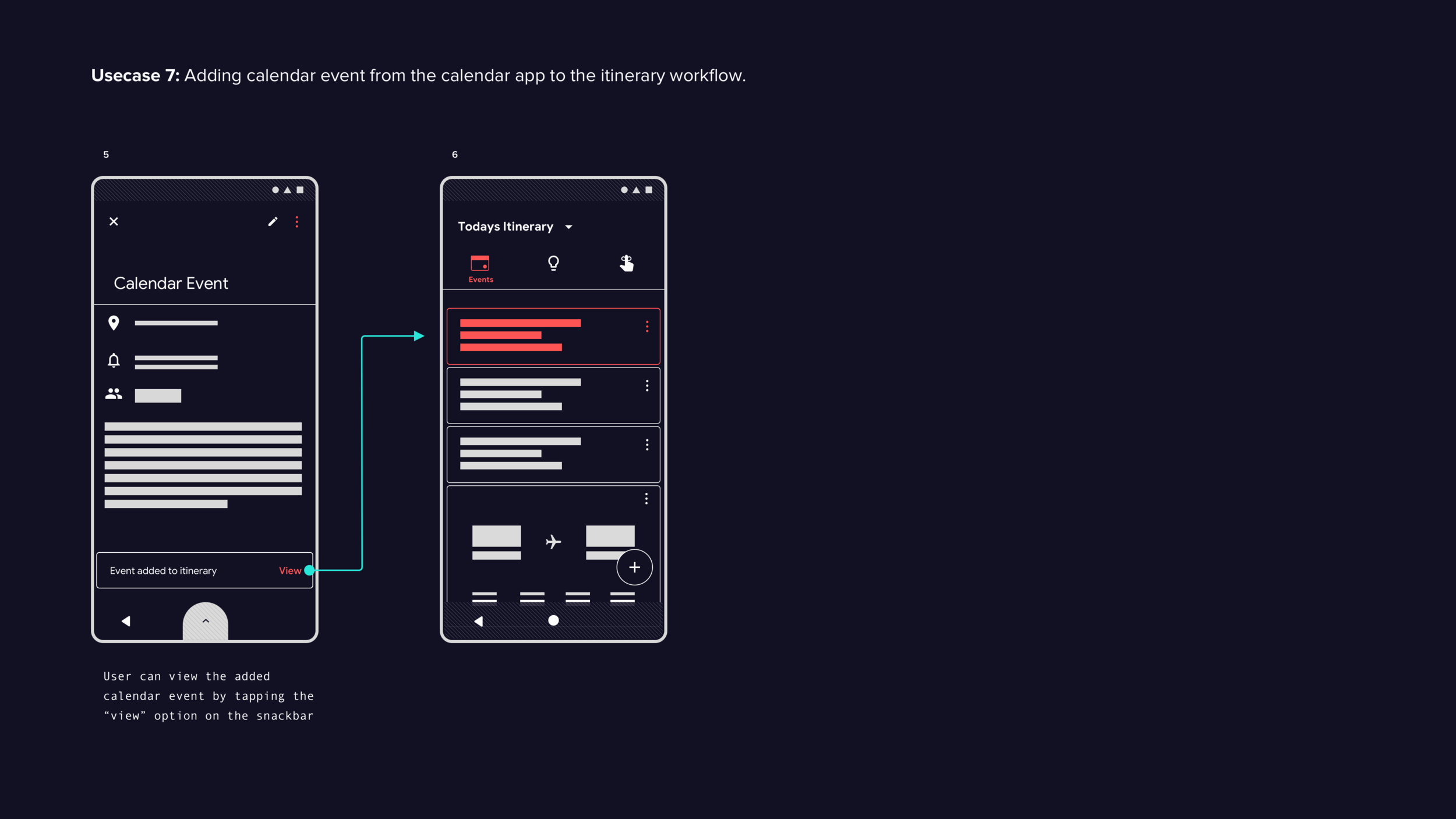
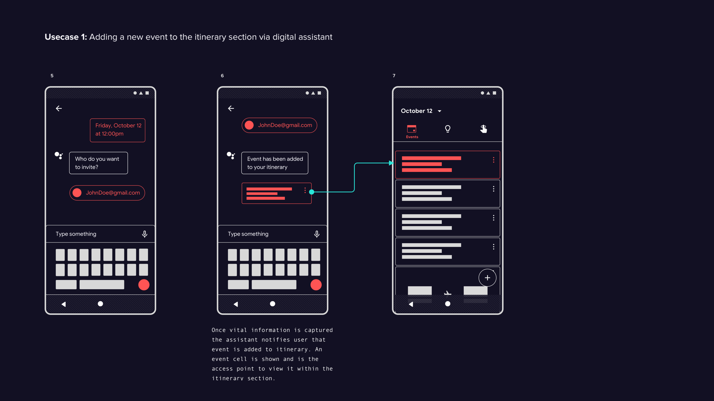
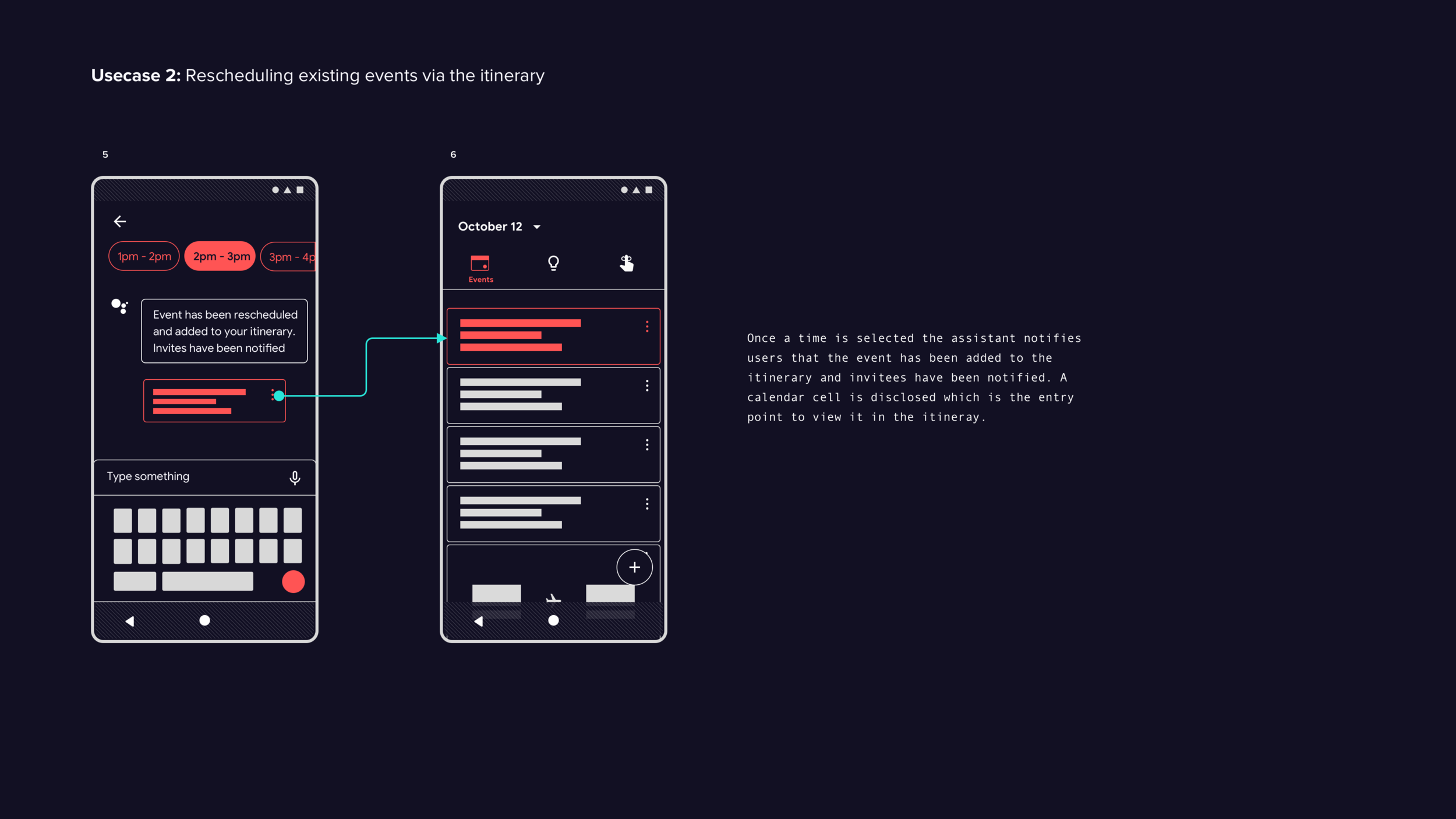
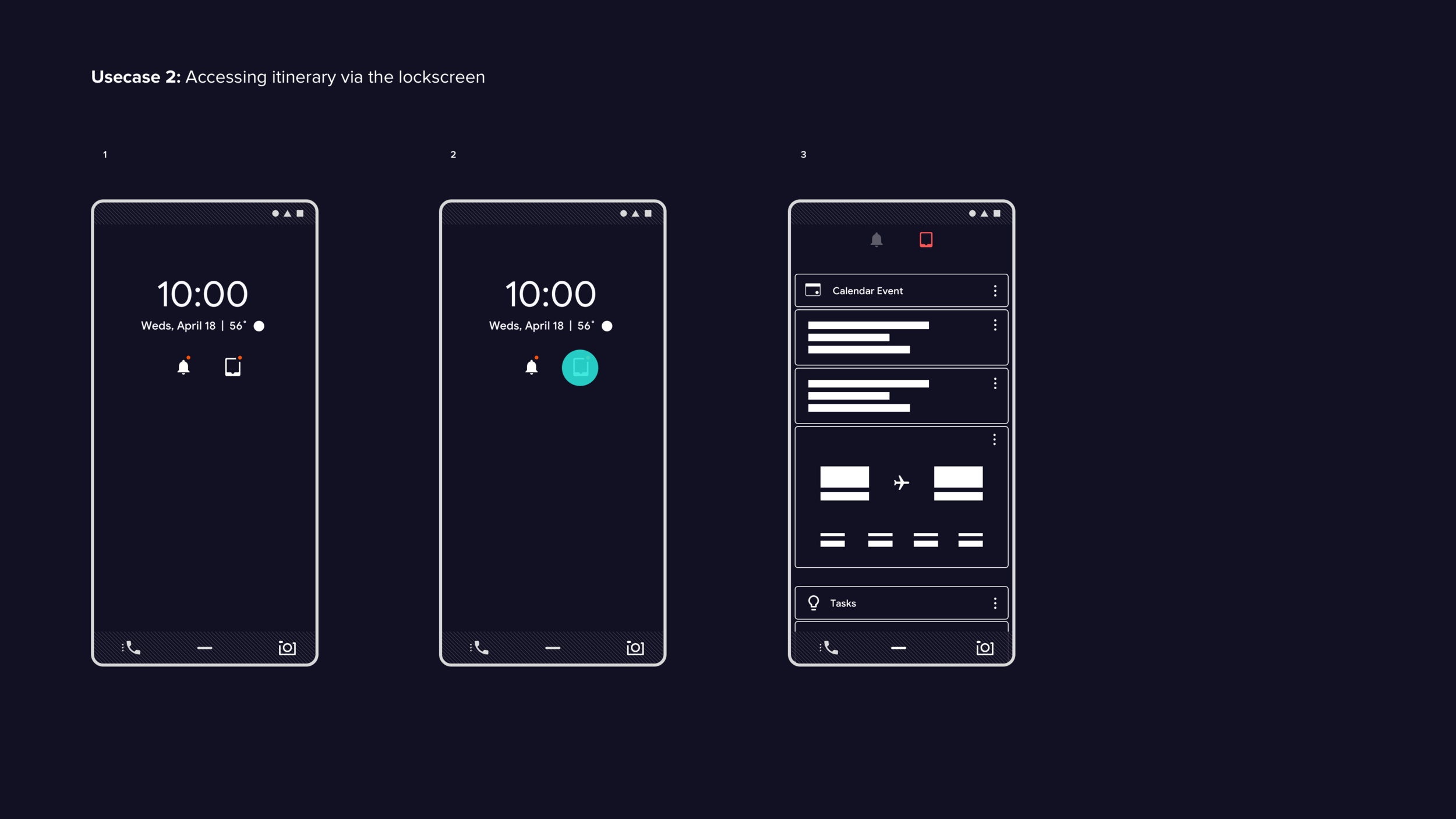
Itinerary Section
Itinerary section test findings
All test subjects expressed interest in the itinerary center concept and understood it as a collection of timely events generated by the system. However, the idea of adding items to the itinerary center was met with confusion as it is not a current feature. When asked about the option to add items of interest, most subjects felt it would no longer be an itinerary section. However, upon further discussion, most subjects liked the idea of adding items as long as they were consistent with the system's tracking.
The test subjects responded positively when informed that the dedicated itinerary section could potentially resolve various issues by diverting traffic to a separate section.
Simplifying the notification feature to only surface critical and timely notifications, such as system updates and text messages, would reduce user anxiety and improve confidence.
The itinerary center concept leverages the user's existing mental model of having control over their schedule, which can create a sense of calm, reduce anxiety, and potentially prevent unintended habituation, allowing users to focus on productive tasks.
Final recommendations
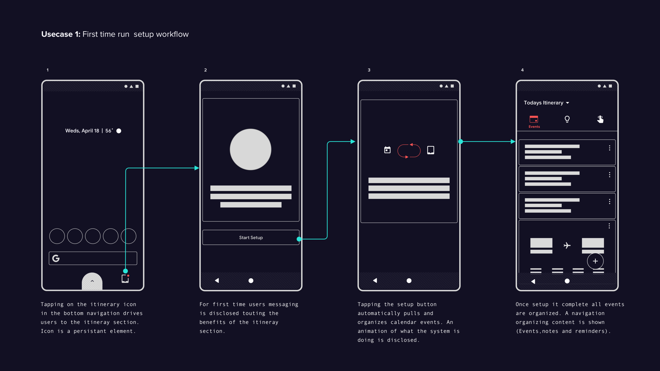
Further testing is necessary to validate the concept of a dedicated itinerary section. To improve this initial idea, the following steps can be taken:
Gather user feedback on the first-time setup workflow by having them complete an automated setup. Measure their satisfaction with the process.
Collect user feedback on adding items to the itinerary section and their understanding of the concept. Use existing design patterns to enhance discoverability, recoverability, and learnability.
Gain insights into how users prioritize, organize, and associate different types of content that would be surfaced in the itinerary section. Understand users' attitudes and mental models with content types such as emails, calendar events, reminders, notes, and to-do lists. This will inform the best way to organize and manage content.

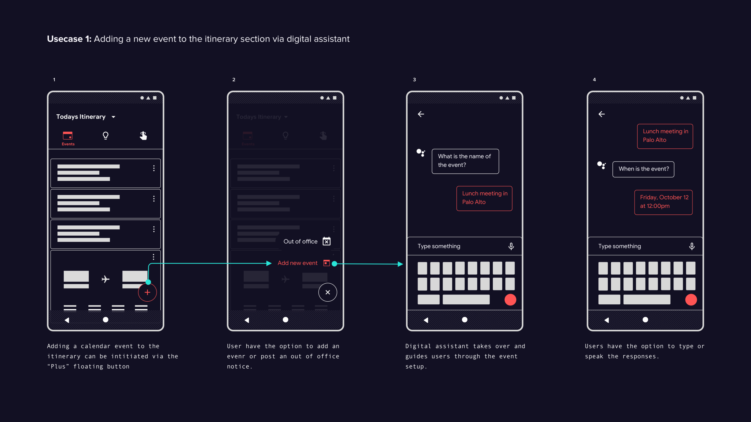
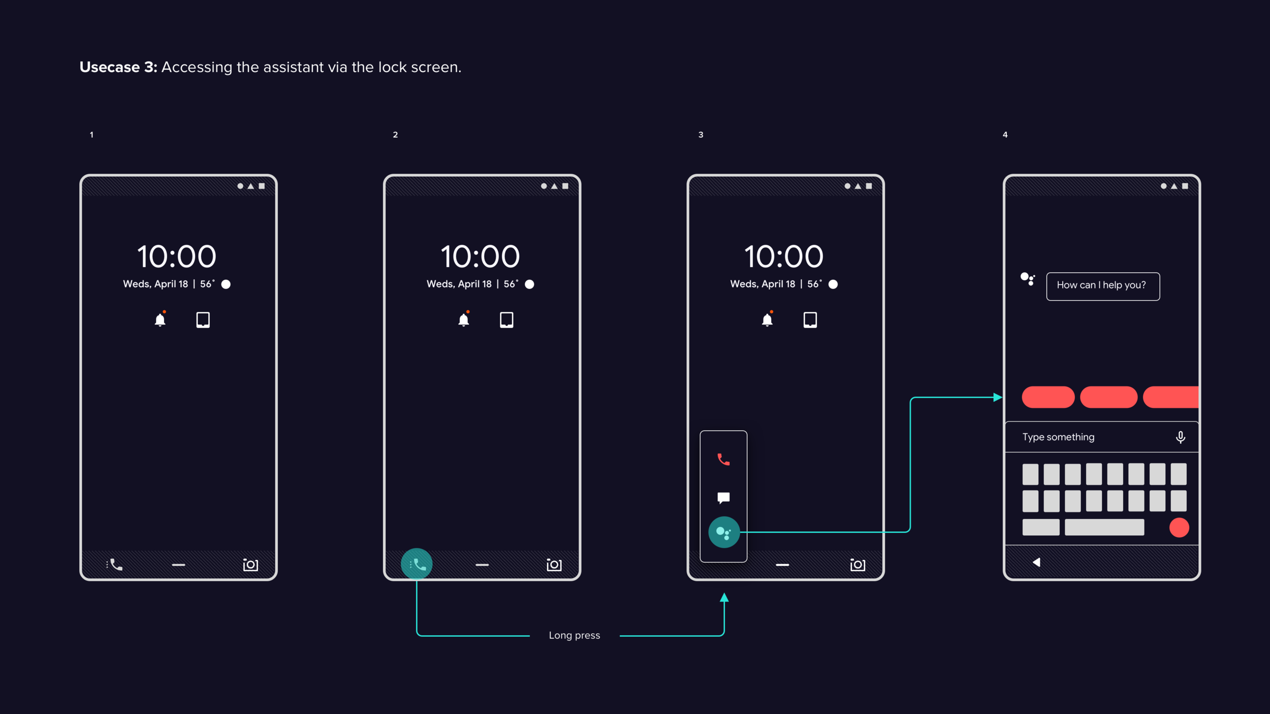
Digital Assistant Experience
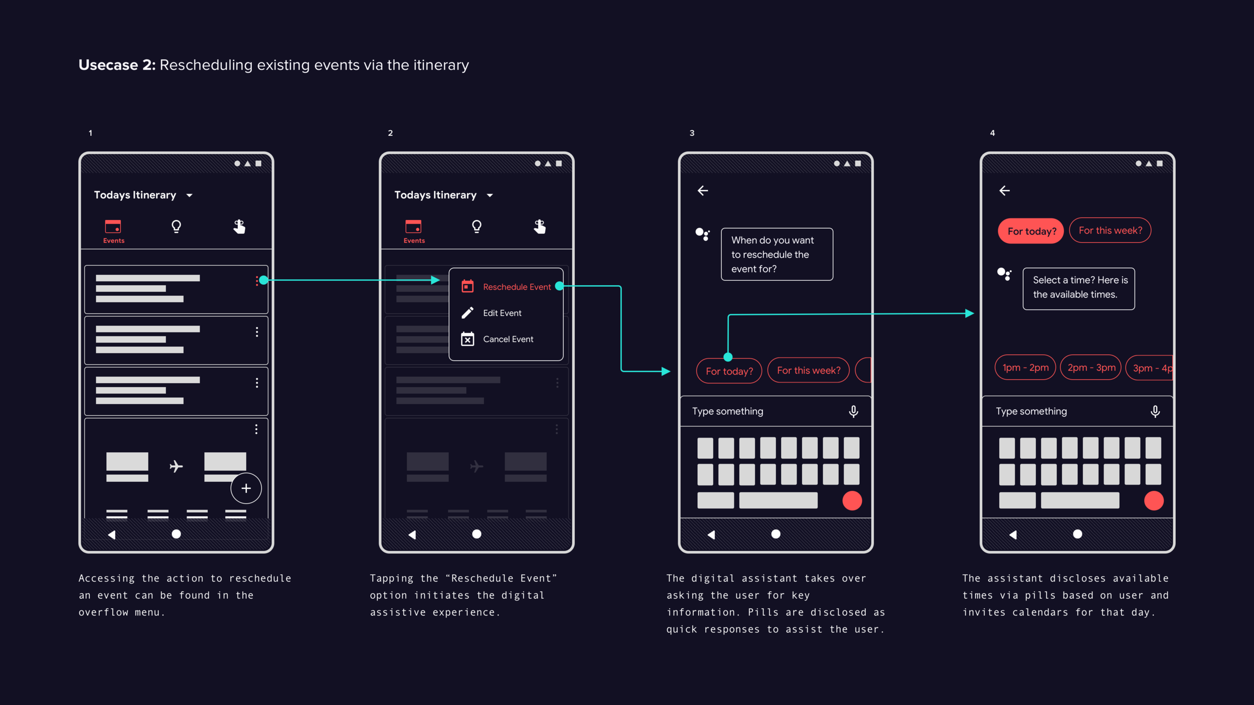
Digital assistant test findings
All six test subjects were able to successfully cancel a calendar event using the itinerary section. However, when asked to reschedule the event, all test subjects found it difficult to discover the entry point to initiate the rescheduling action. Several test subjects tried a variety of gestures (swipe, long press, etc.) to initiate the task. In the prototype, the entry point to initiate the rescheduling of a calendar event was the assistant icon, which users were already familiar with before the test. When asked why they did not access the assistant icon, subjects expected an overflow icon instead of the assistant icon.
Once subjects discovered the option to reschedule via the assistant icon, they were able to complete the task without errors. Once in the rescheduling workflow, users found the assistive experience easy and intuitive.
Final recommendations
Although initial feedback on the digital assistant experience was positive, the testing was limited to one use case. Therefore, it is recommended to conduct further testing to evaluate the effectiveness of the digital assistant in various parts of the system. This will provide a more comprehensive understanding of its value and potential areas for improvement.
Next round of prototypes could cover these specific areas and they are as such:
Itinerary (Adding calendar event or rescheduling existing calendar events)
Notifications shade
Via native notes app, calendar app.
Via default search
App tray.
Established some rule, as guidance for implementing the digital assistive experience and design pattern. Further testing is need to measure its effectiveness.
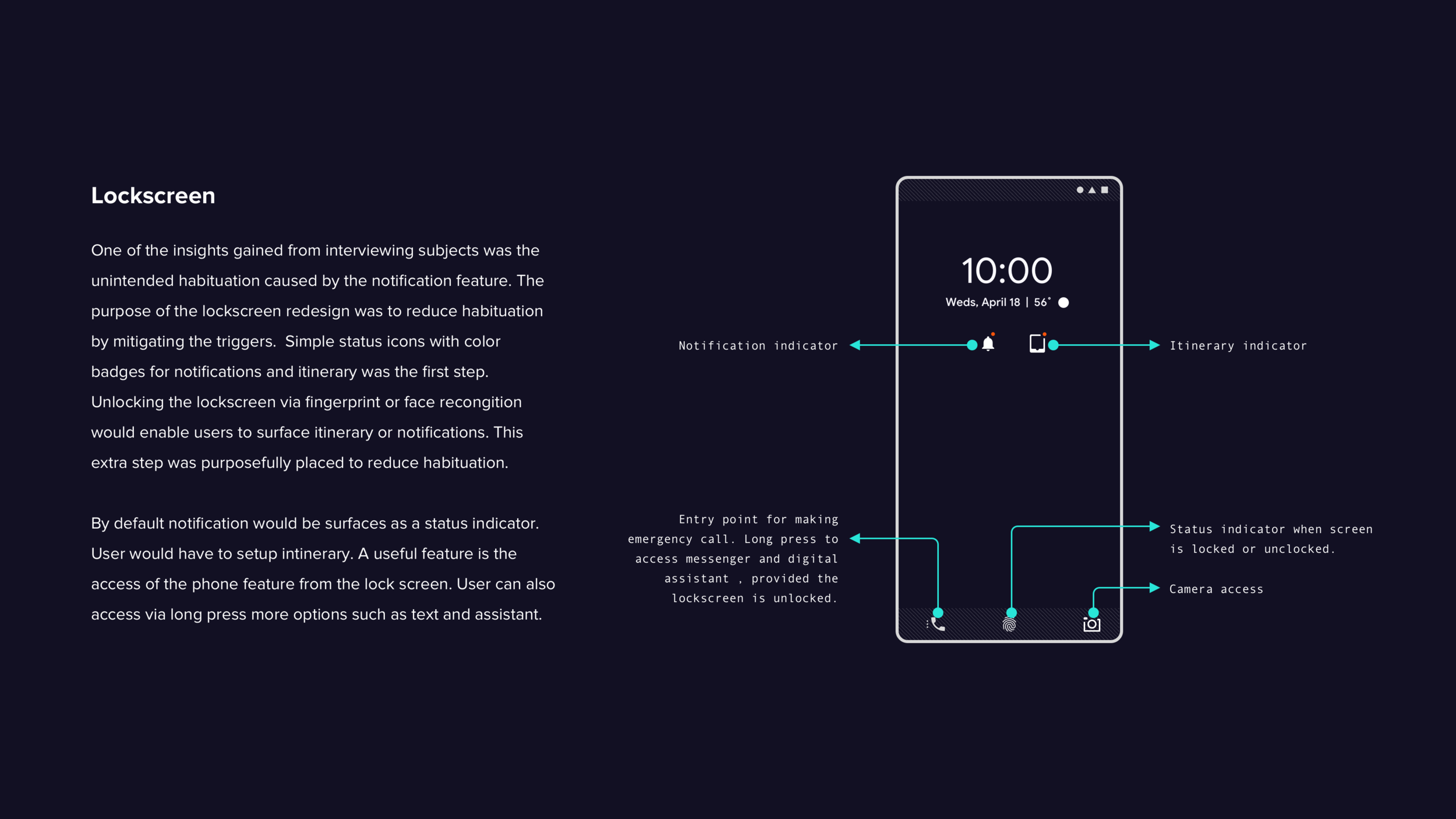
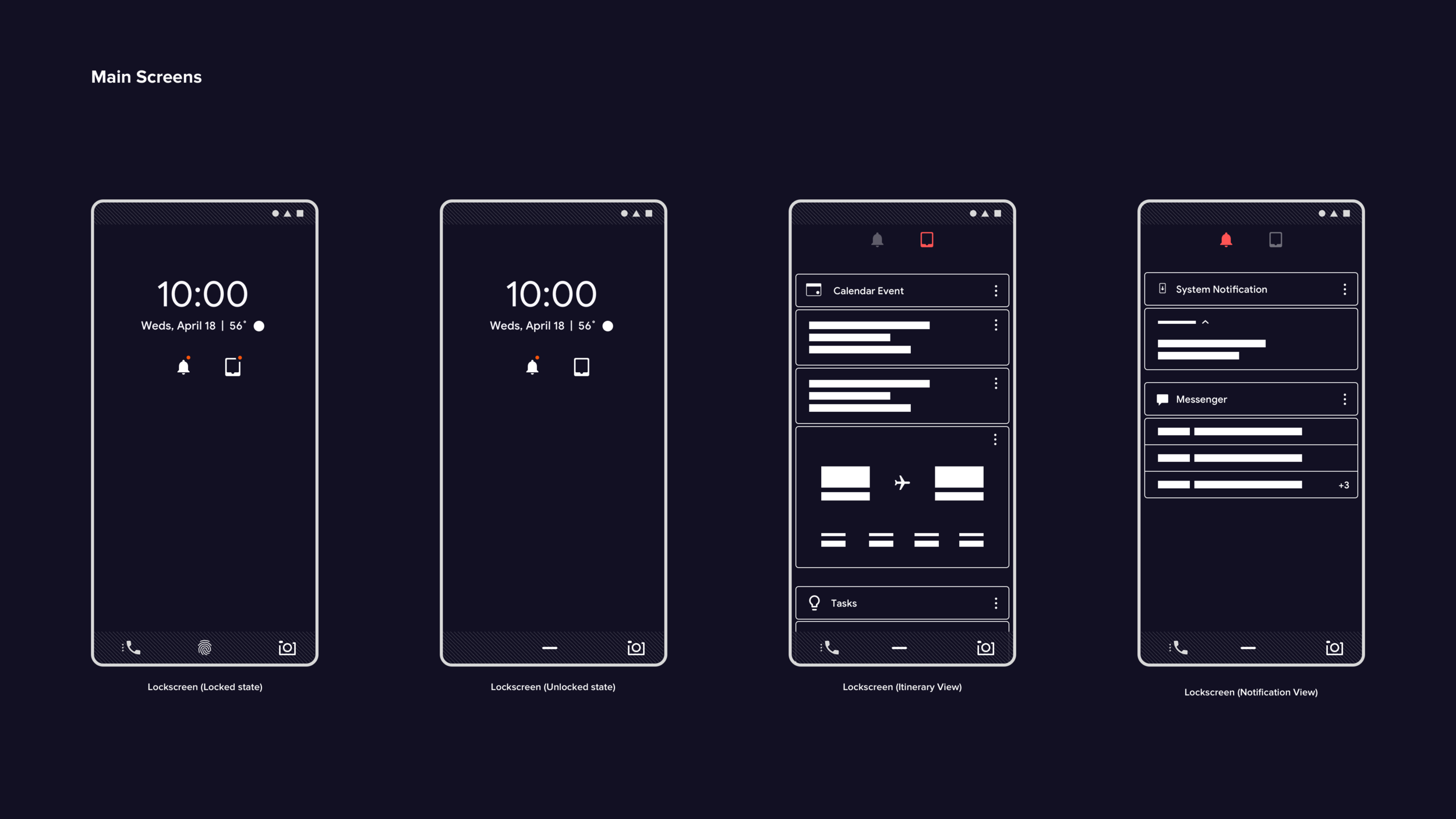
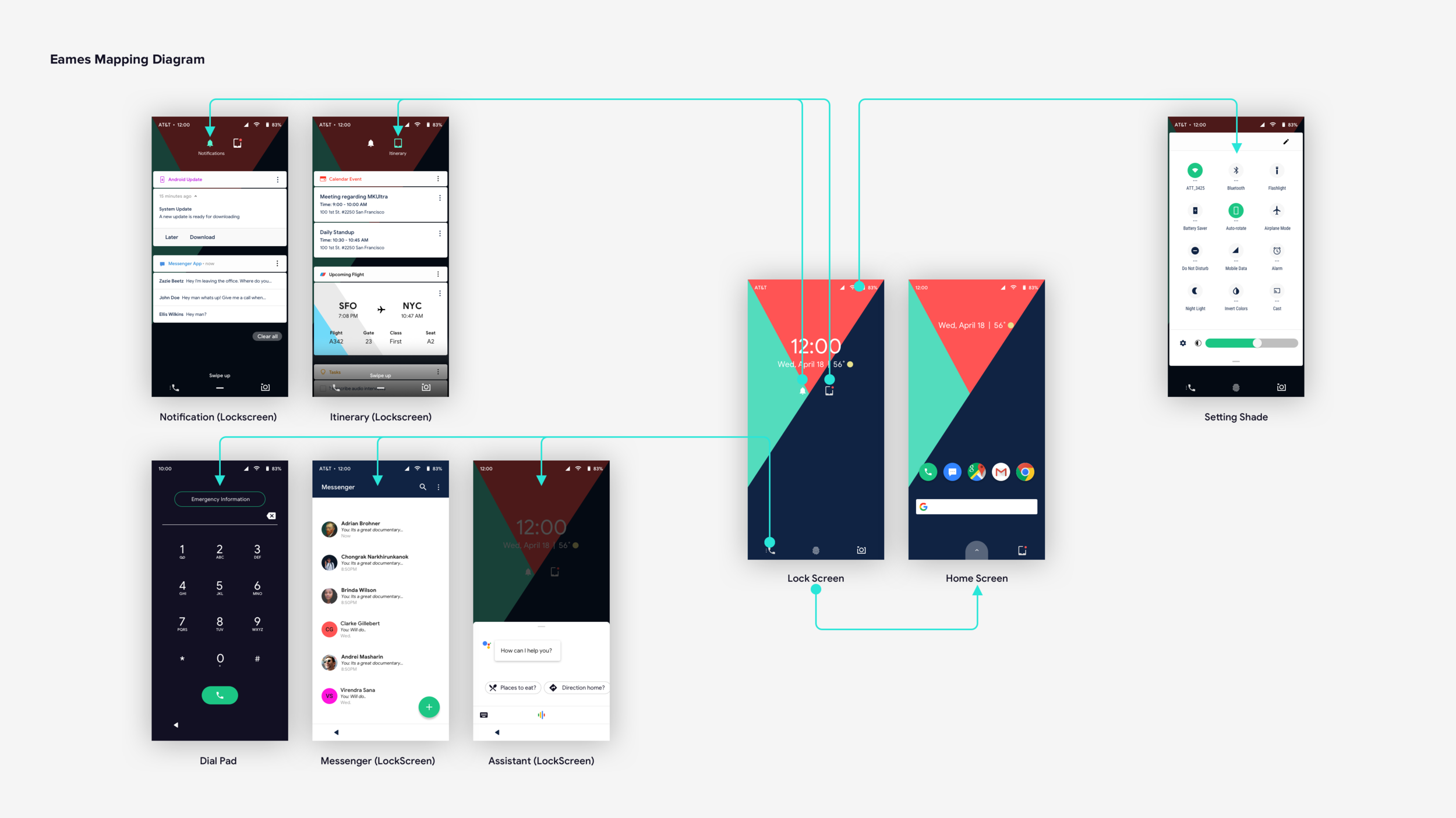
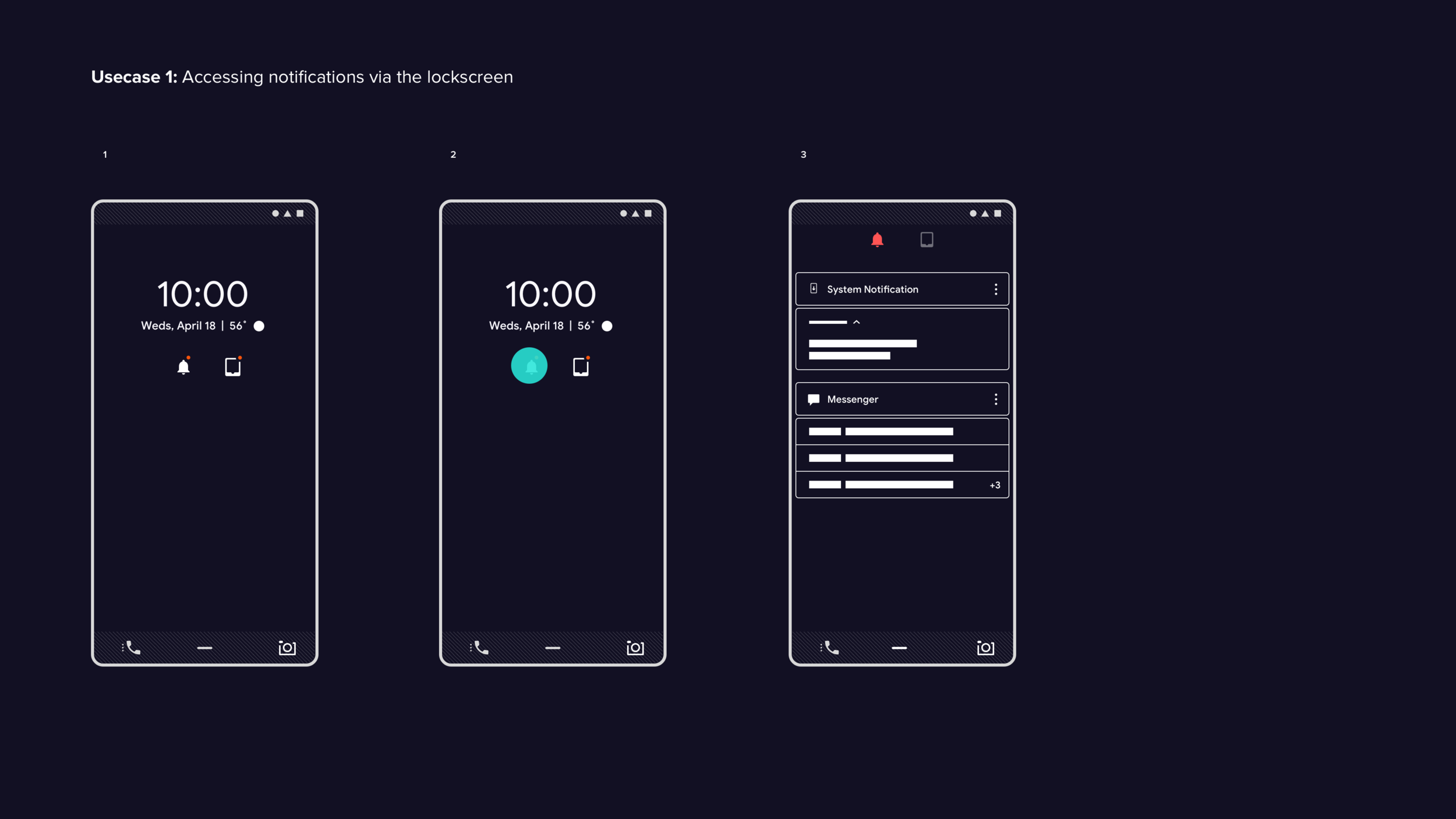
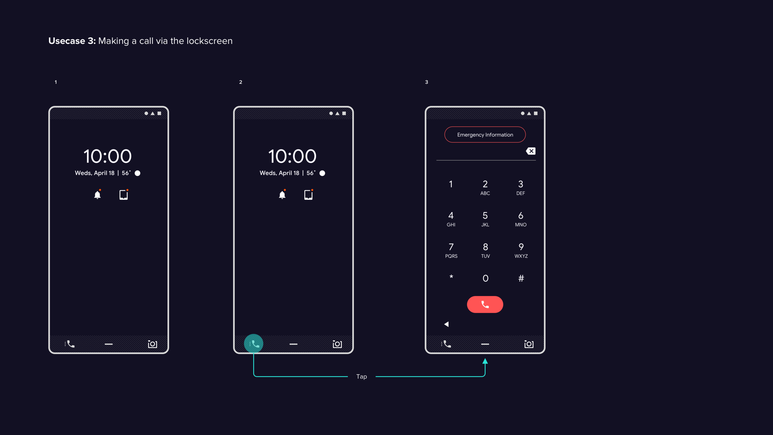
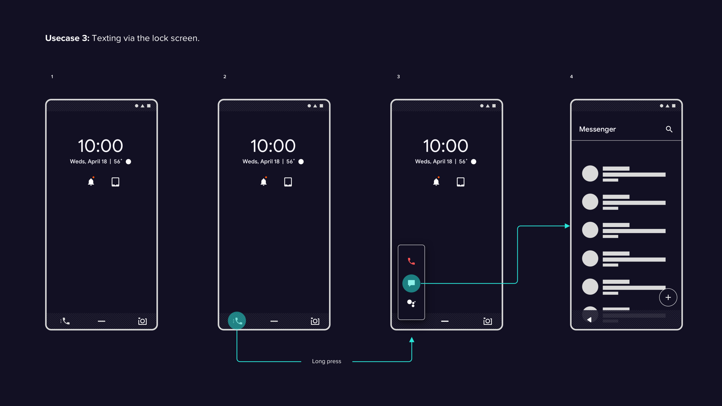
Lockscreen
Although designs were created for a lock-screen experience that scope of work was not included in test session due to time. Further tests would be needed to measure the effectiveness of this new approach. Below are the design created.
App Tray
App tray test findings
During user testing, the intent based categorization (IBC) layout was evaluated as a potential alternative to the classic grid view layout. The results of the testing were positive, with all six subjects given tasks to measure overall efficiency. Here are the key takeaways from the user testing:
All six subjects were able to access the app tray and access various apps without experiencing any friction.
Initially, three out of six test subjects had difficulty understanding the association of the history carousel with the app tray, but quickly grasped it once they accessed an app. All subjects found the carousel overly distracting, and some found the information density of the tray problematic when searching for an app. Two out of six subjects also commented that having to swipe twice to access all apps was inefficient.
When tasked with pivoting from within an app back to the app tray, four out of six subjects tapped on the home button to return to the home screen and then swiped up on the tab affordance to access the app tray. This behavior was due to existing muscle memory from the classic Android 3 button navigation.
Two out of six subjects utilized the tab affordance to access the app tray, despite the gesture-based navigation being new for all subjects. Once they used it, users found the experience easy.
All subjects found the categorization of apps valuable. Three test subjects expressed a desire for personalization of the layout and custom categories.
Final feedback
It's great to hear that the intent based categorization (IBC) layout was received well and that users are interested in customizing and personalizing the categories. User testing around customization and personalization workflows can help to identify the ideal ways for users to make the layout work for them.
Providing users with the option to choose between the IBC layout and the classic icon grid layout can be a great way to give users more flexibility and control over how they organize their apps. This can help to make the user experience more personalized and tailored to their individual preferences.
However, it's important to ensure that the customization and personalization options are easy to use and intuitive for users. It may be helpful to conduct further user testing to determine the most effective ways to implement these features and ensure that they are accessible to all users, regardless of their technical abilities.