Netgear/Arlo - PART 3
The objective of this project was to simplify the device on-boarding experience using Bluetooth Low Energy (BLE) technology while ensuring compatibility with older devices. The project was divided into two phases. The first phase focused on optimizing the current workflow and addressing any usability issues, while still using the existing QR code for network connection. The second phase involved incorporating BLE as the primary method for new Arlo products to connect to the network, with the QR code serving as a backup option in case of BLE malfunction.
Challenge
To improve the device on-boarding process, the original responsive web experience that was ported into the iOS and Android apps needed to be redesigned to maintain consistency in the user experience. The format and layout of the screens were inconsistent, the presentation was poor, and the experience lacked the responsiveness that users expect from native on-boarding experiences. Therefore, it was essential to keep the device on-boarding experience native within the iOS and Android platforms to maintain a consistent experience. In addition, understanding how users experienced the current on-boarding process was also an objective.
Arlo On-boarding Experience Evaluation
During the discovery phase, Lu Yu, our user researcher, and I conducted a moderated usability evaluation of the device on-boarding experience. We invited 8 individuals who were not Arlo customers to participate and provided them with a few of the Arlo products. The evaluation was divided into three parts:
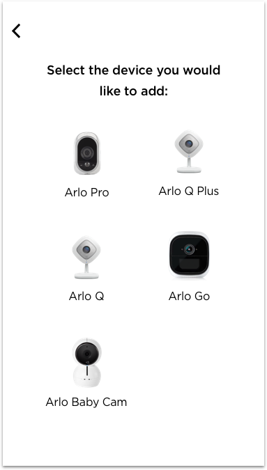
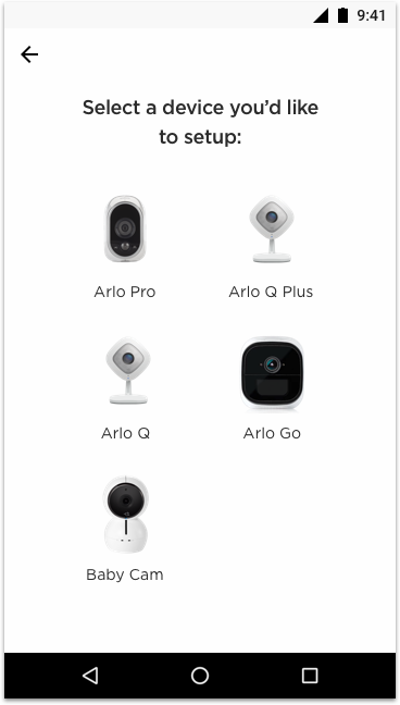
During the evaluation, we asked the participants to set up both Arlo Pro and Arlo Q+ products. To randomize the tasks, we assigned half of the participants to set up the Arlo Pro first, and the other half to set up the Arlo Q+ first.
We documented issues related to the current on-boarding experiences encountered by the participants.
After completing the on-boarding tasks, we had the participants fill out a brief survey.
In the final part of the session, we conducted a semi-structured debrief interview to gather the participants' feedback on the design.
Key Takeaways
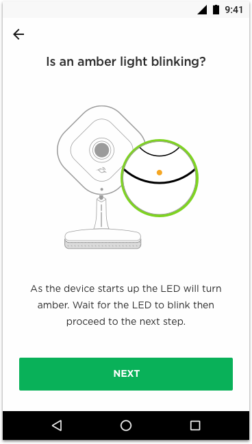
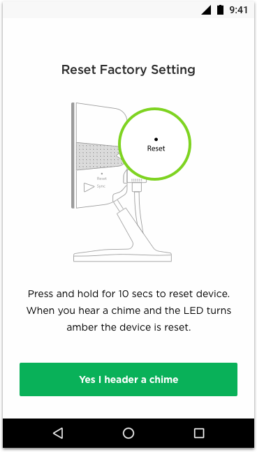
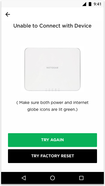
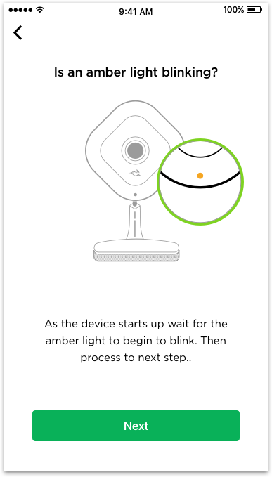
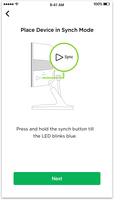
Participants in this test consistently found the LED patterns from the device to be confusing.
The app's imagery should be improved to display more relevant and helpful information to the user.
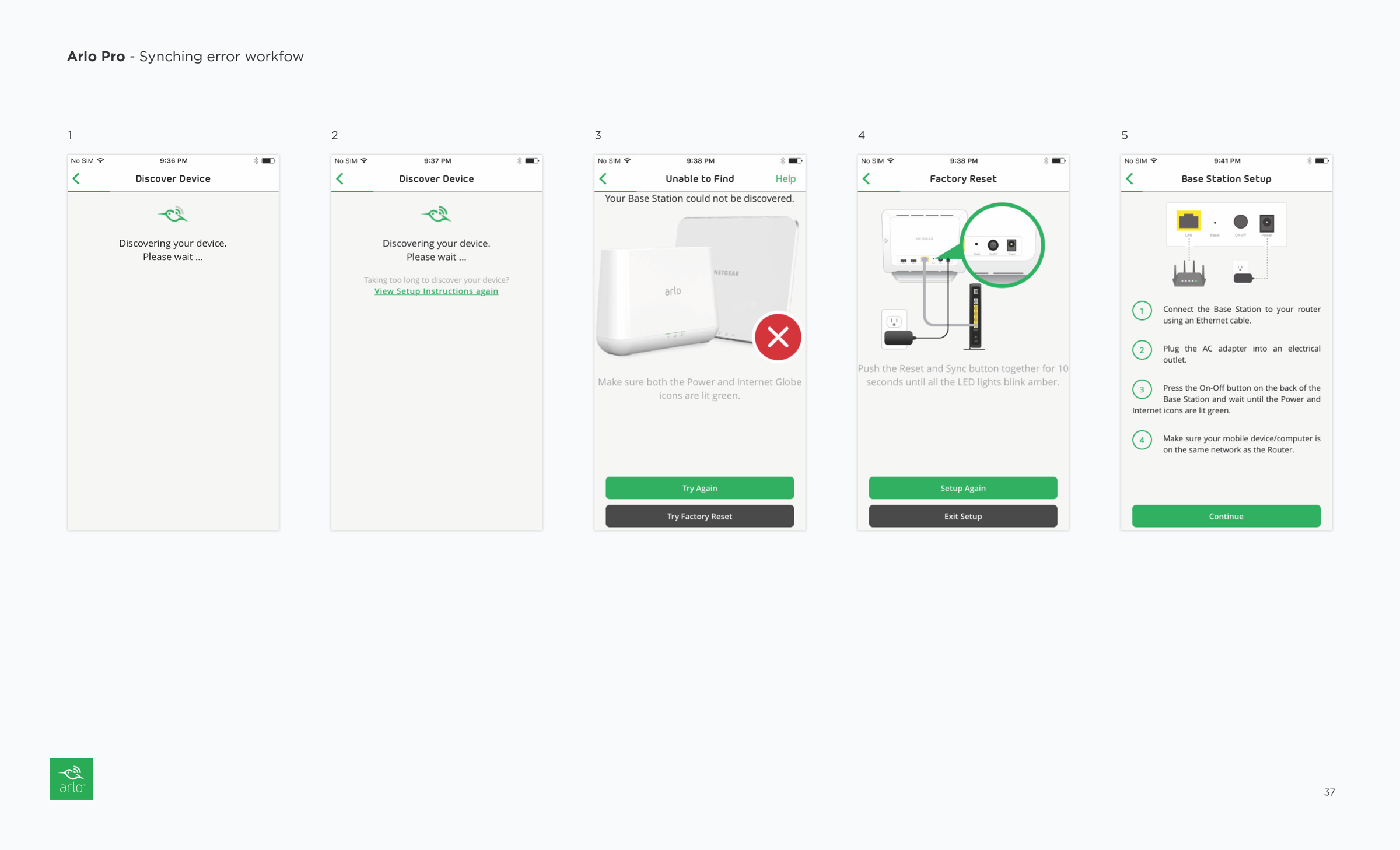
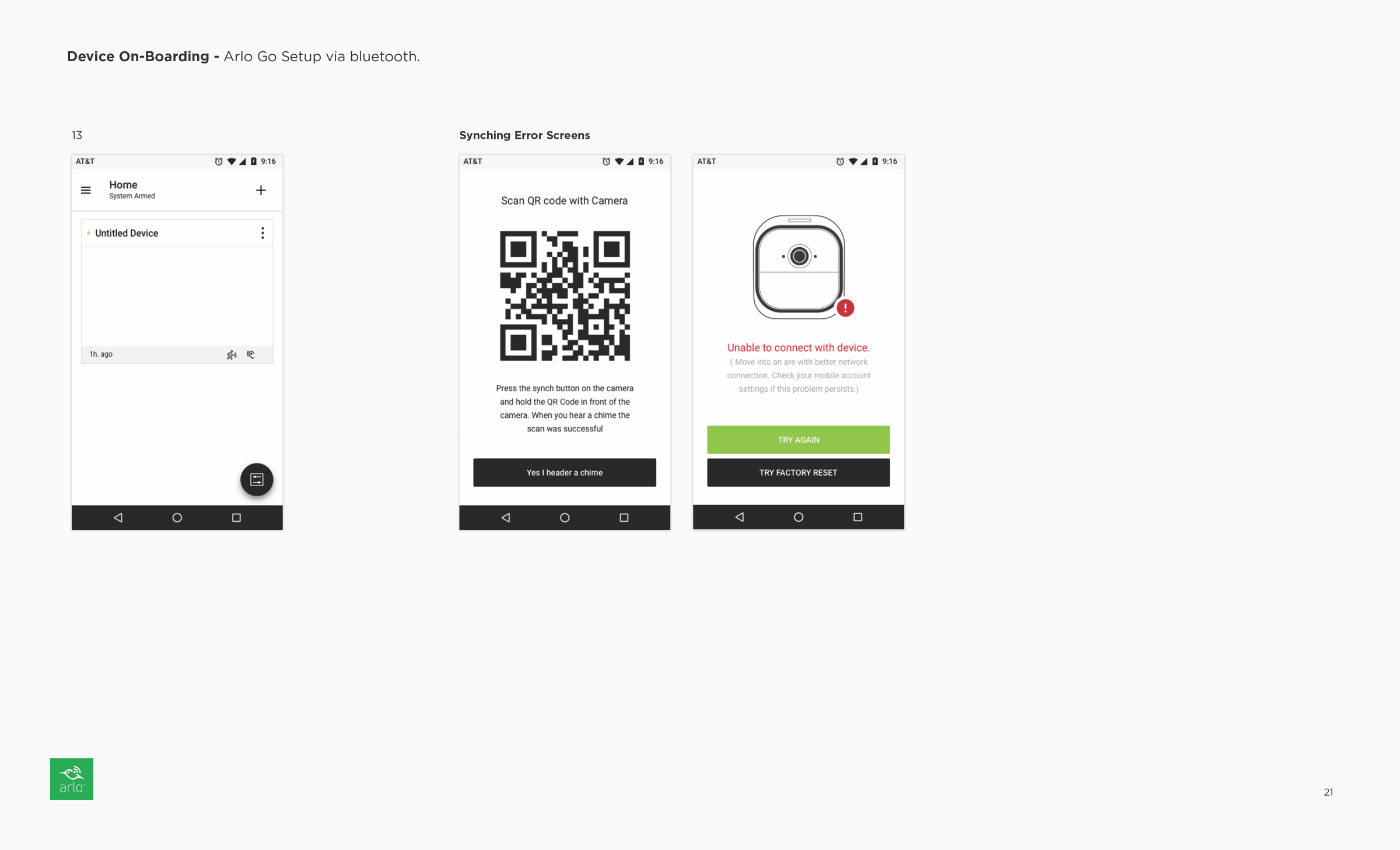
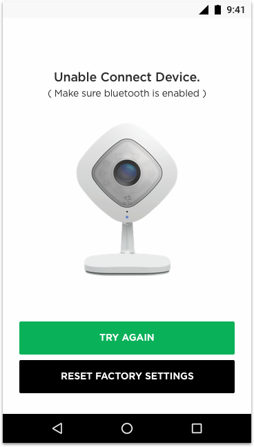
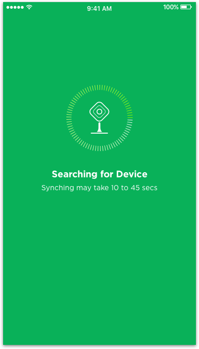
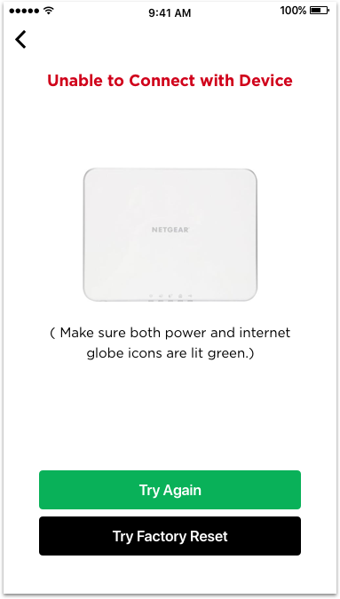
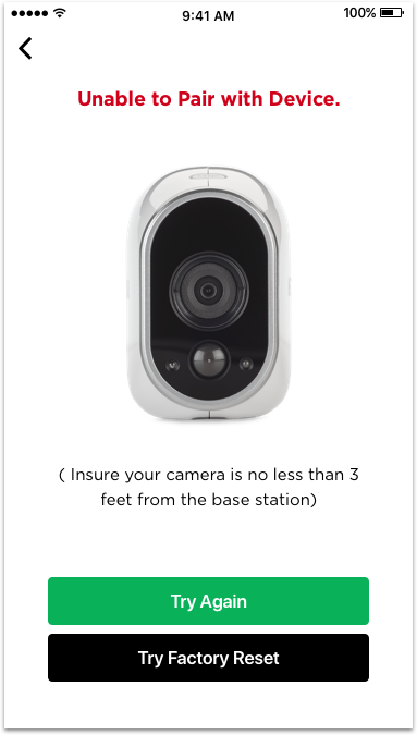
The app failed to provide appropriate feedback or cues when the user was stuck on a step or waiting for a connection to establish.
From a human experience perspective, the app could be described as inconsiderate when the user encounters a problem during on-boarding and needs help. It's like a customer service representative who ignores you and becomes unresponsive when you have a problem.
Original On-boarding Experience
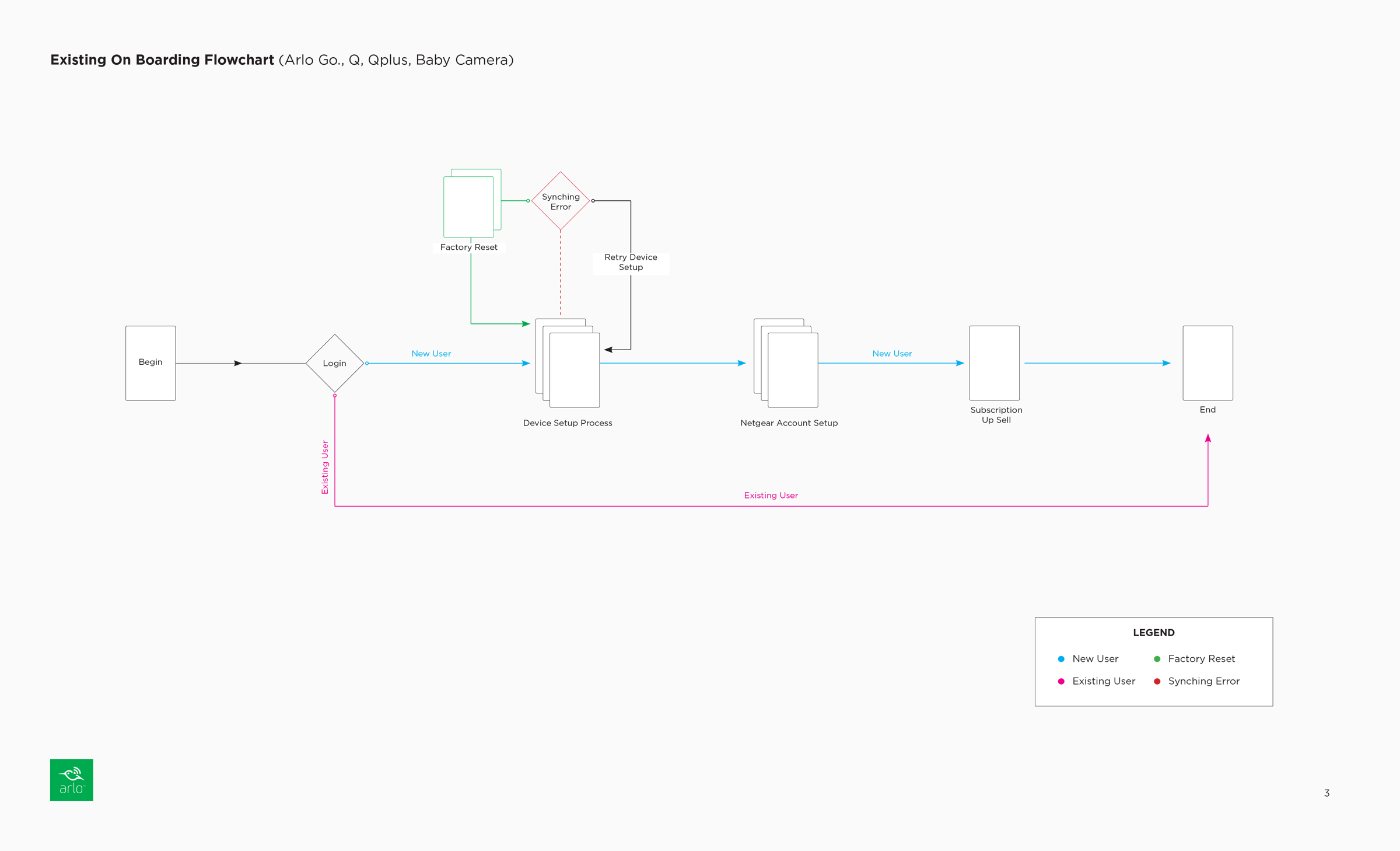
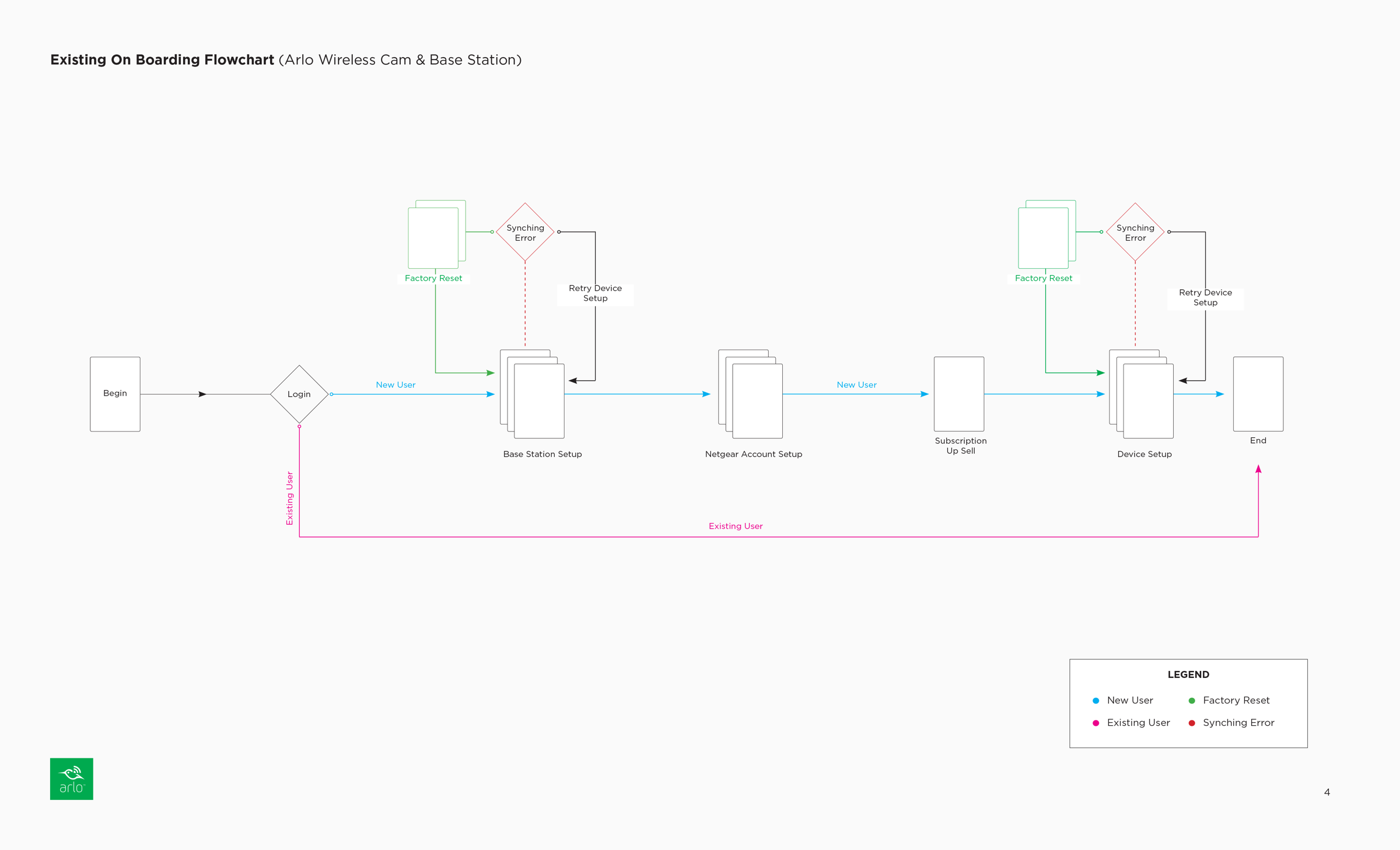


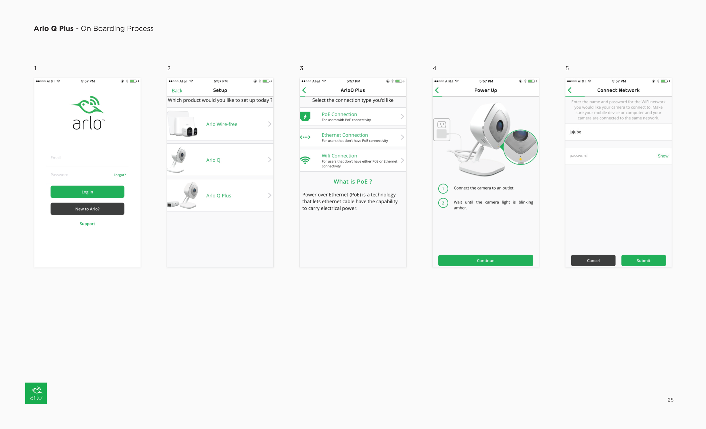
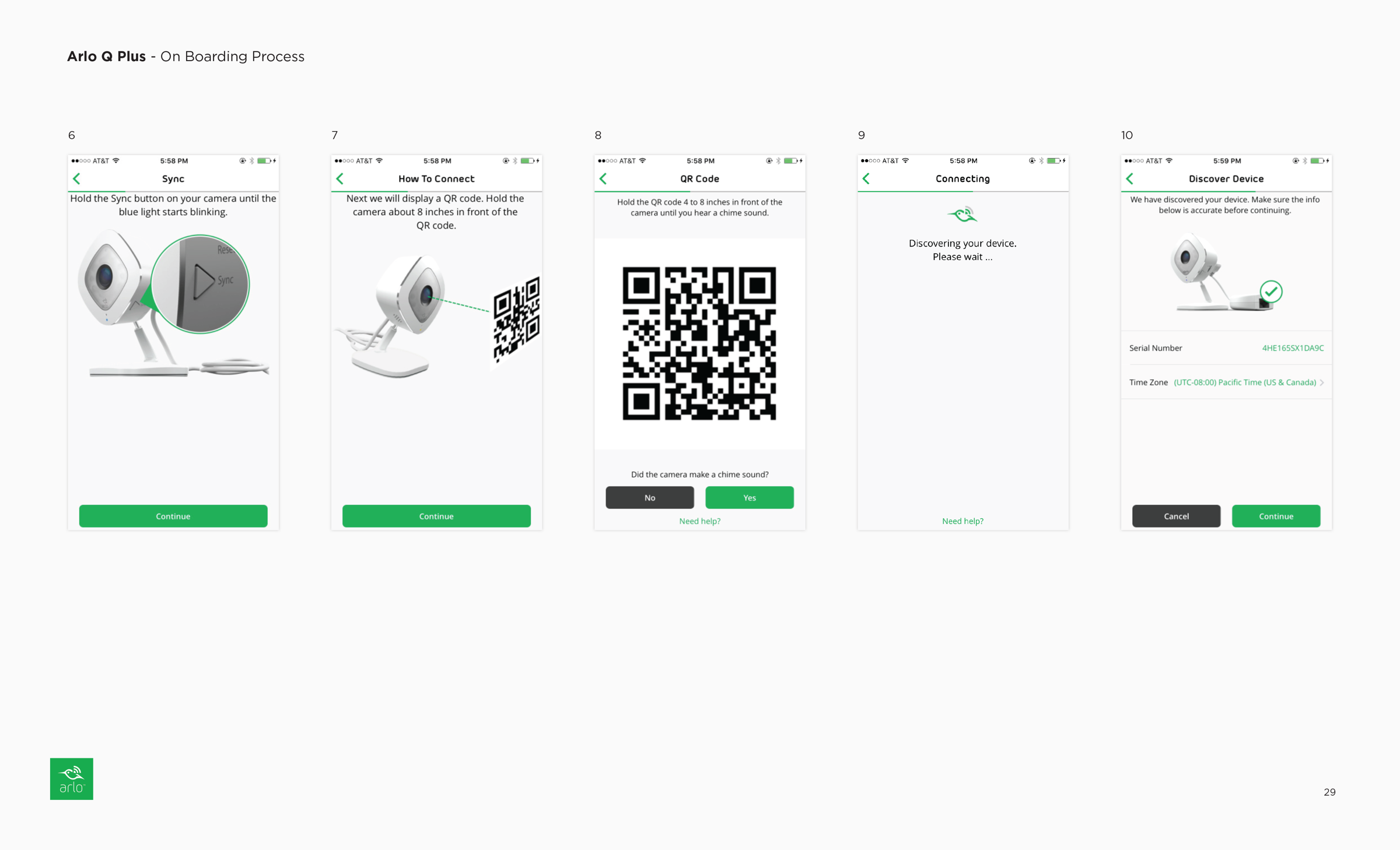
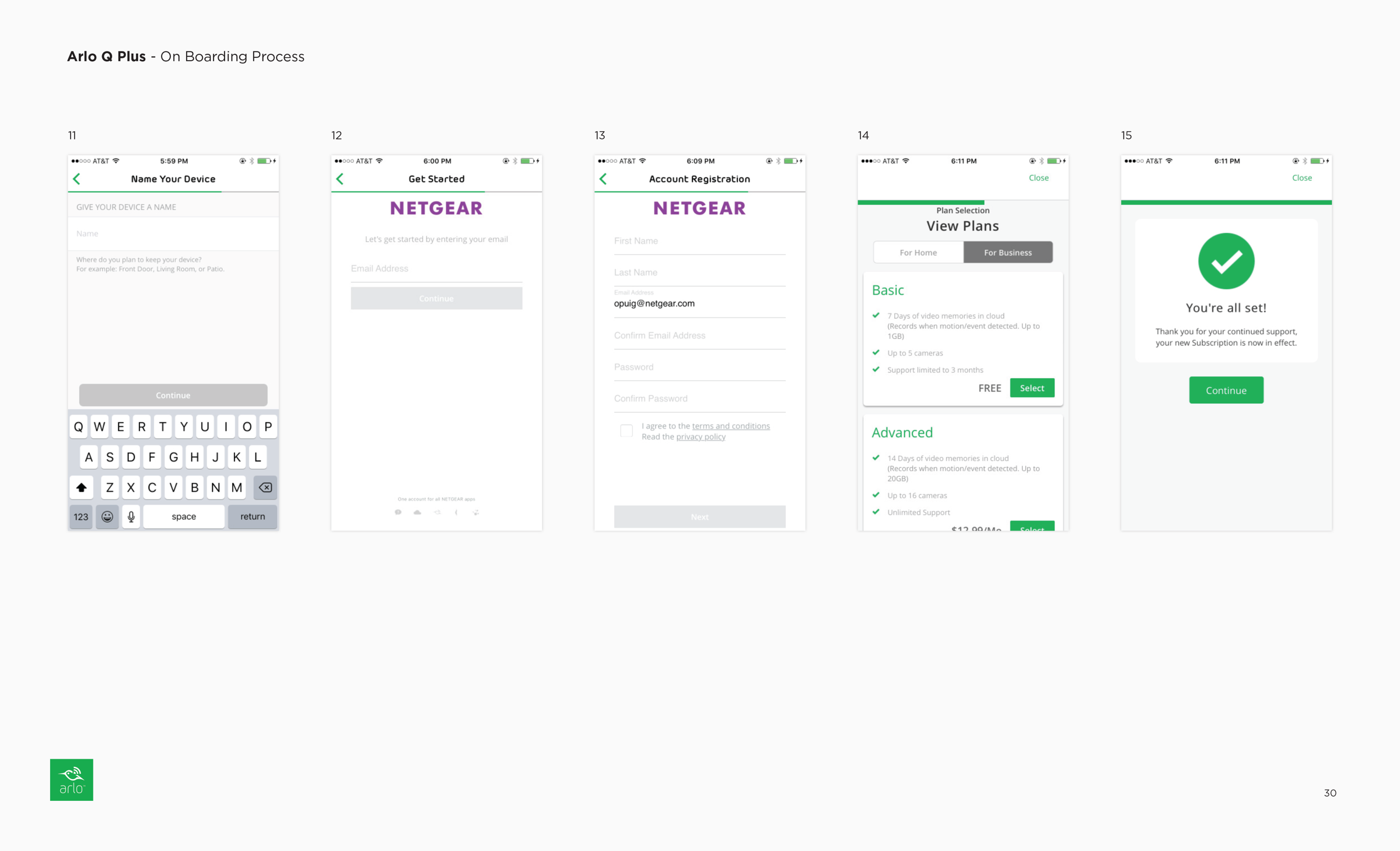
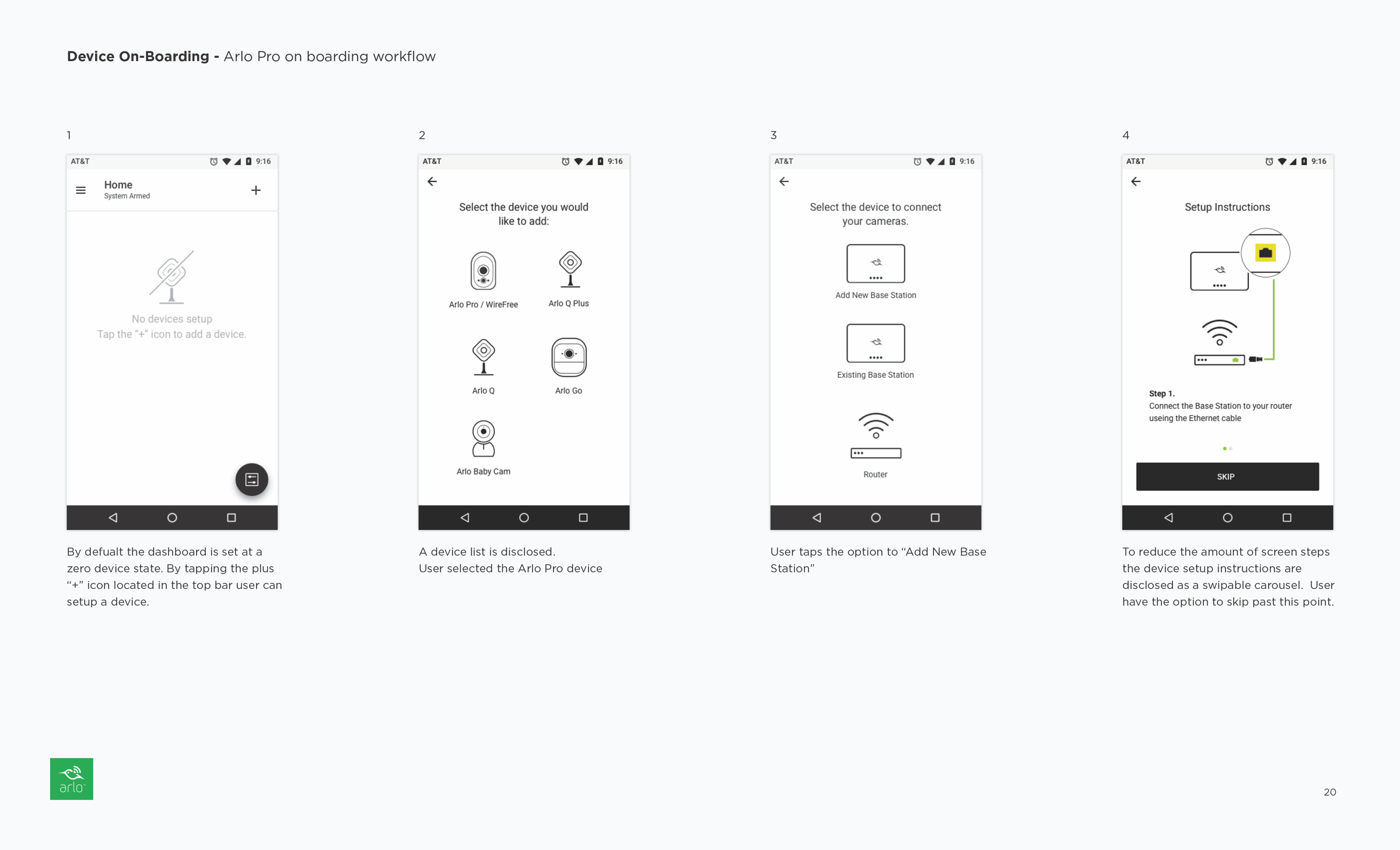
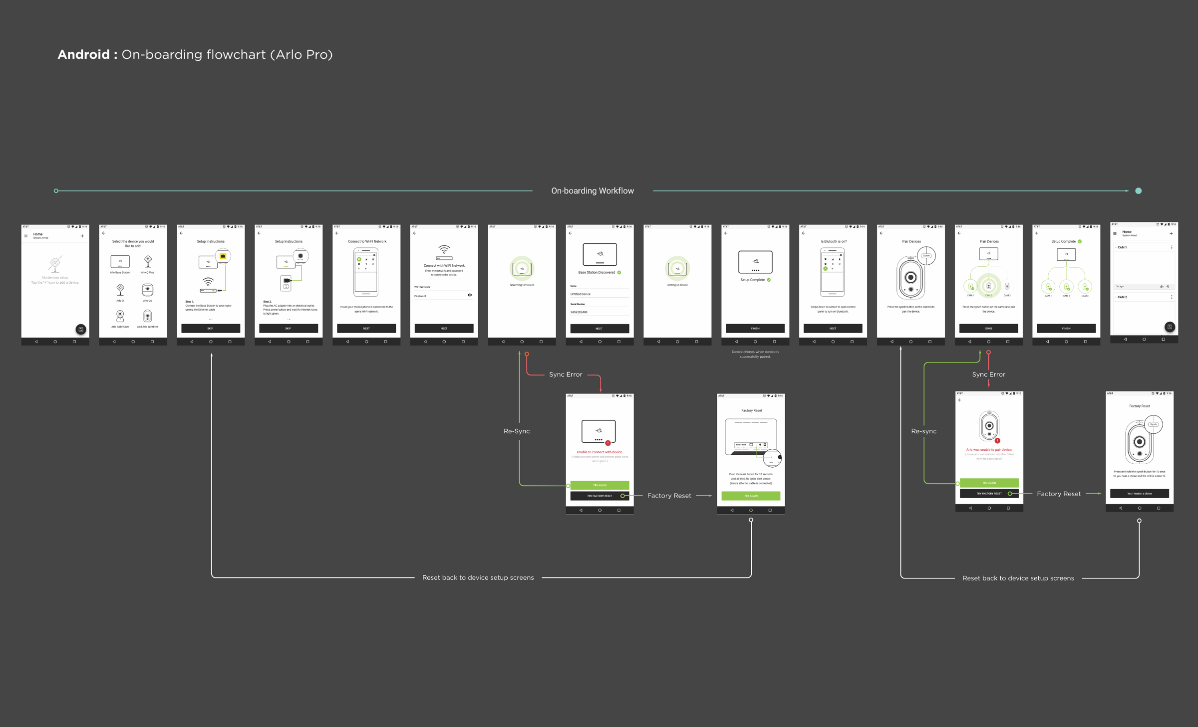
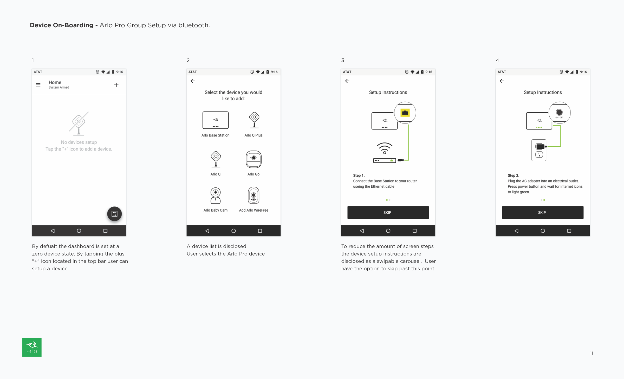
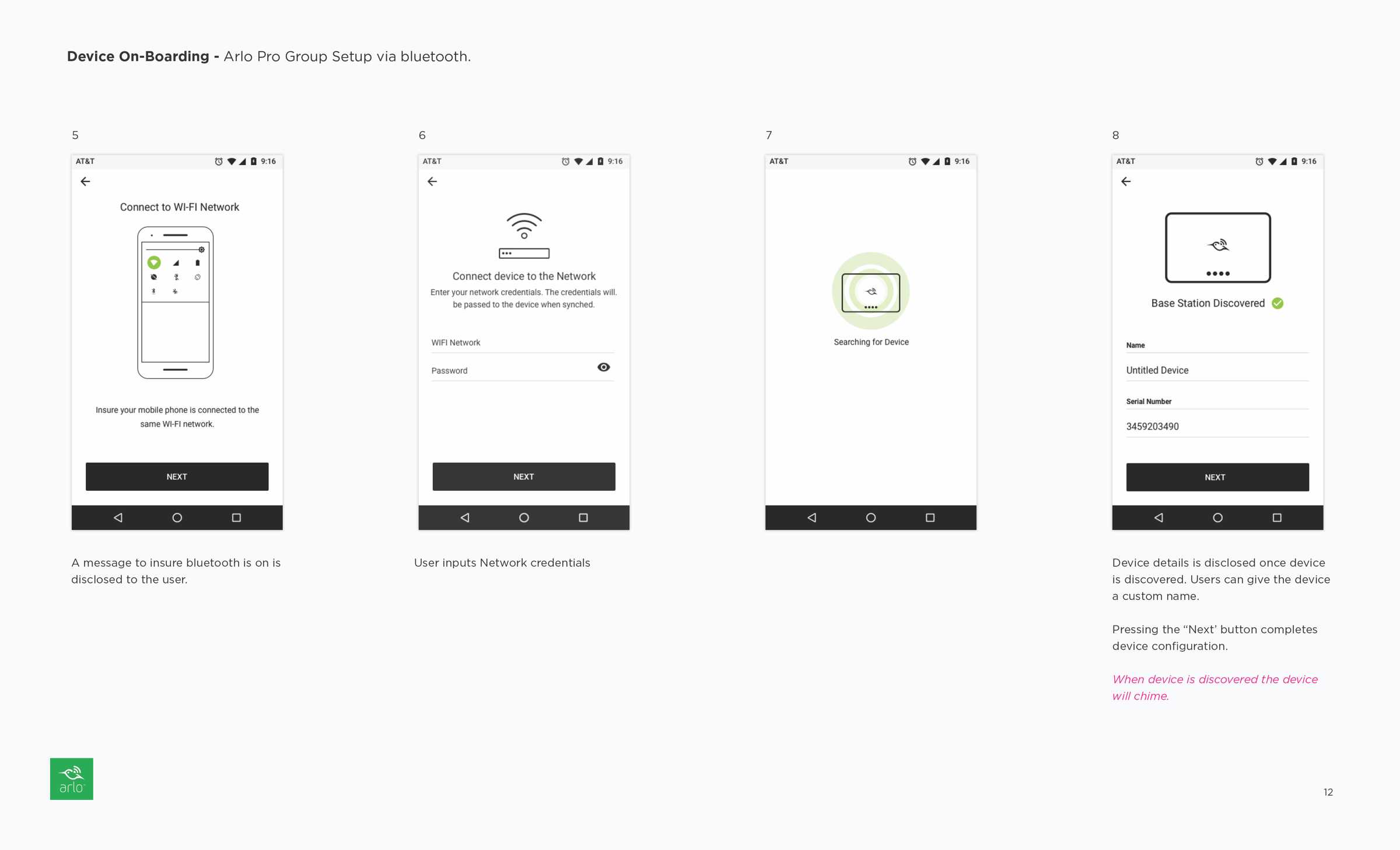
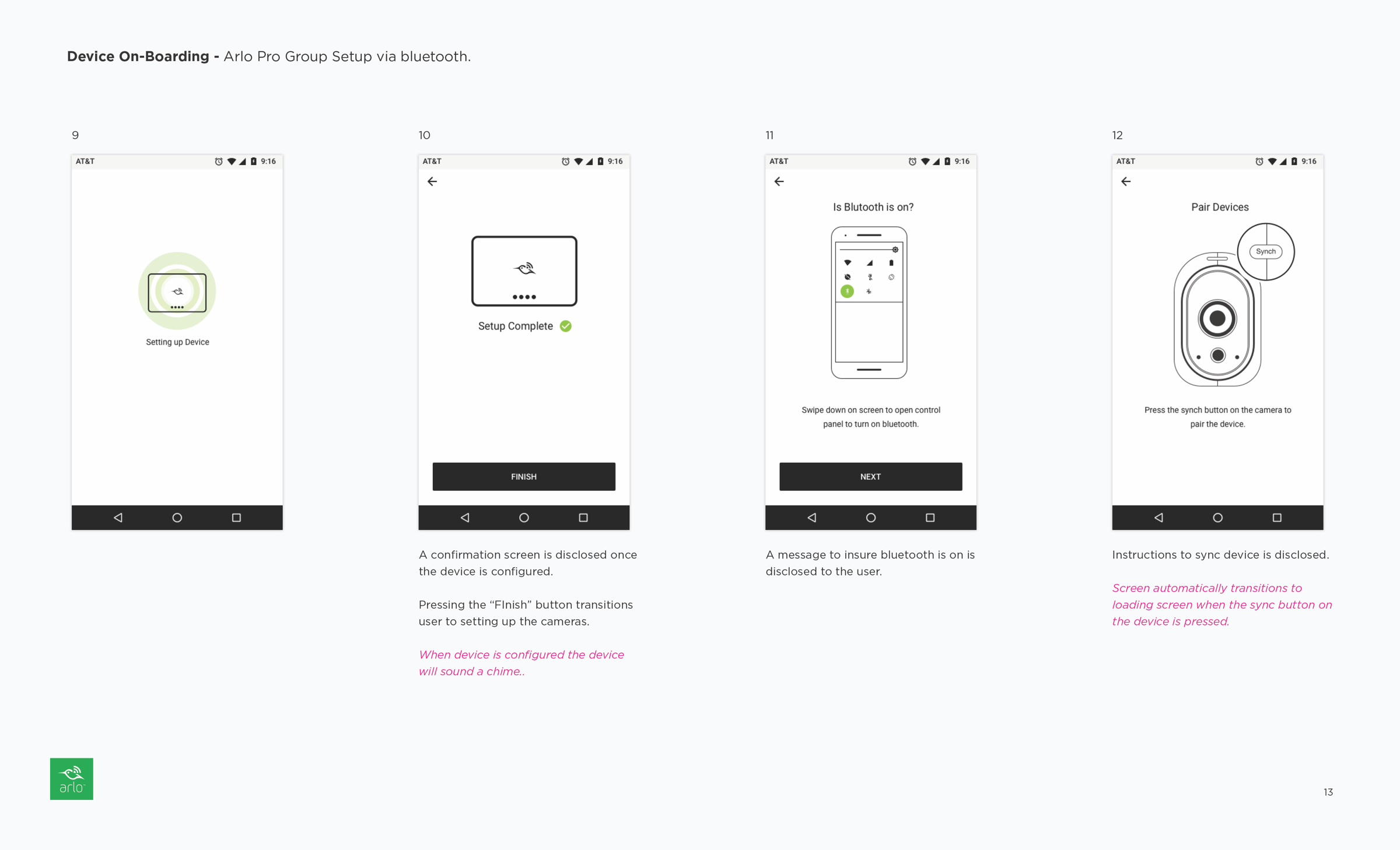
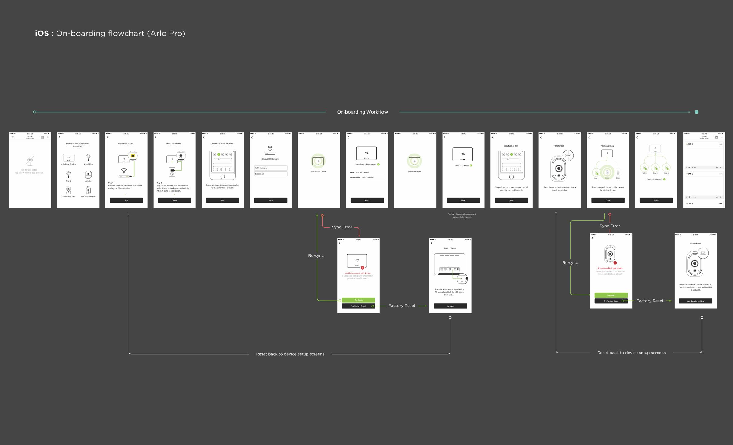
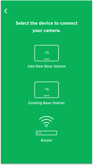
Device On-boarding Redesign
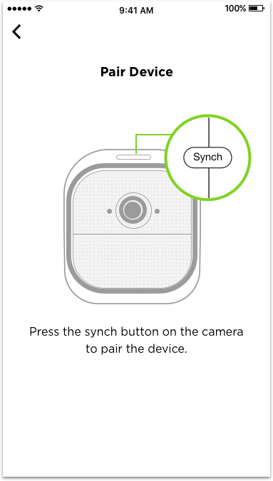
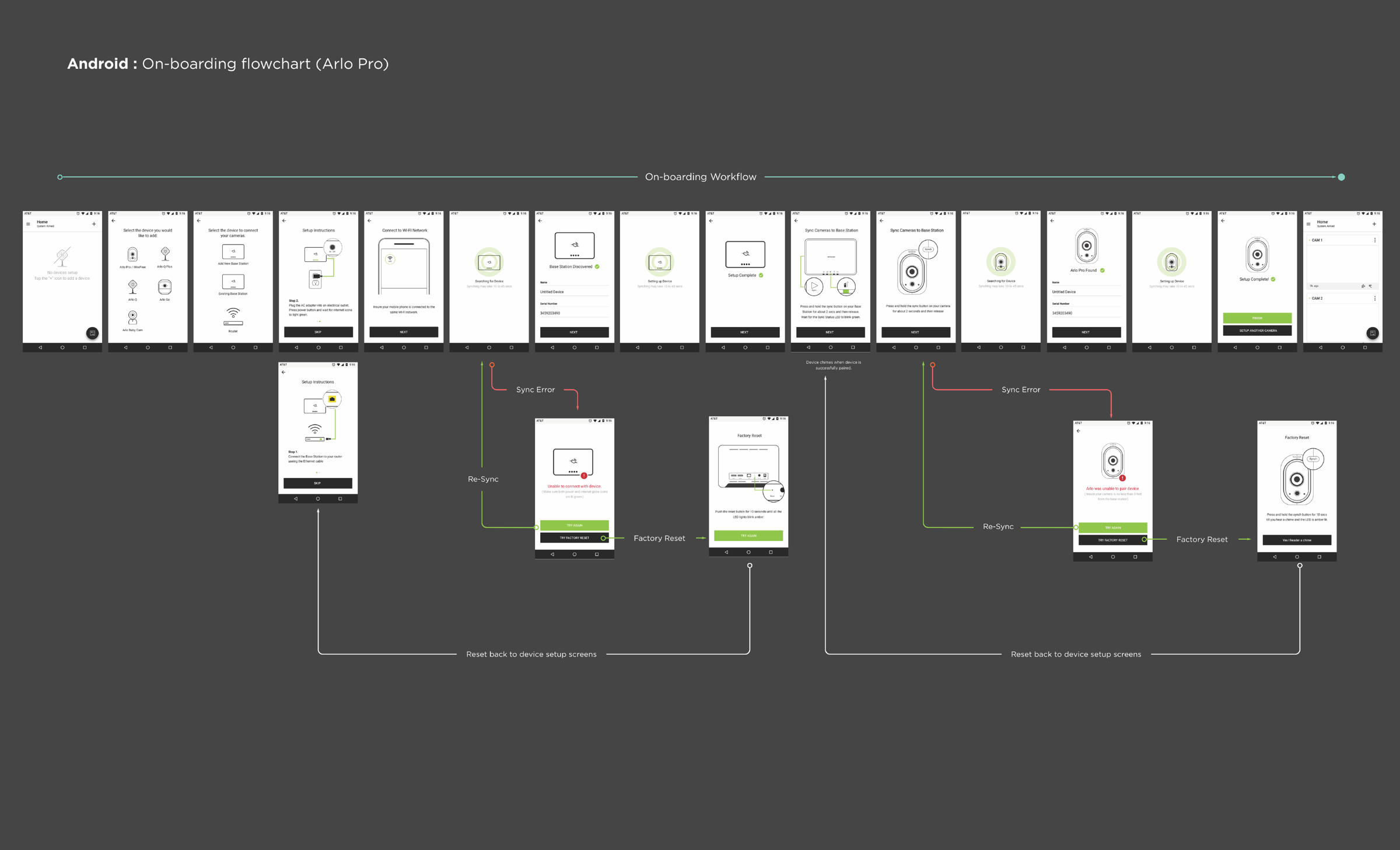
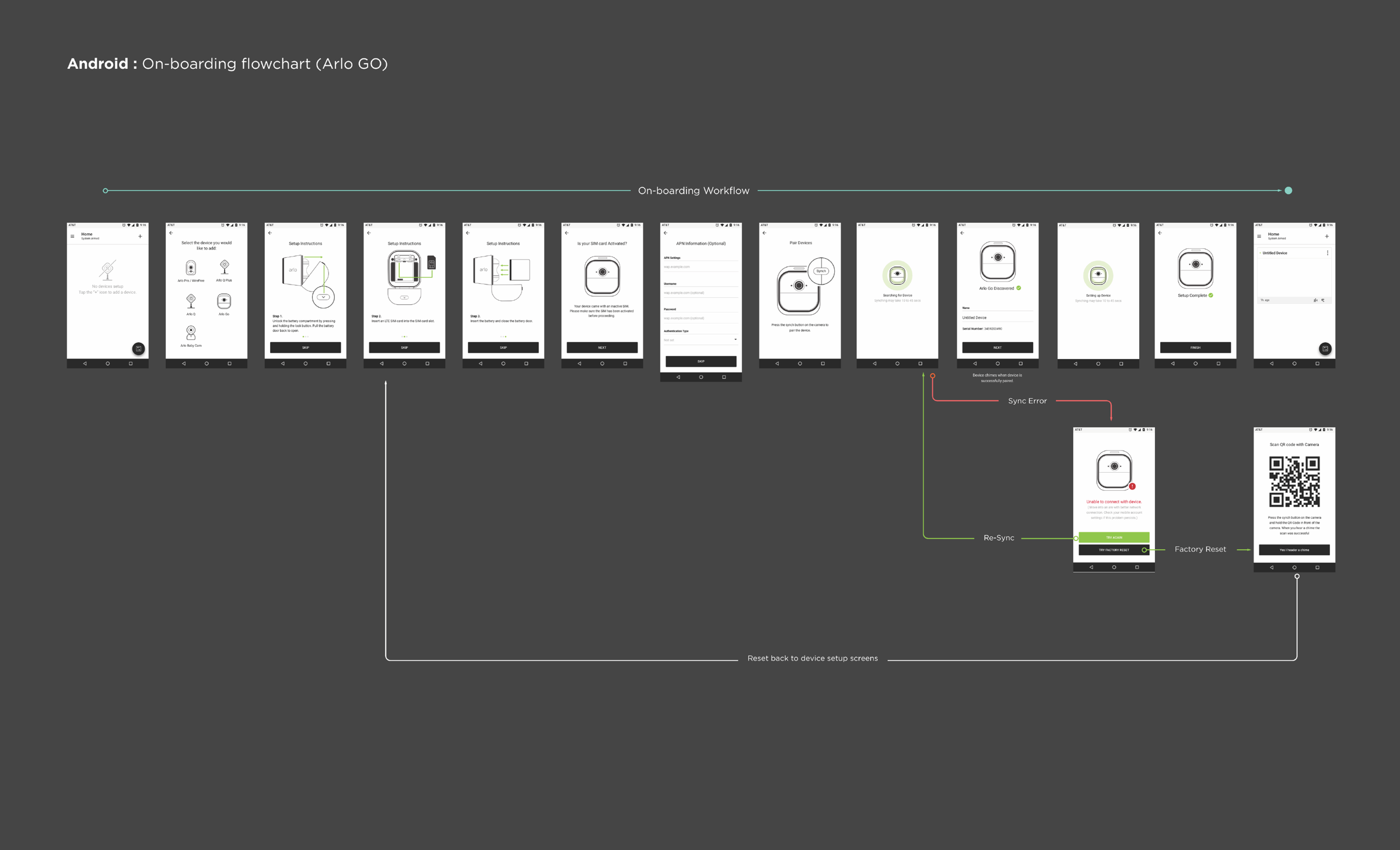
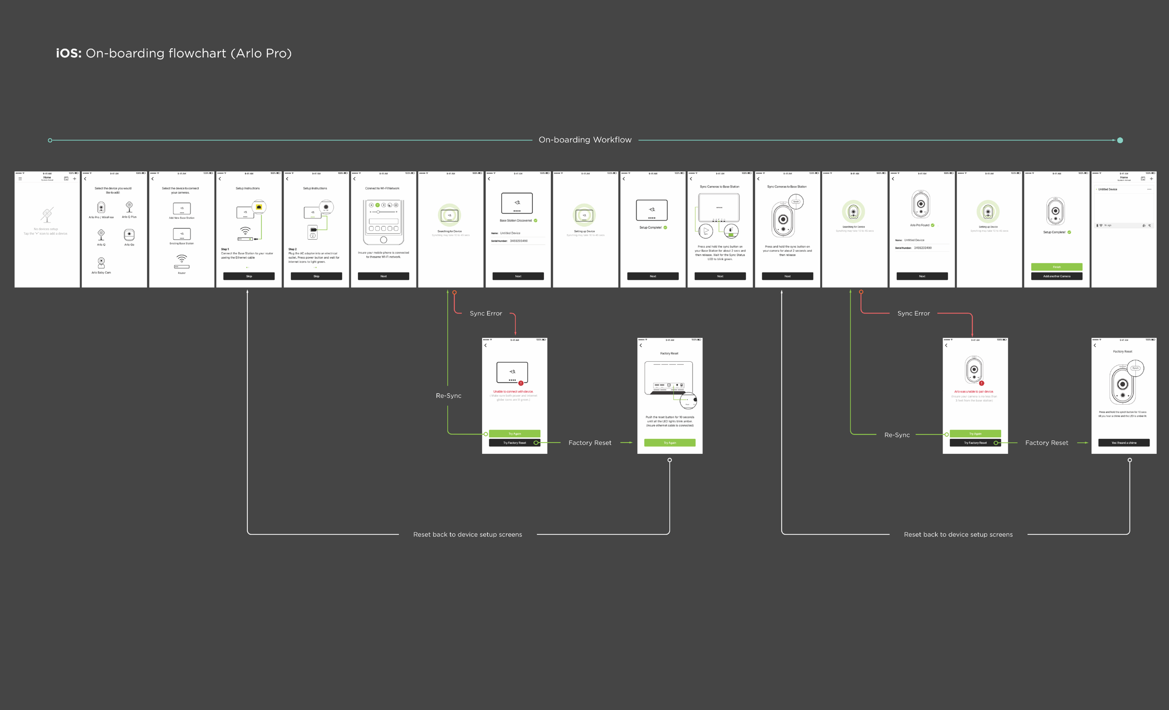
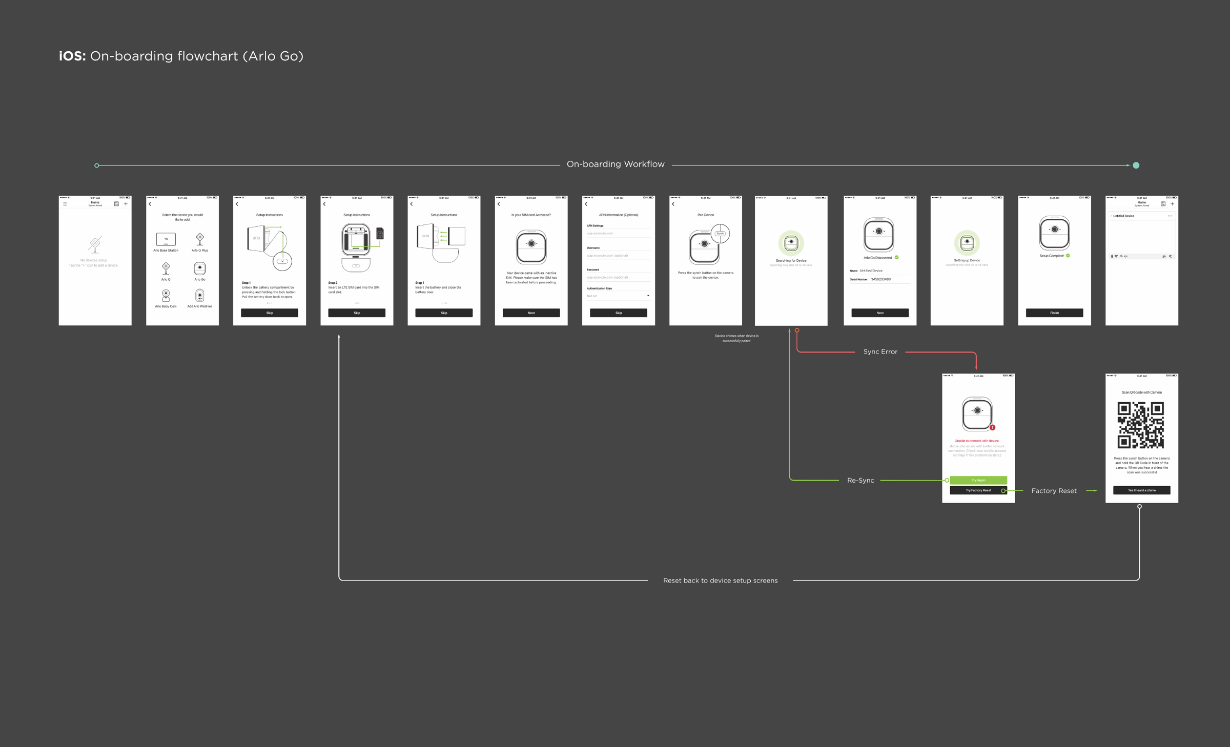
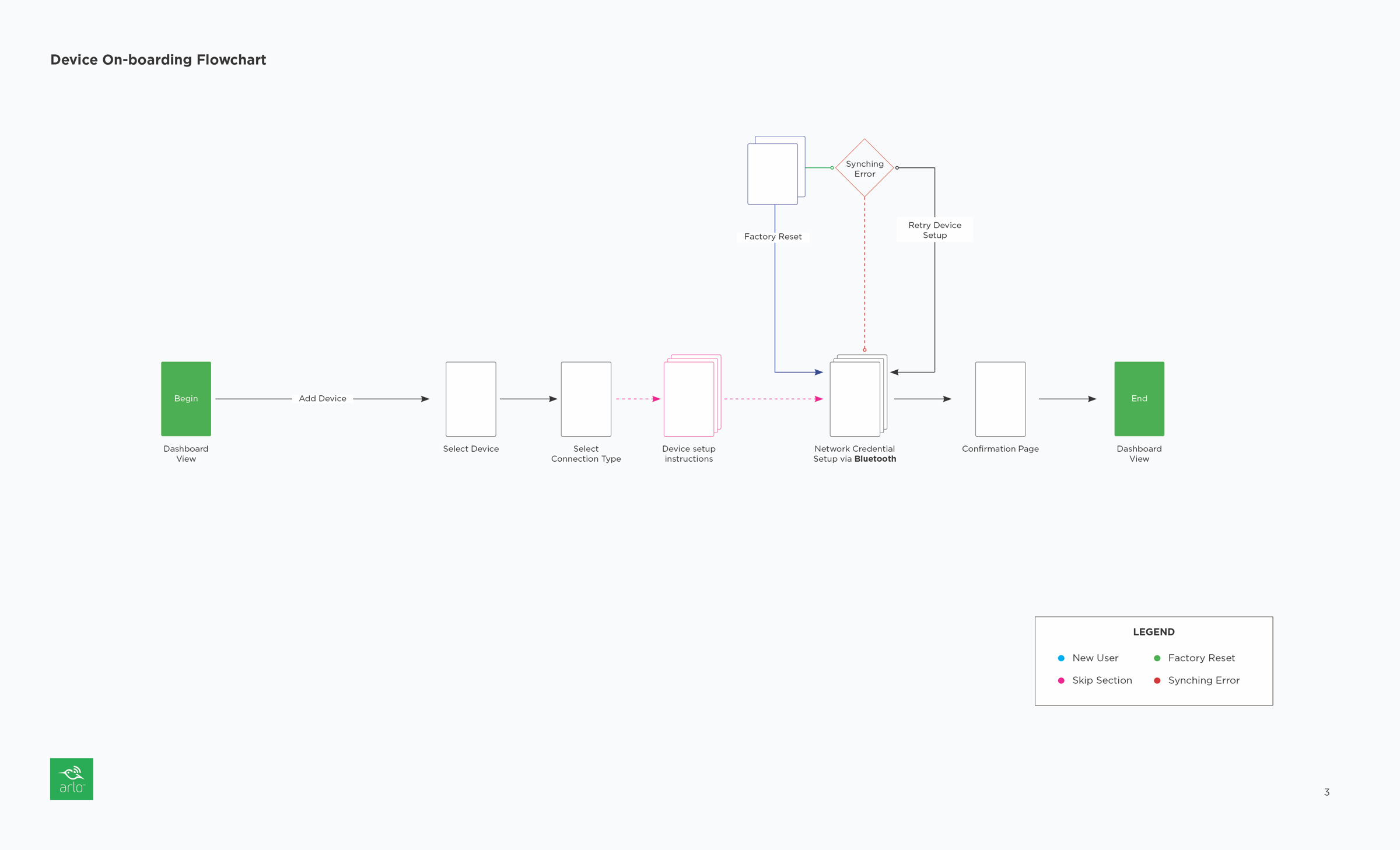
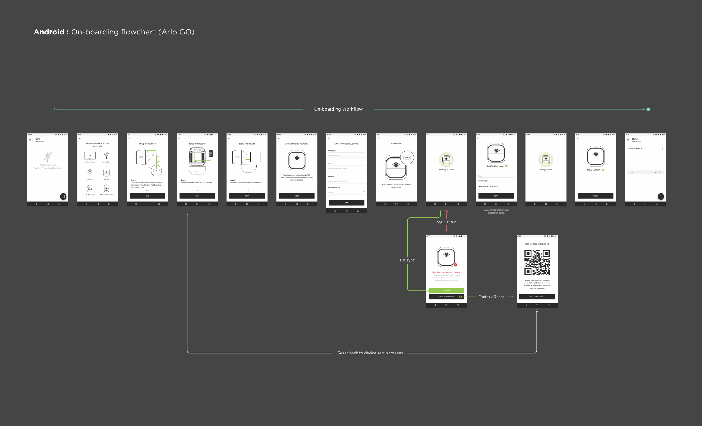
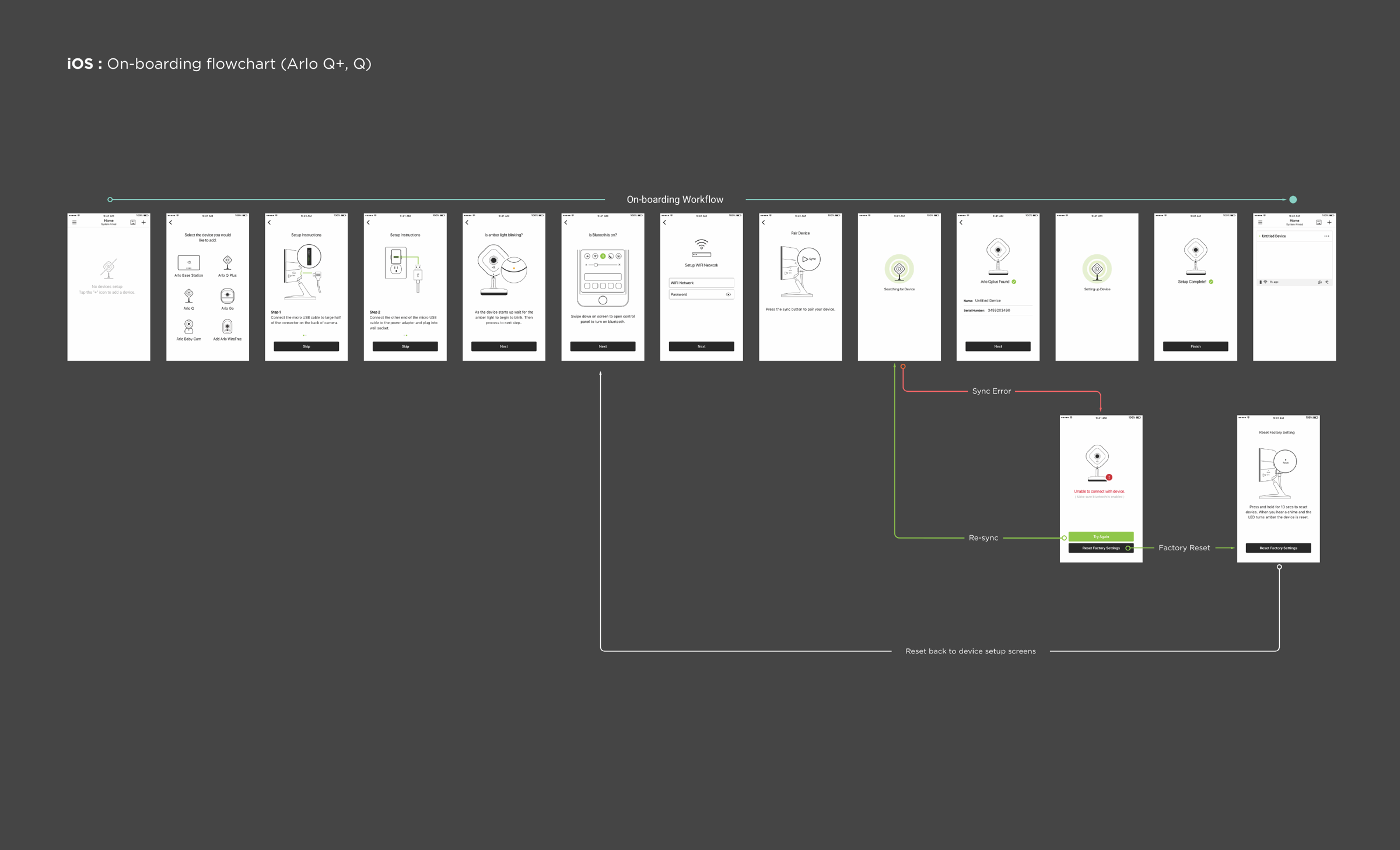
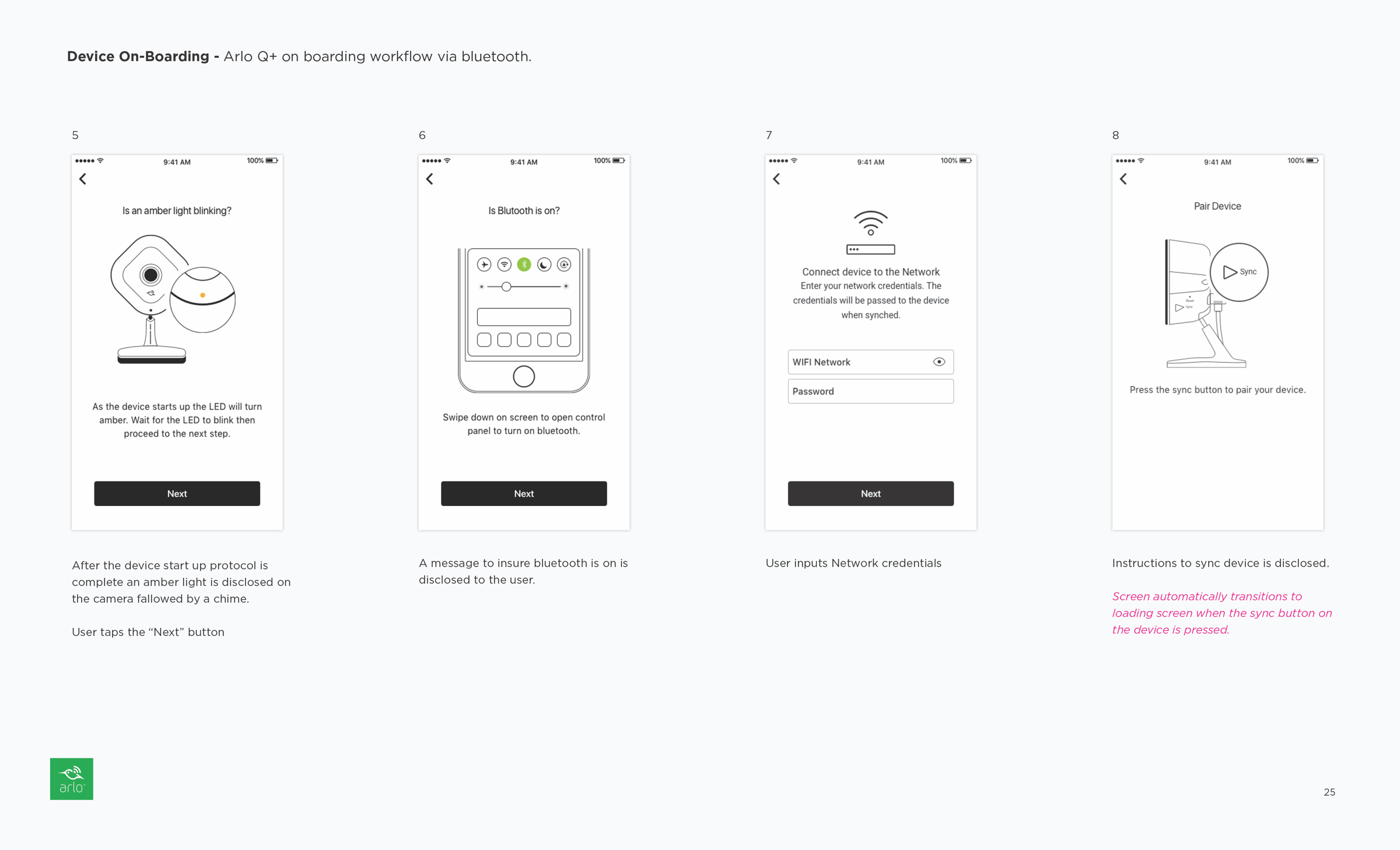
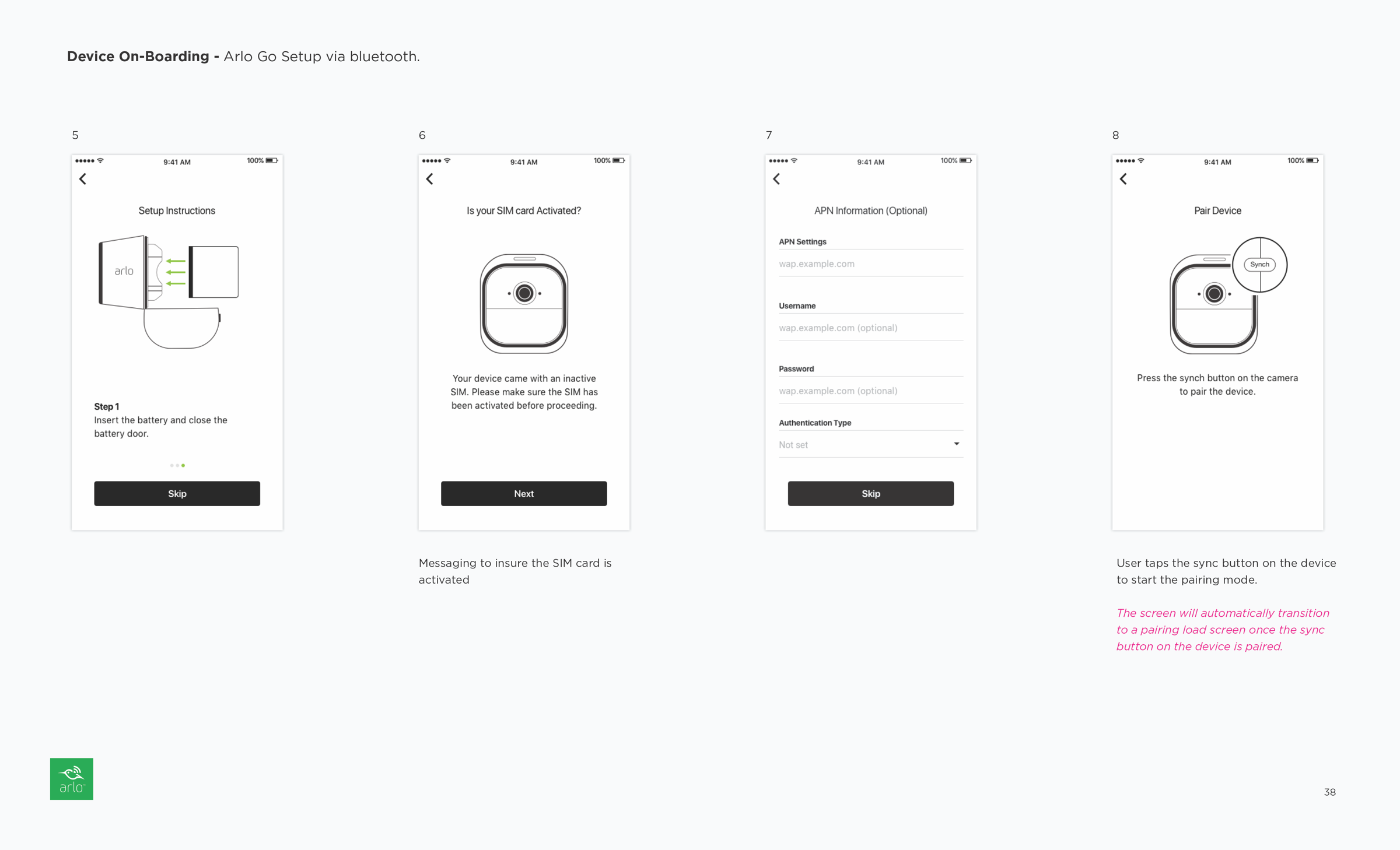
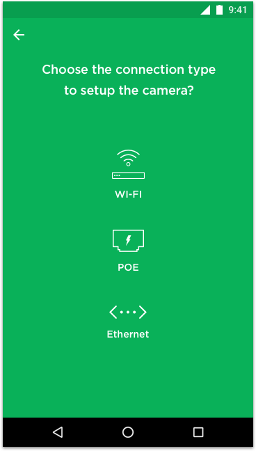
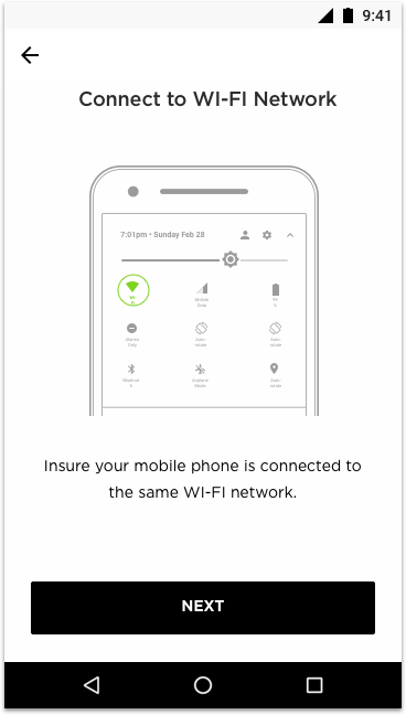
The main goal of the redesign was to streamline the on-boarding experience by implementing BLE (bluetooth low energy) technology. To ensure a seamless transition to BLE, the redesign would be implemented in two phases. The first phase involved optimizing the existing experience and addressing the usability issues uncovered during the device on-boarding evaluation. The second phase would focus on designing the on-boarding experience specifically for BLE, with upcoming and future products using this technology instead of QR code.
Design Objectives
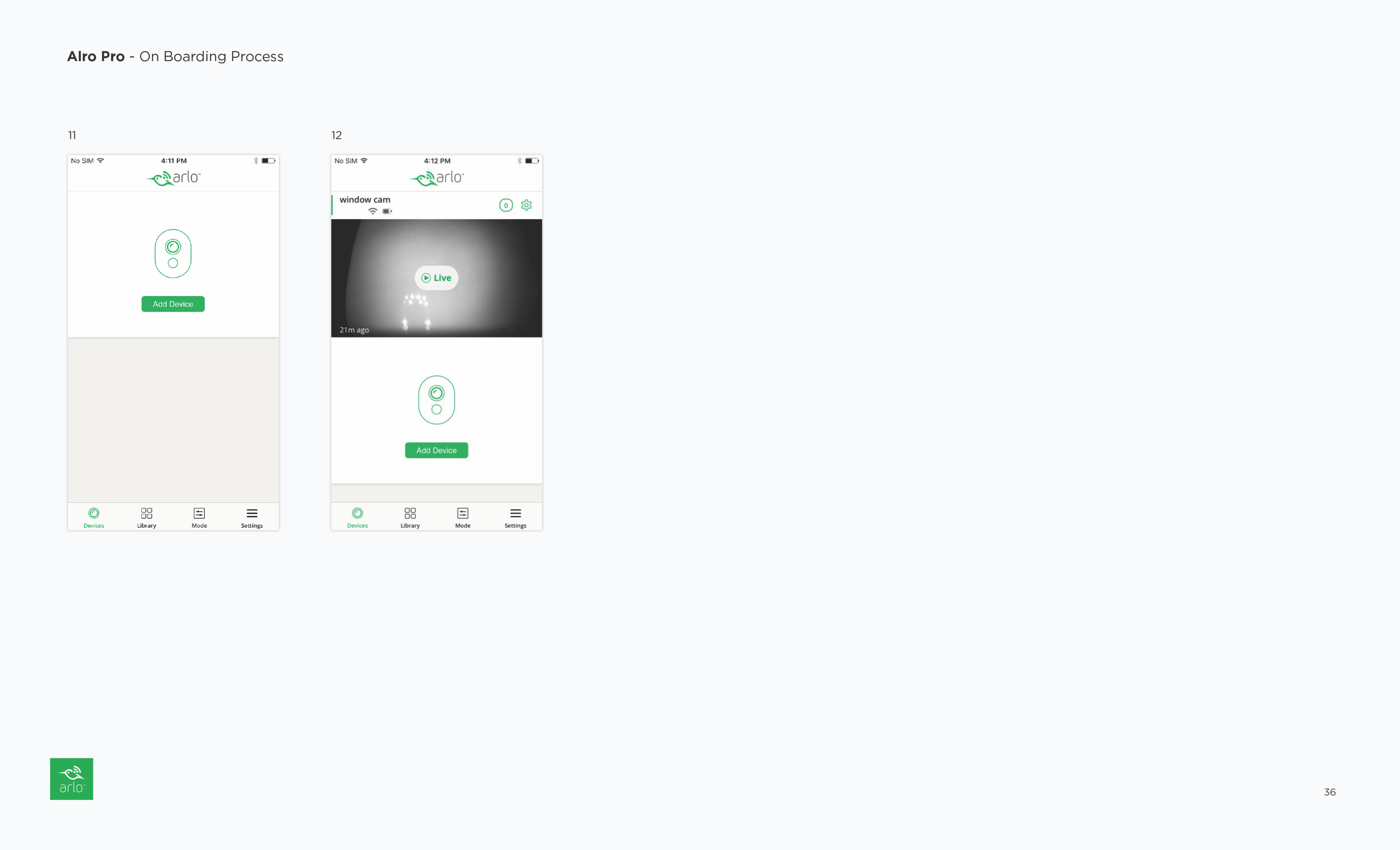
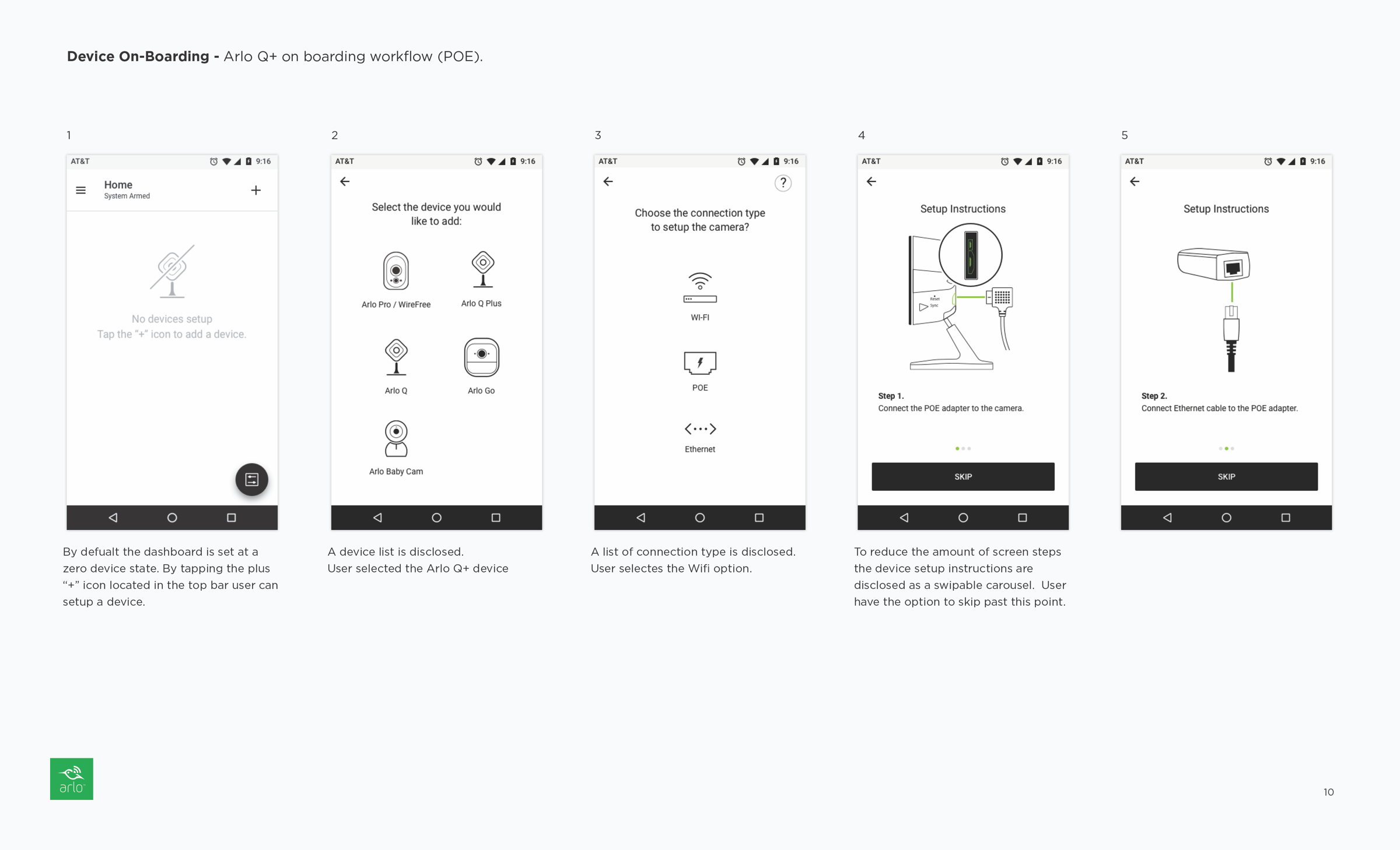
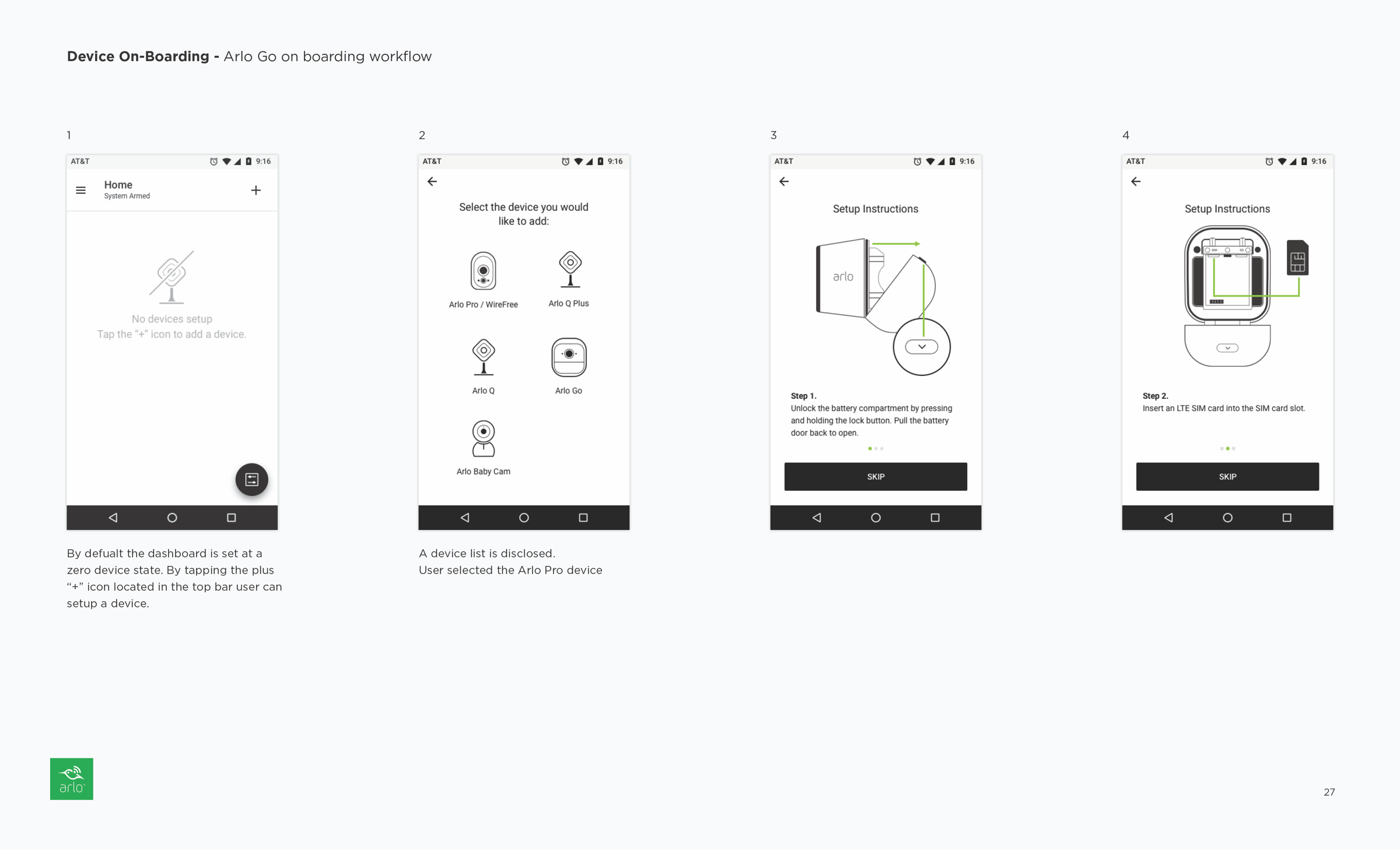
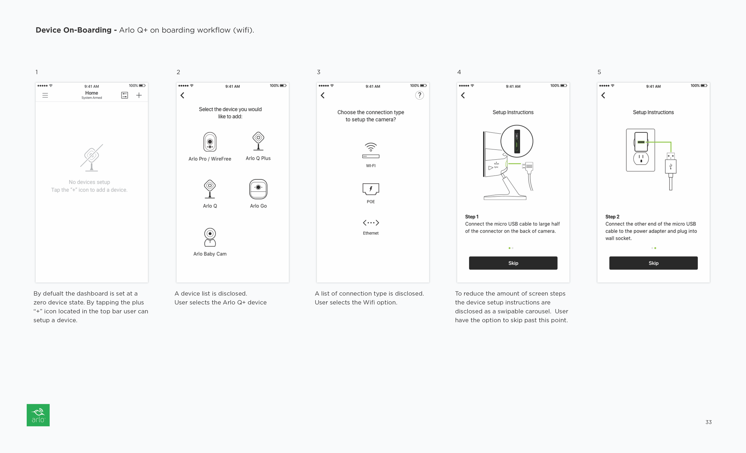
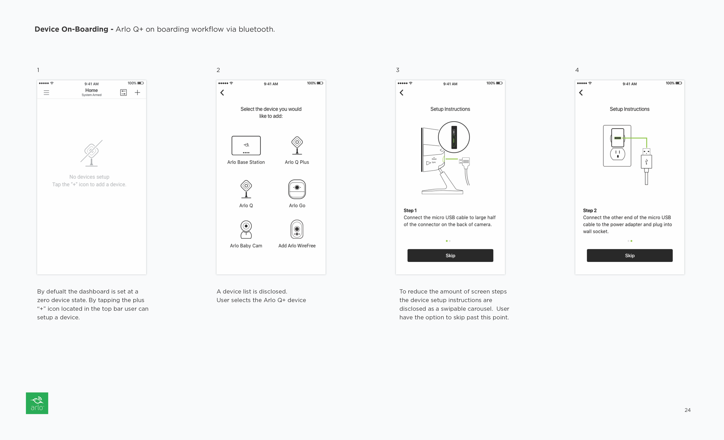
Insure consistent native design for each mobile platform.
The lack of cohesiveness between the native app and the on-boarding experiences was a major pain point. As the on-boarding experience was essentially a responsive website, there was minimal effort made to ensure the screens aligned with iOS or Android visual design and patterns. Therefore, it was crucial to build the on-boarding process natively to ensure optimal performance and consistency.
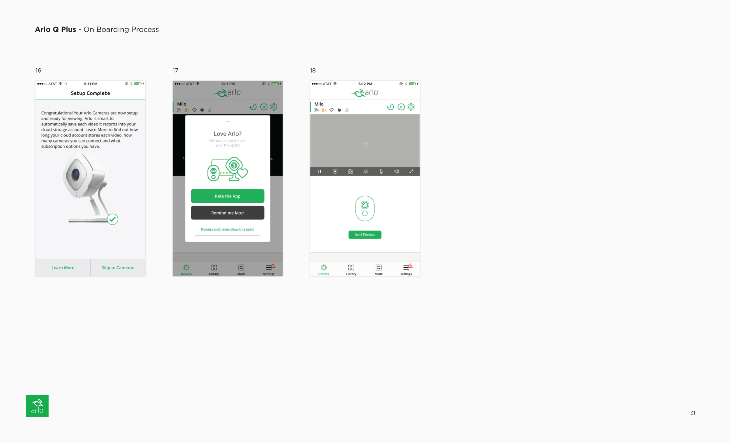
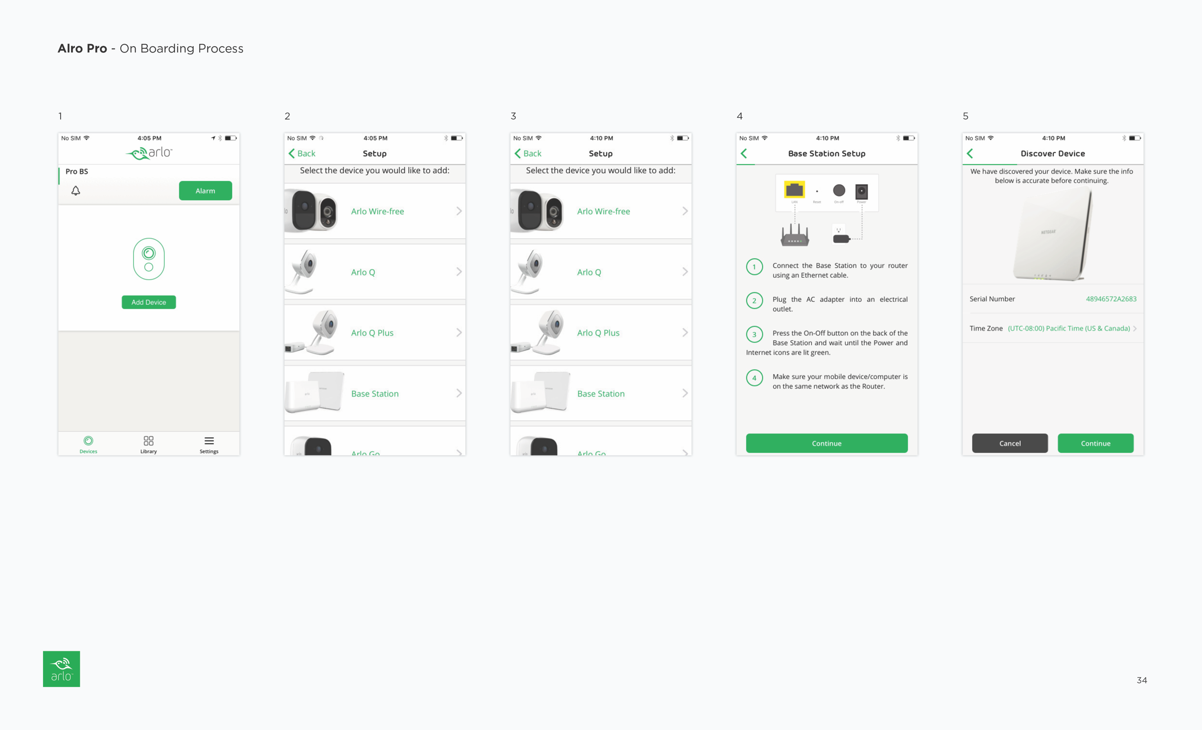
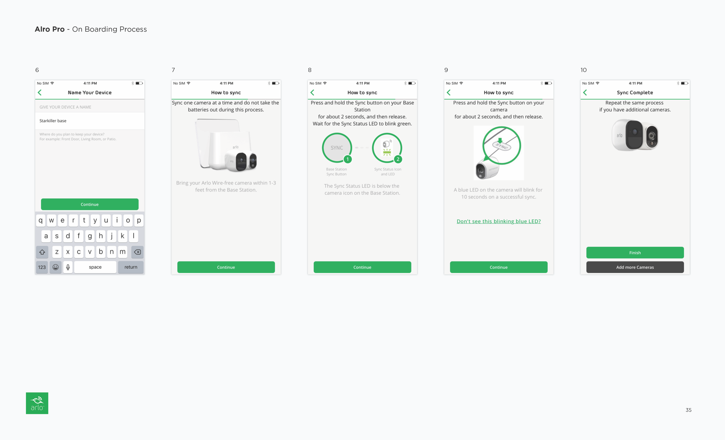
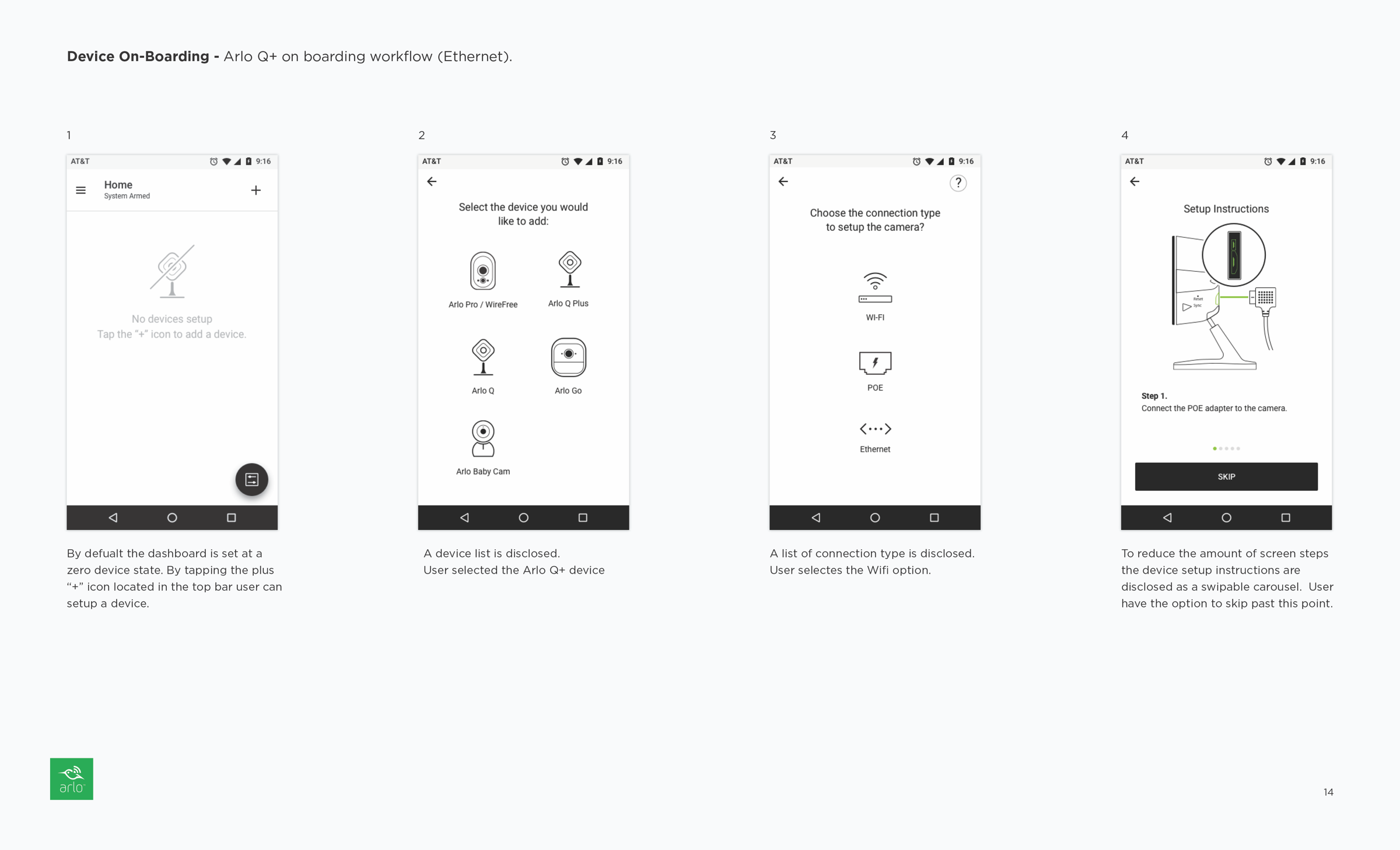
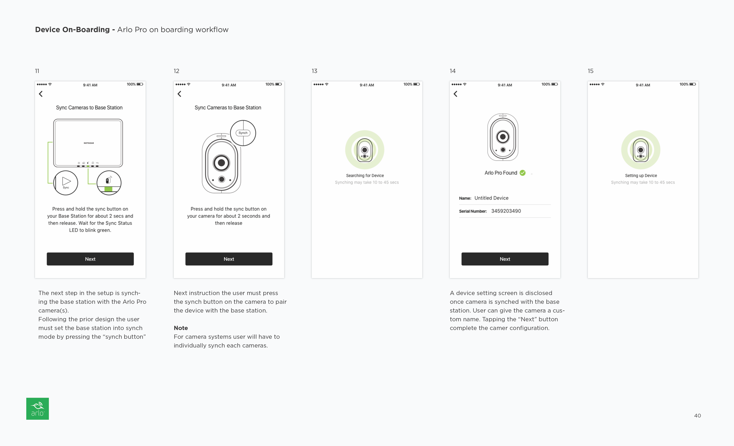
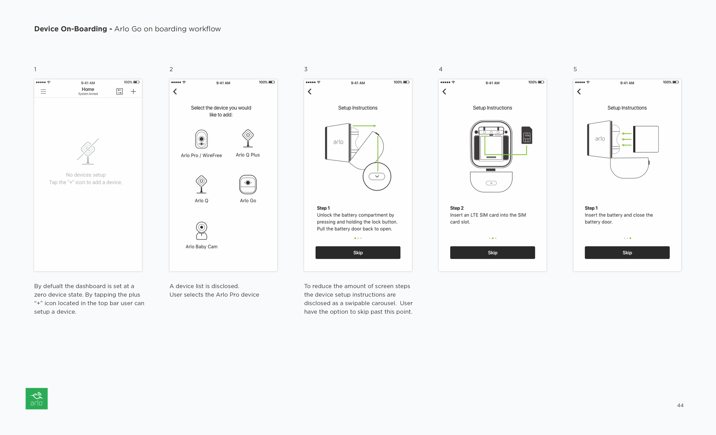
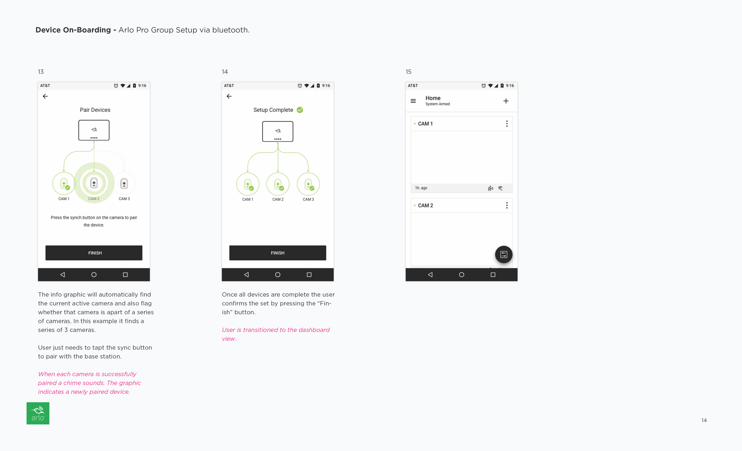
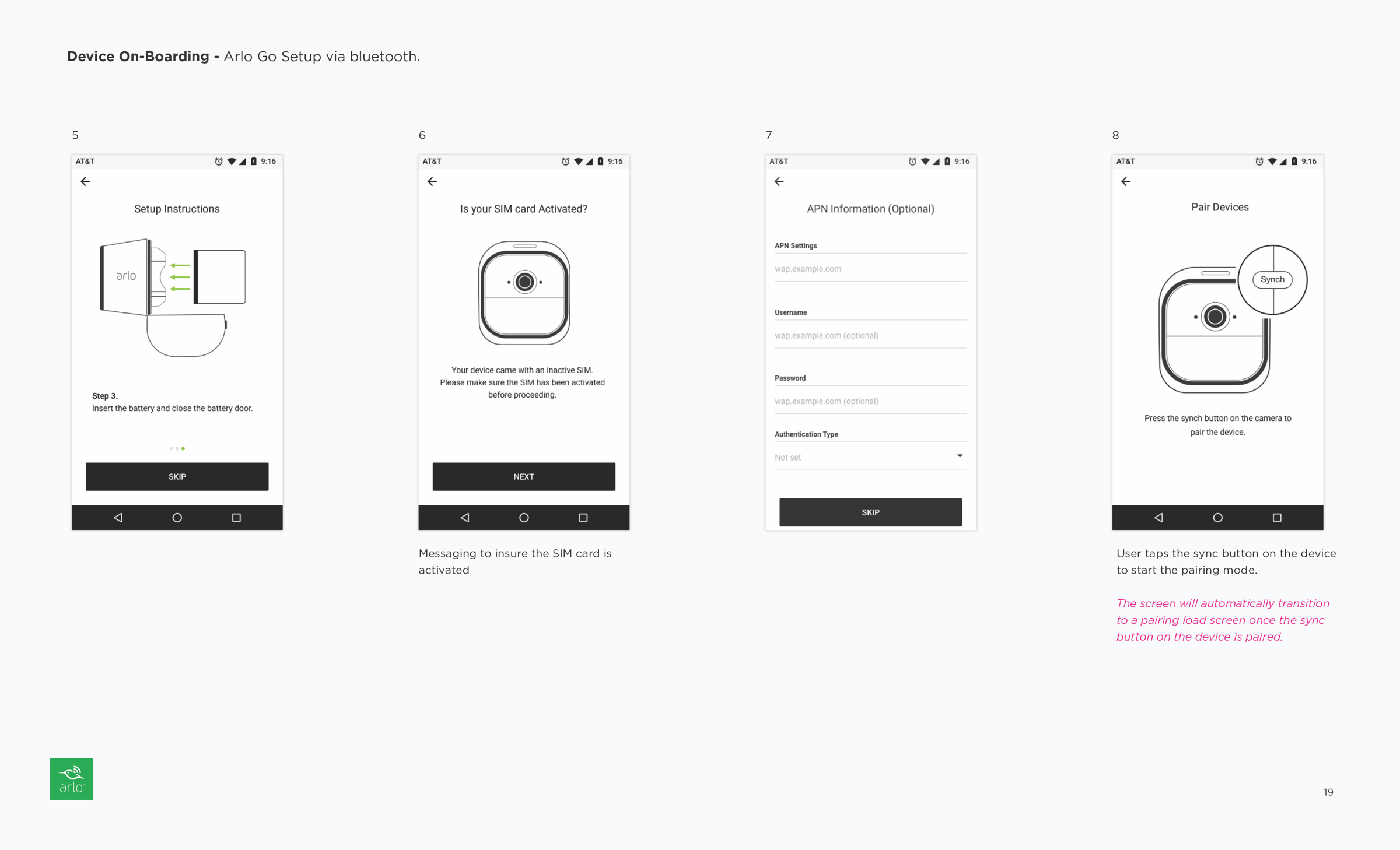
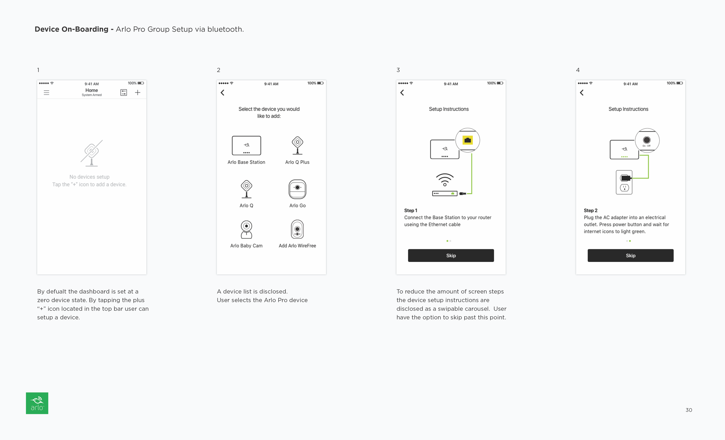
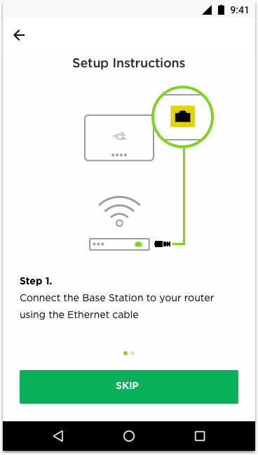
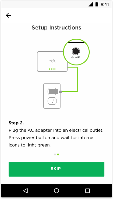
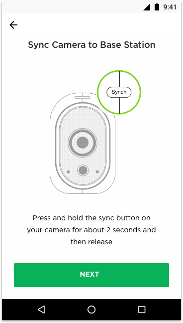
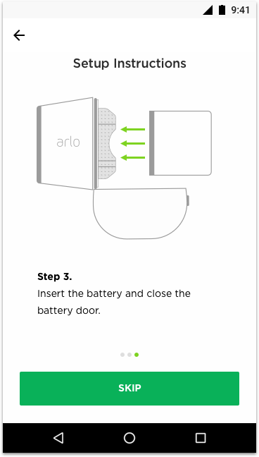
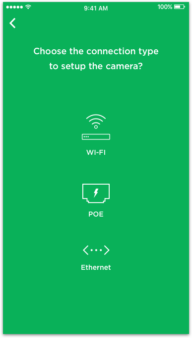
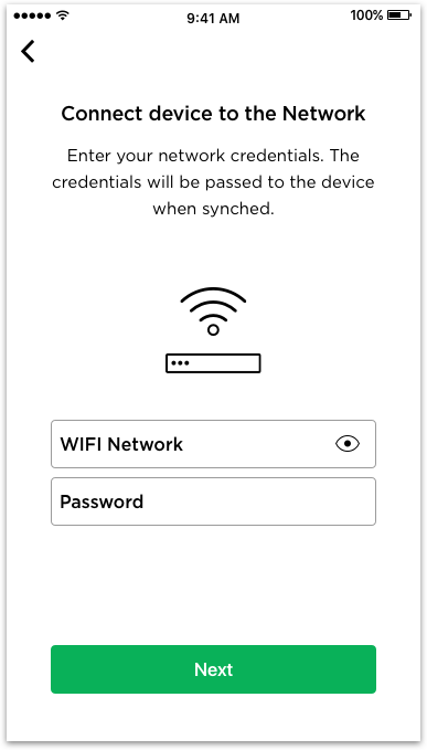
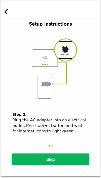
Simplify experience by extending steps, clarify messaging via Illustrations.
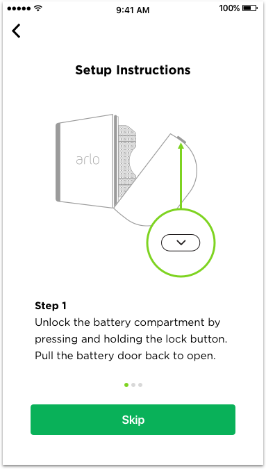
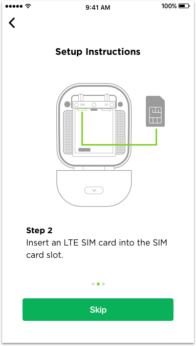
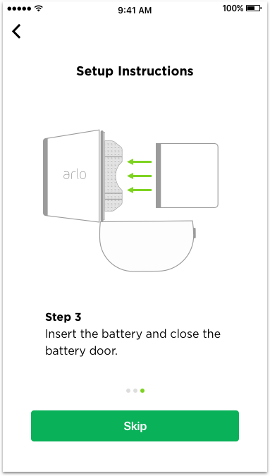
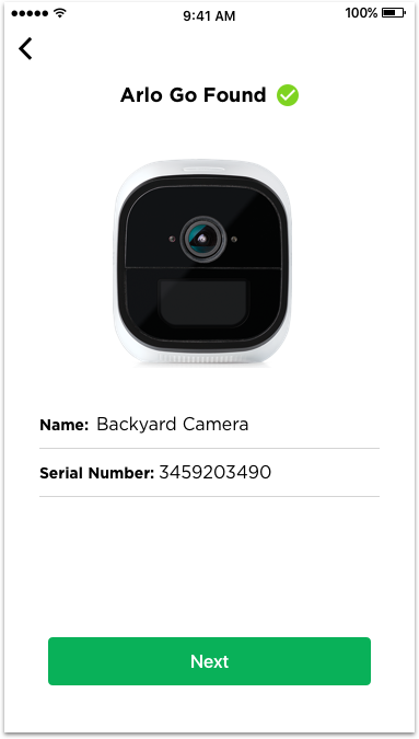
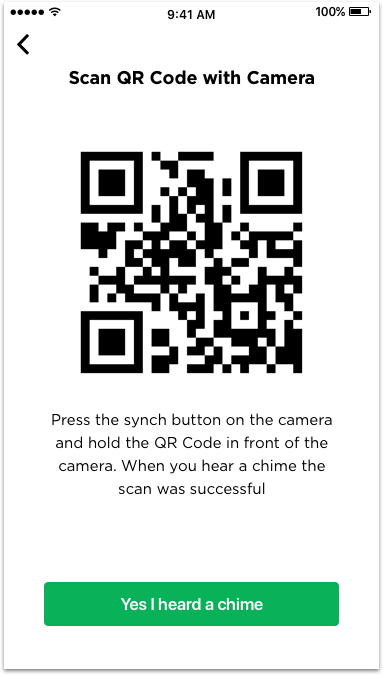
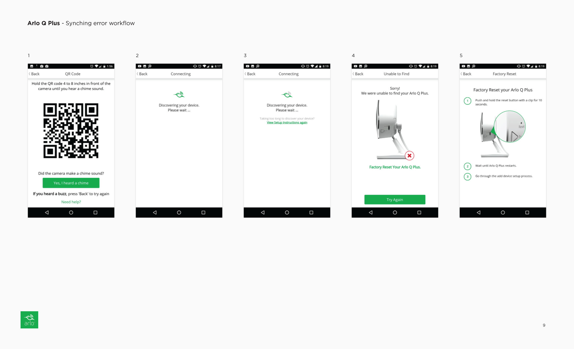
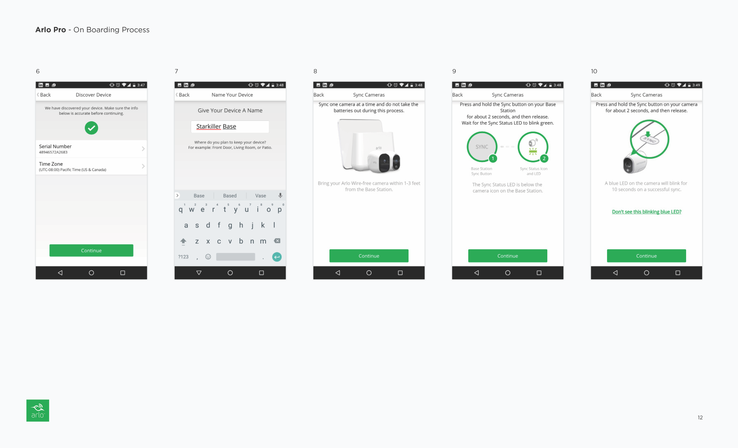
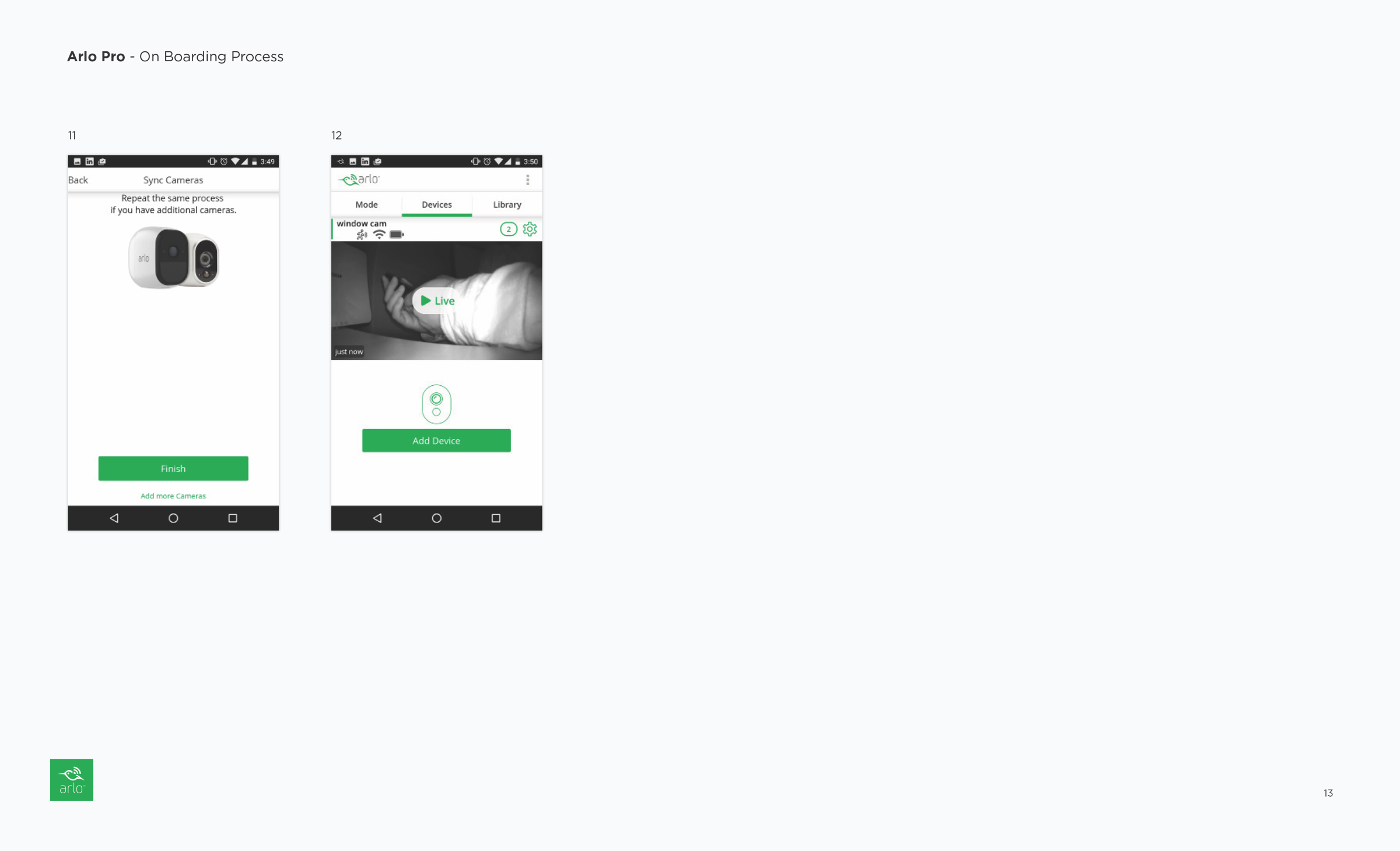
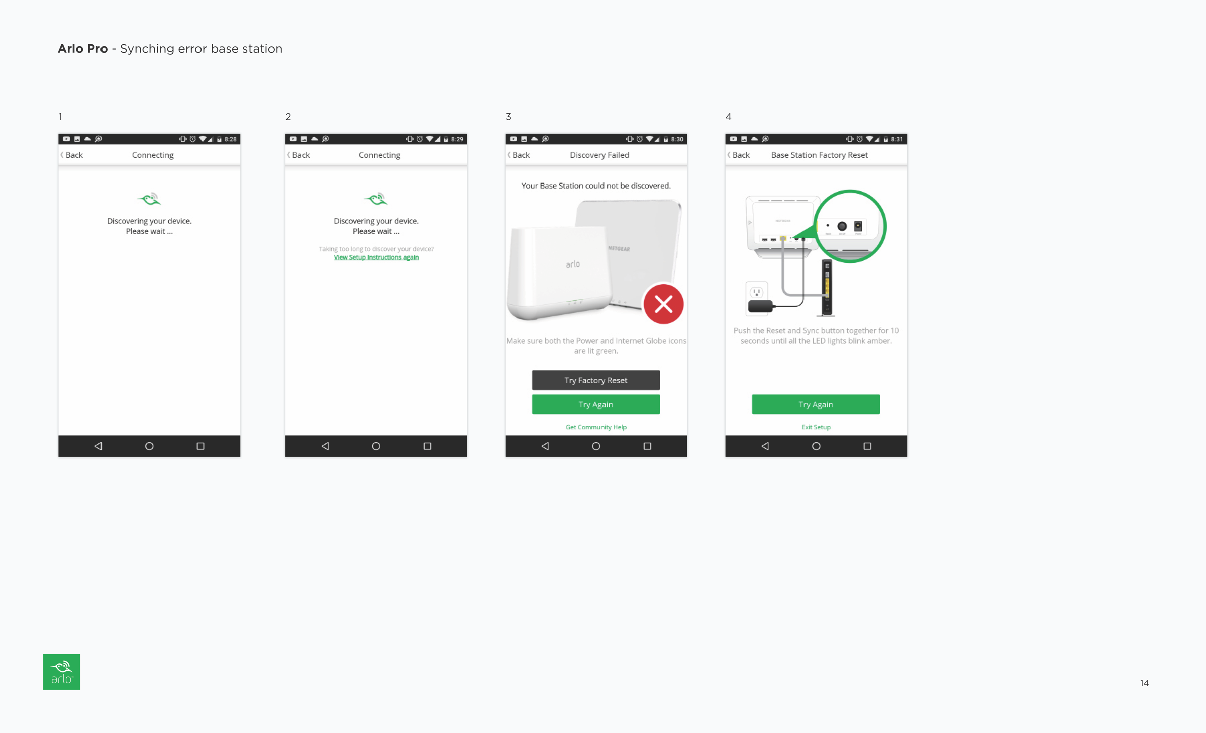
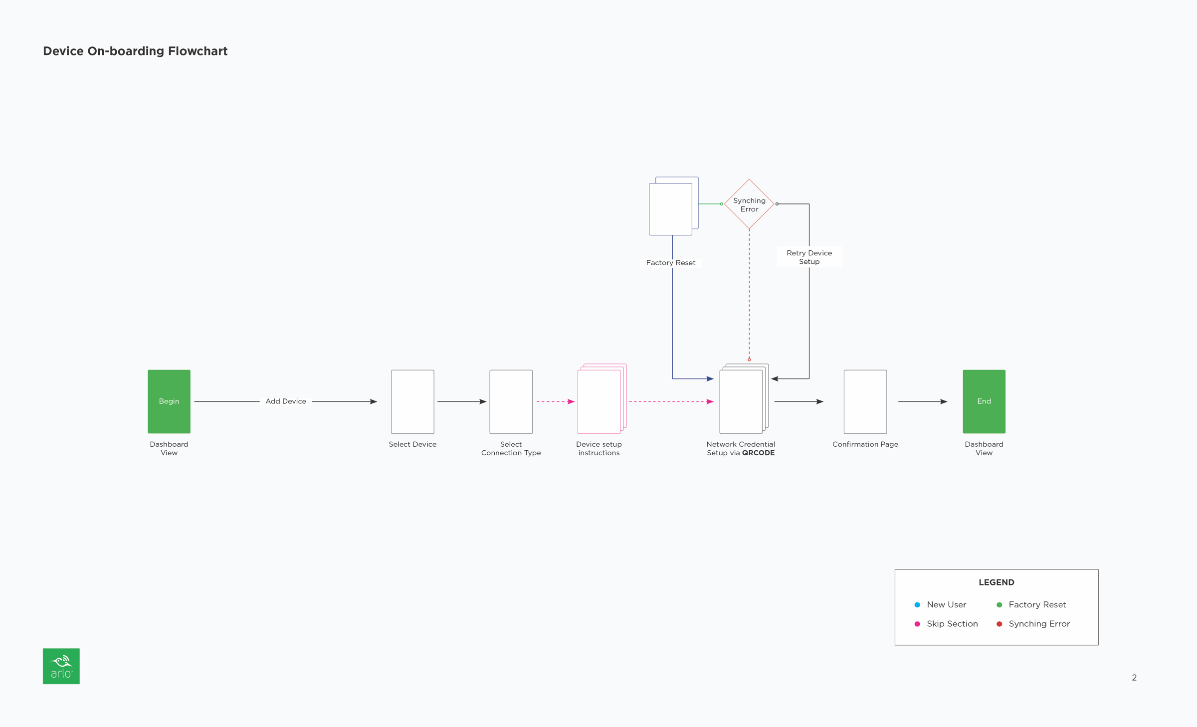
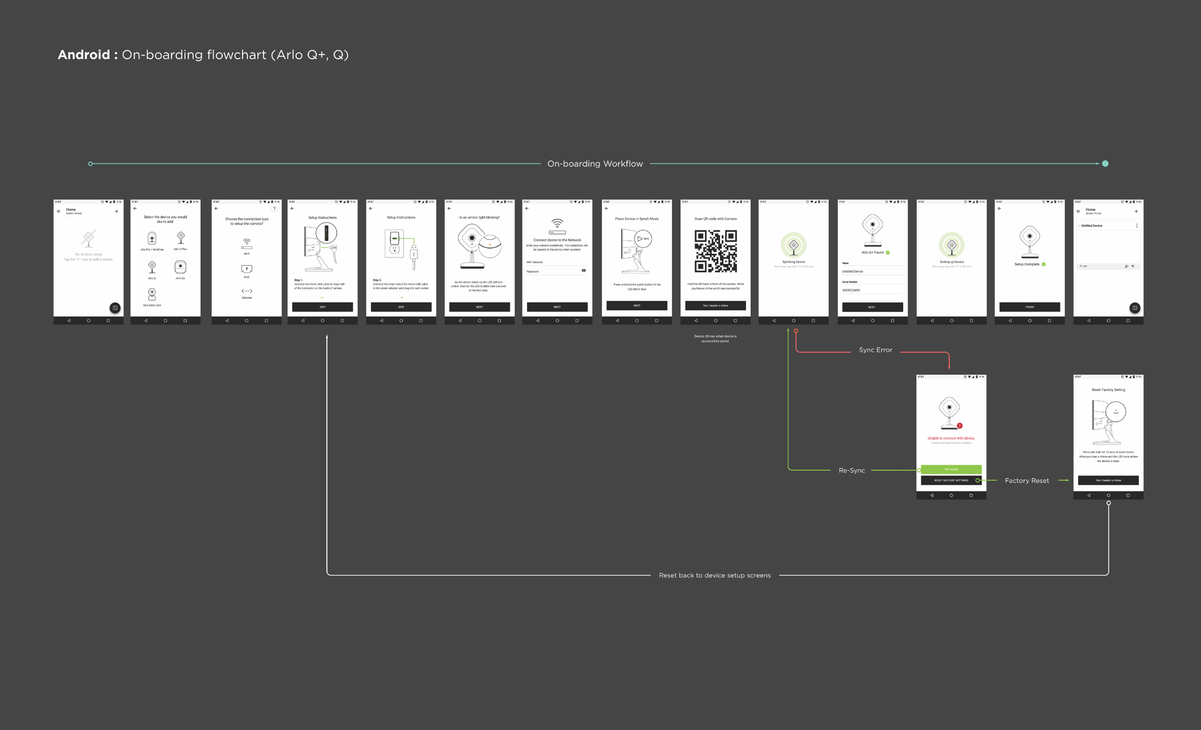
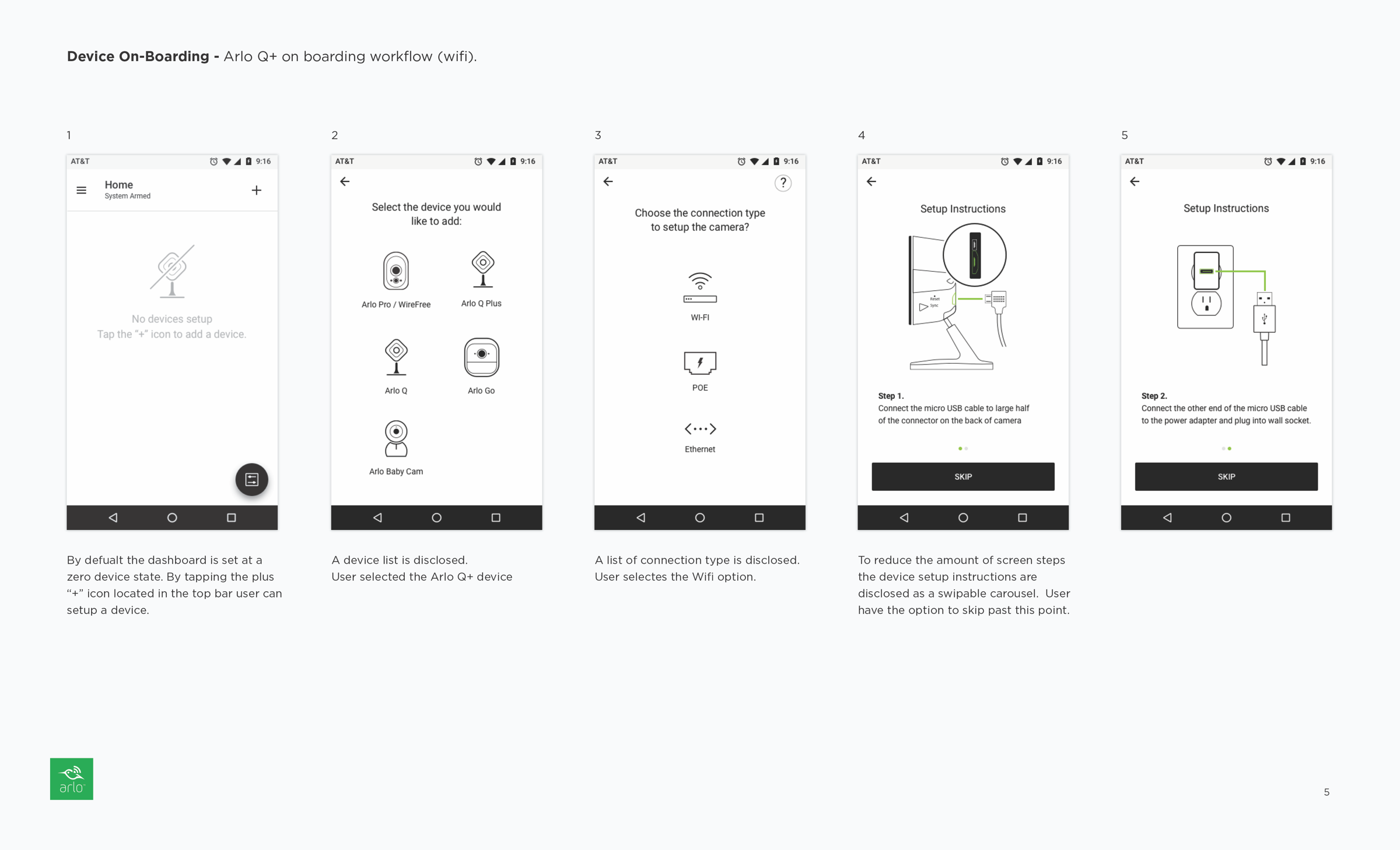
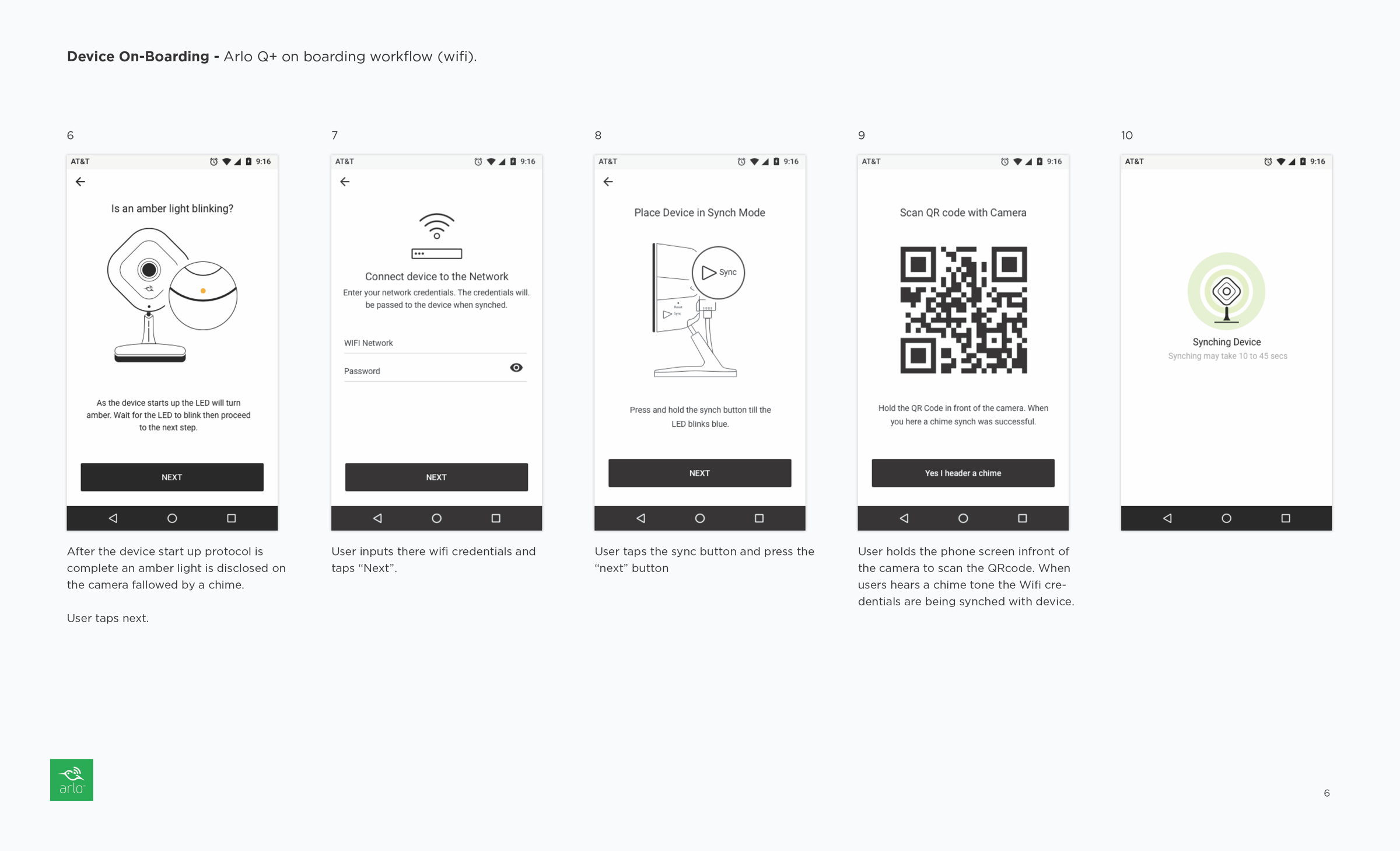
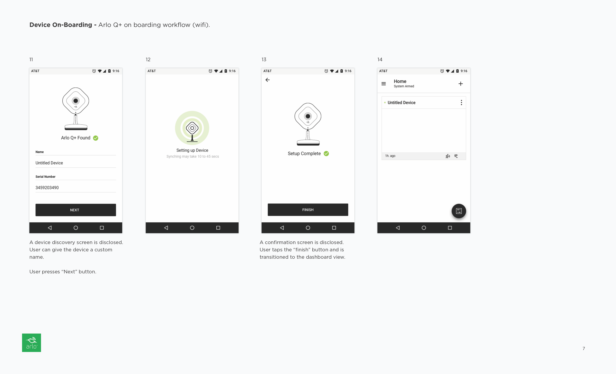
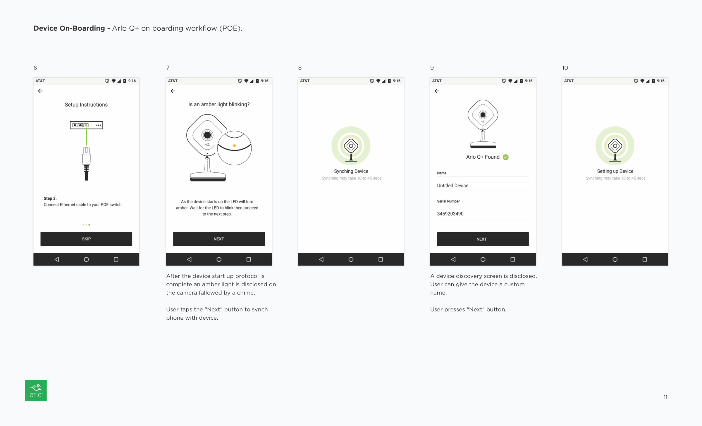
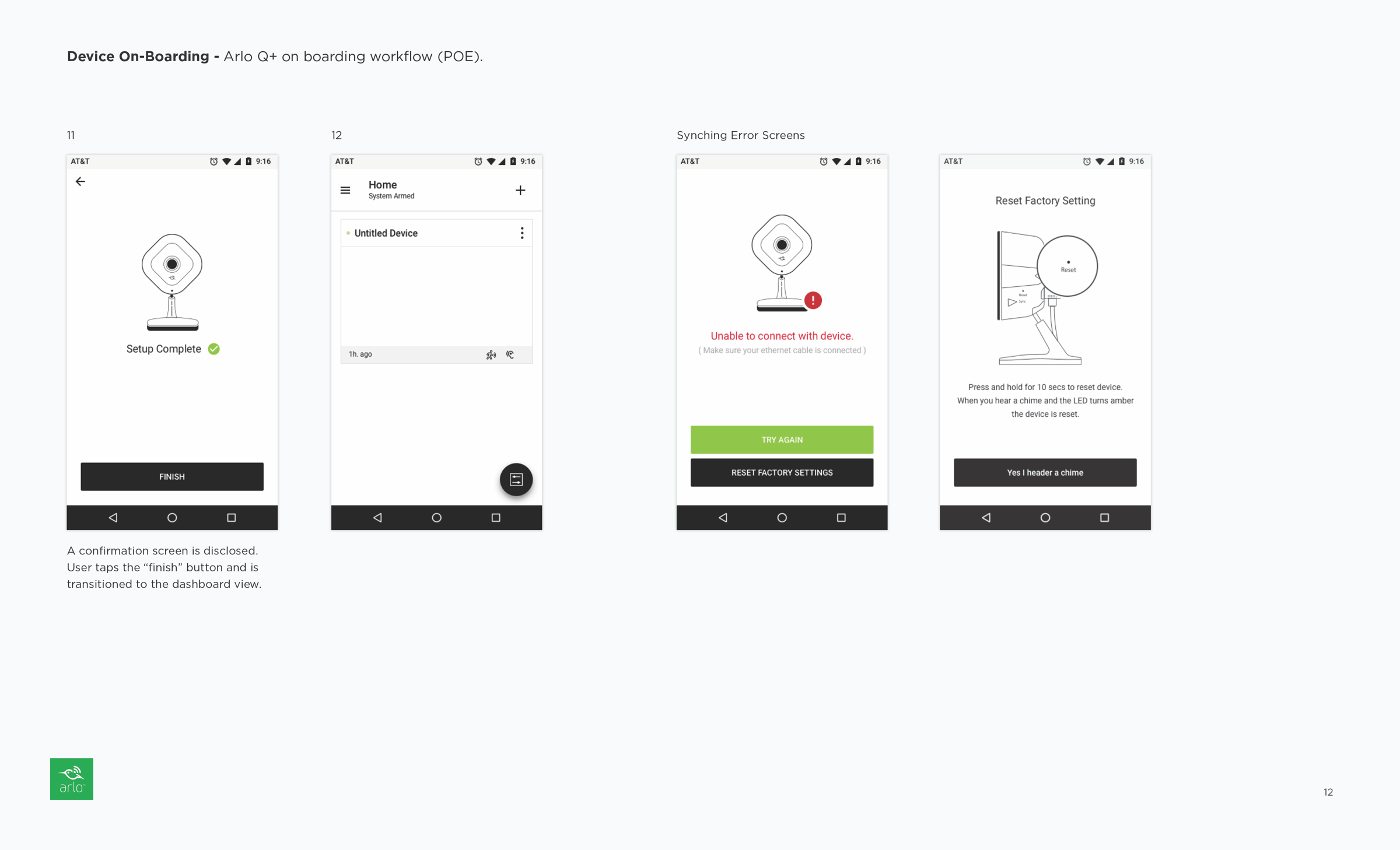
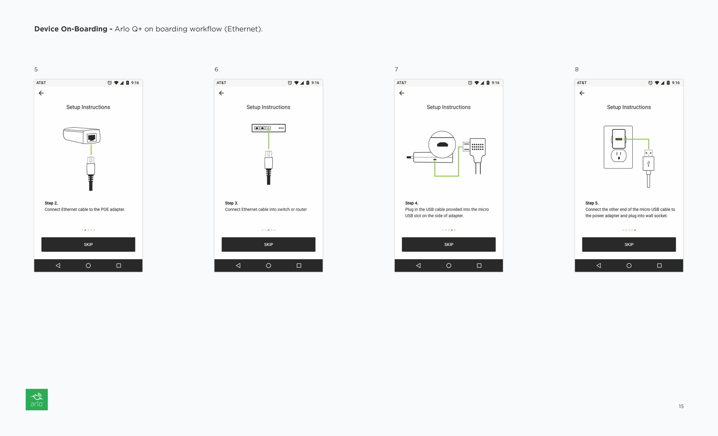
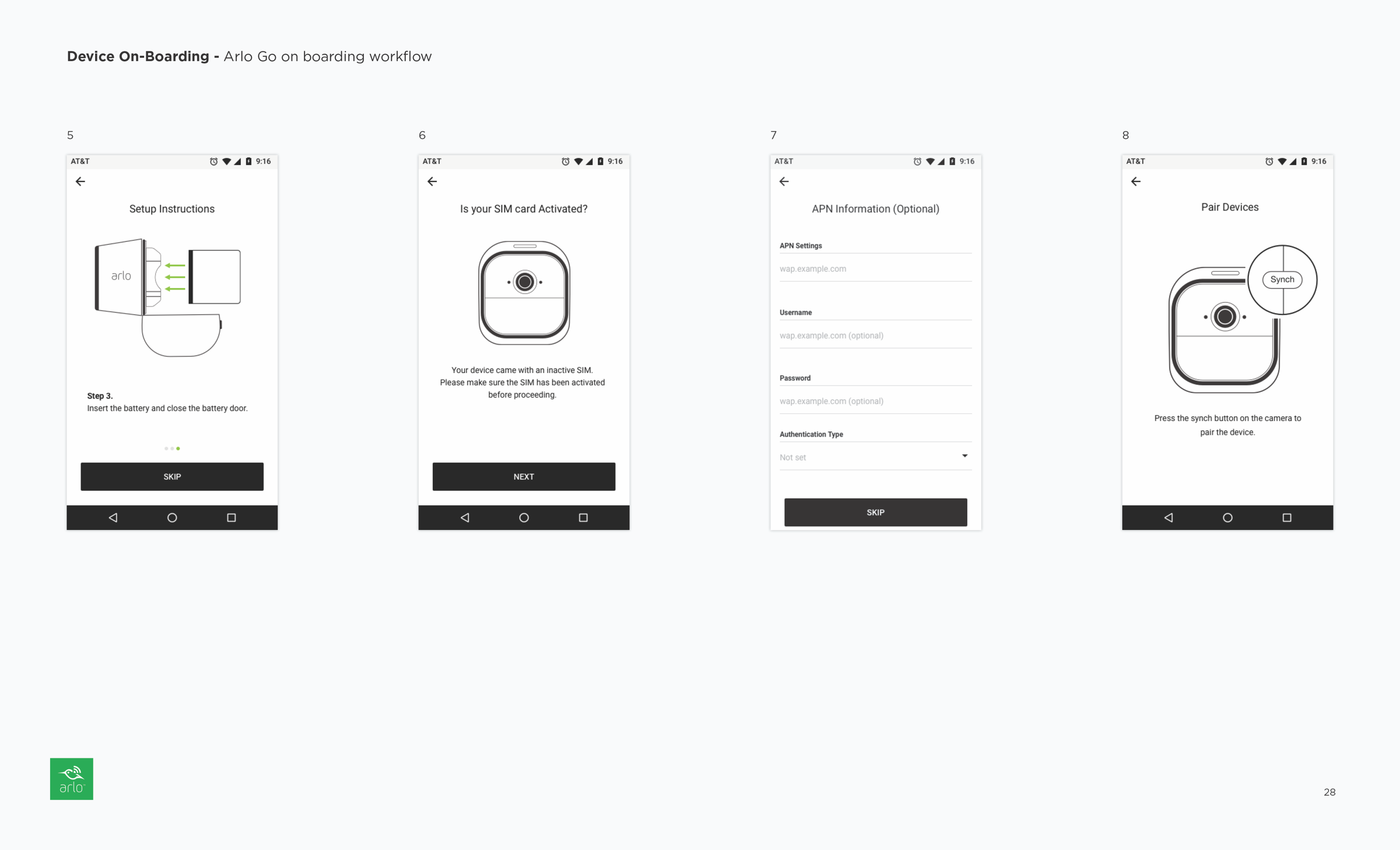
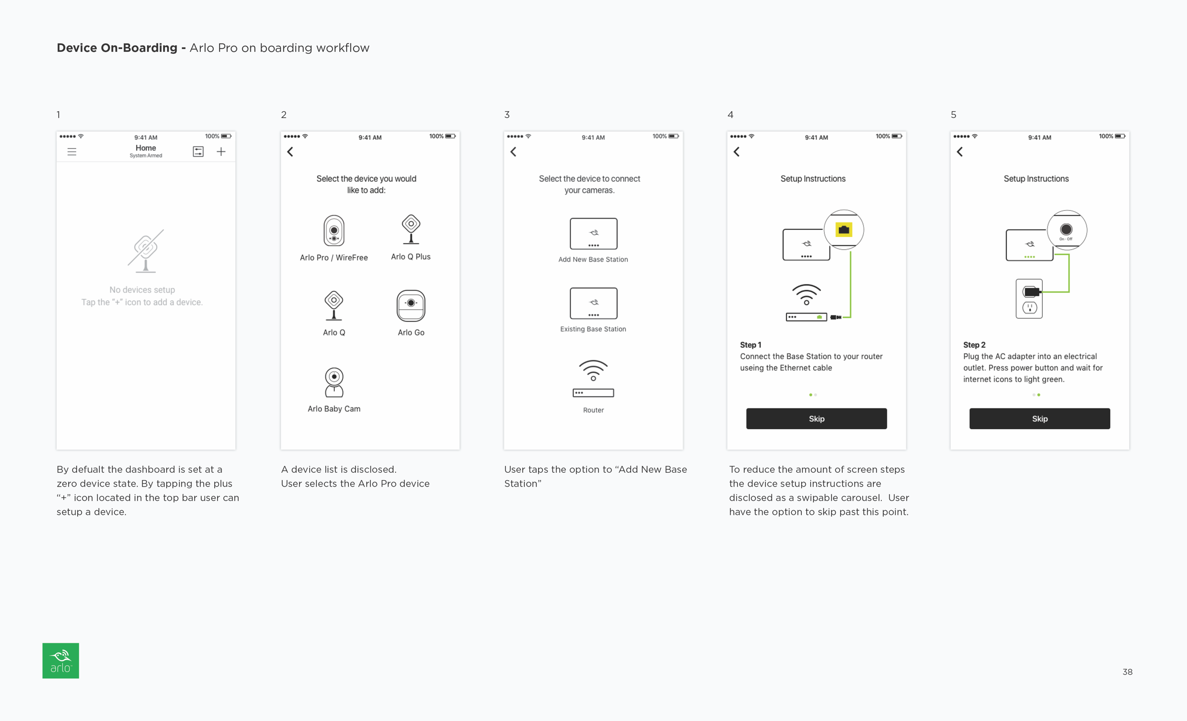
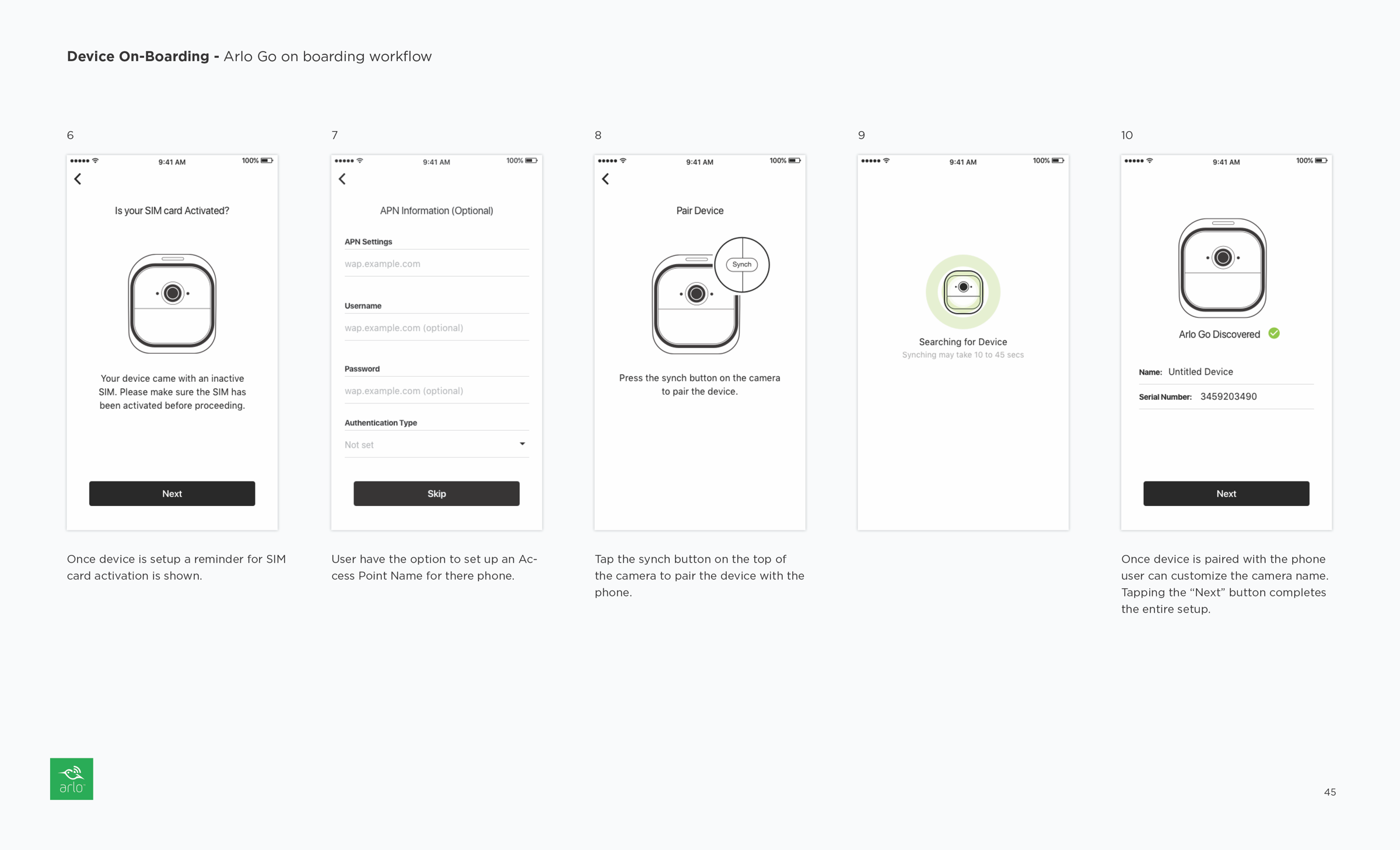
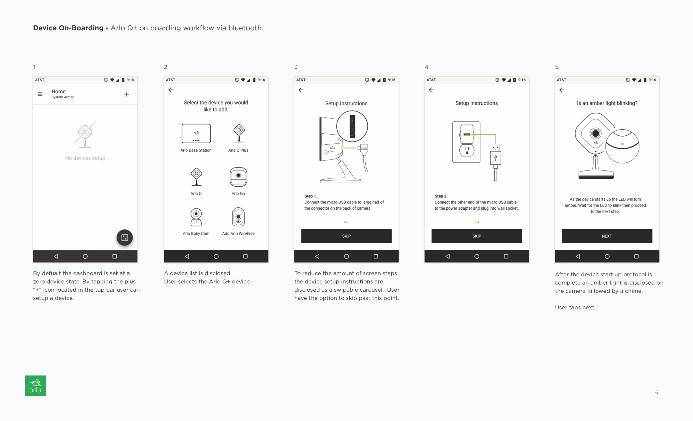
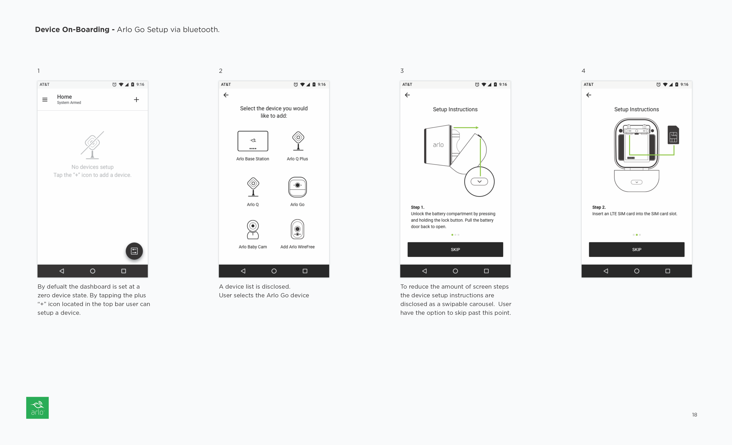
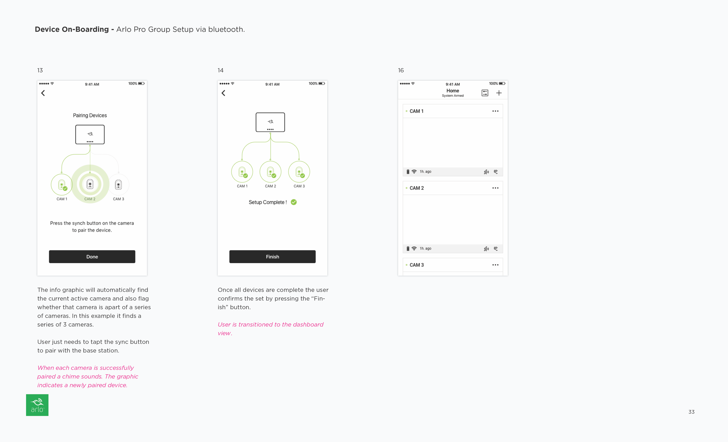
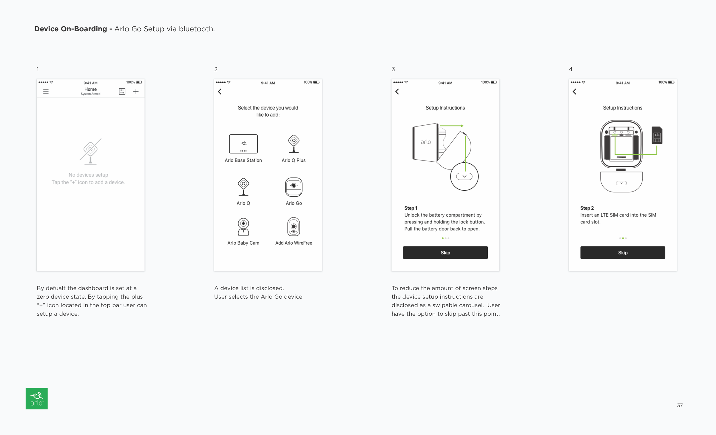
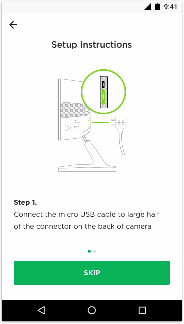
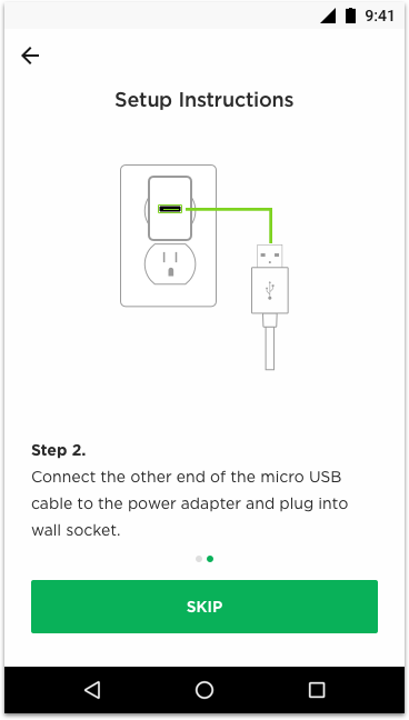
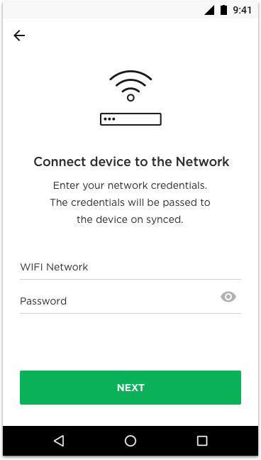
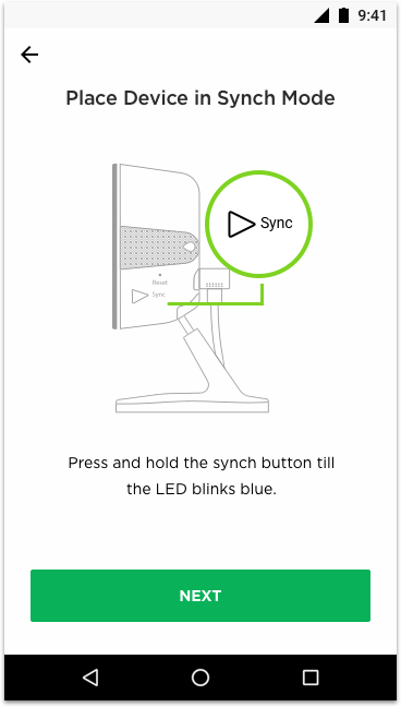
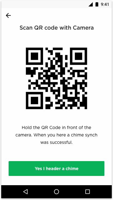
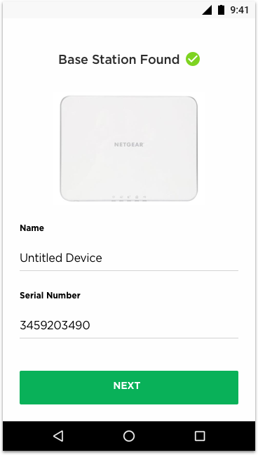
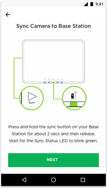
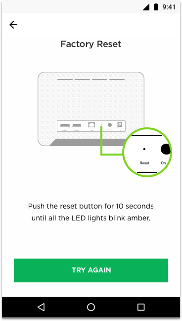
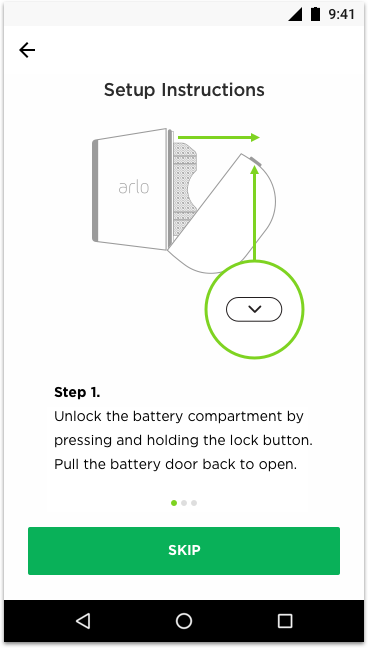
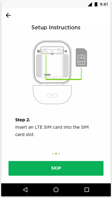
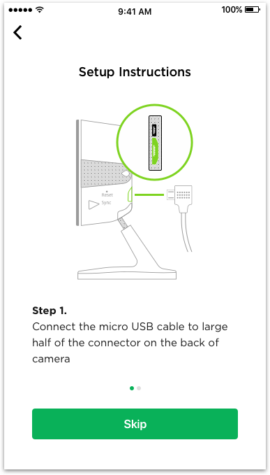
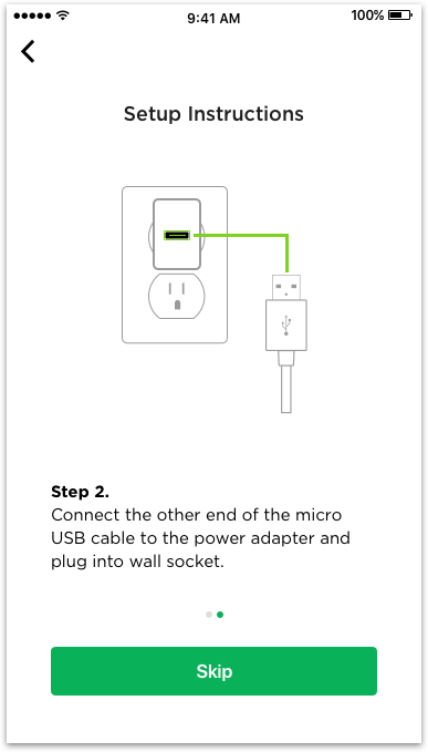
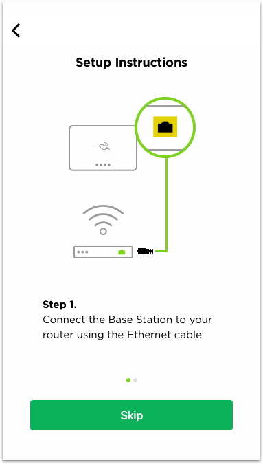
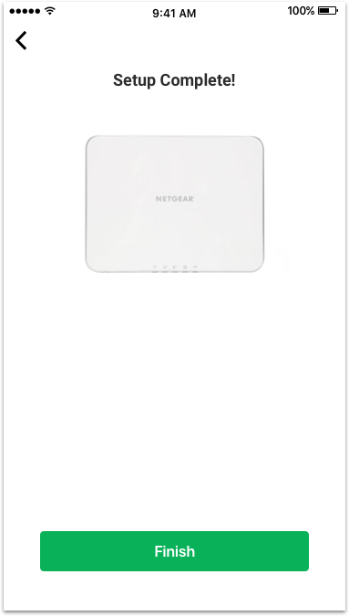
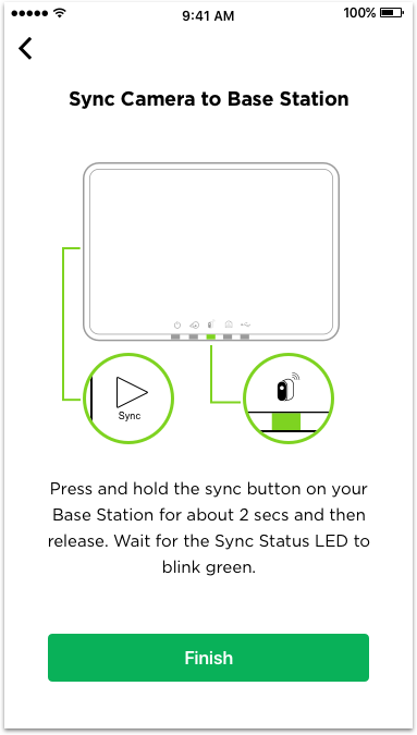
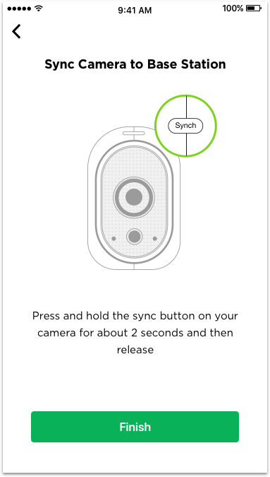
The existing on-boarding experience was plagued by unclear instructions and confusing product composites that competed with the accompanying copy. The photo composites created visual noise and tension on the screens. To address these issues, the redesign extended the device setup instructions to ensure all relevant steps were included for maximum clarity. Messaging was rewritten to be concise and actionable, and photo composites were replaced with flat illustrations that complemented the copy without competing with it. Device instructions were presented in a carousel format with an option to skip, allowing return users to bypass this step while still providing easy access to instructions in case the printed manual was lost.
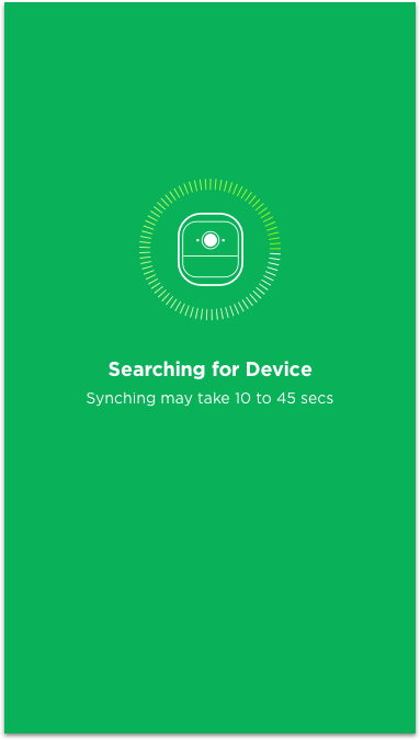
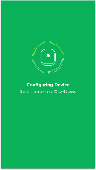
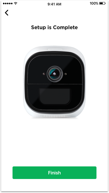
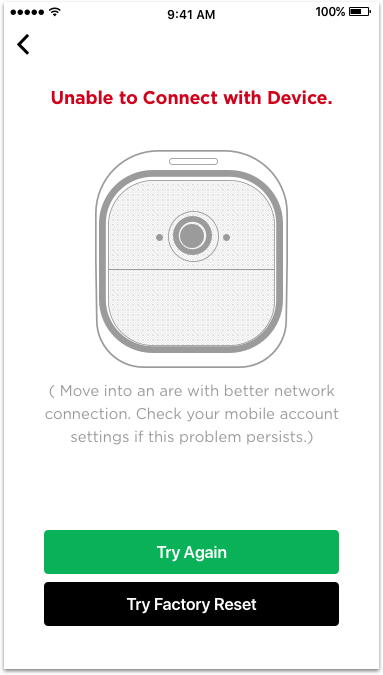
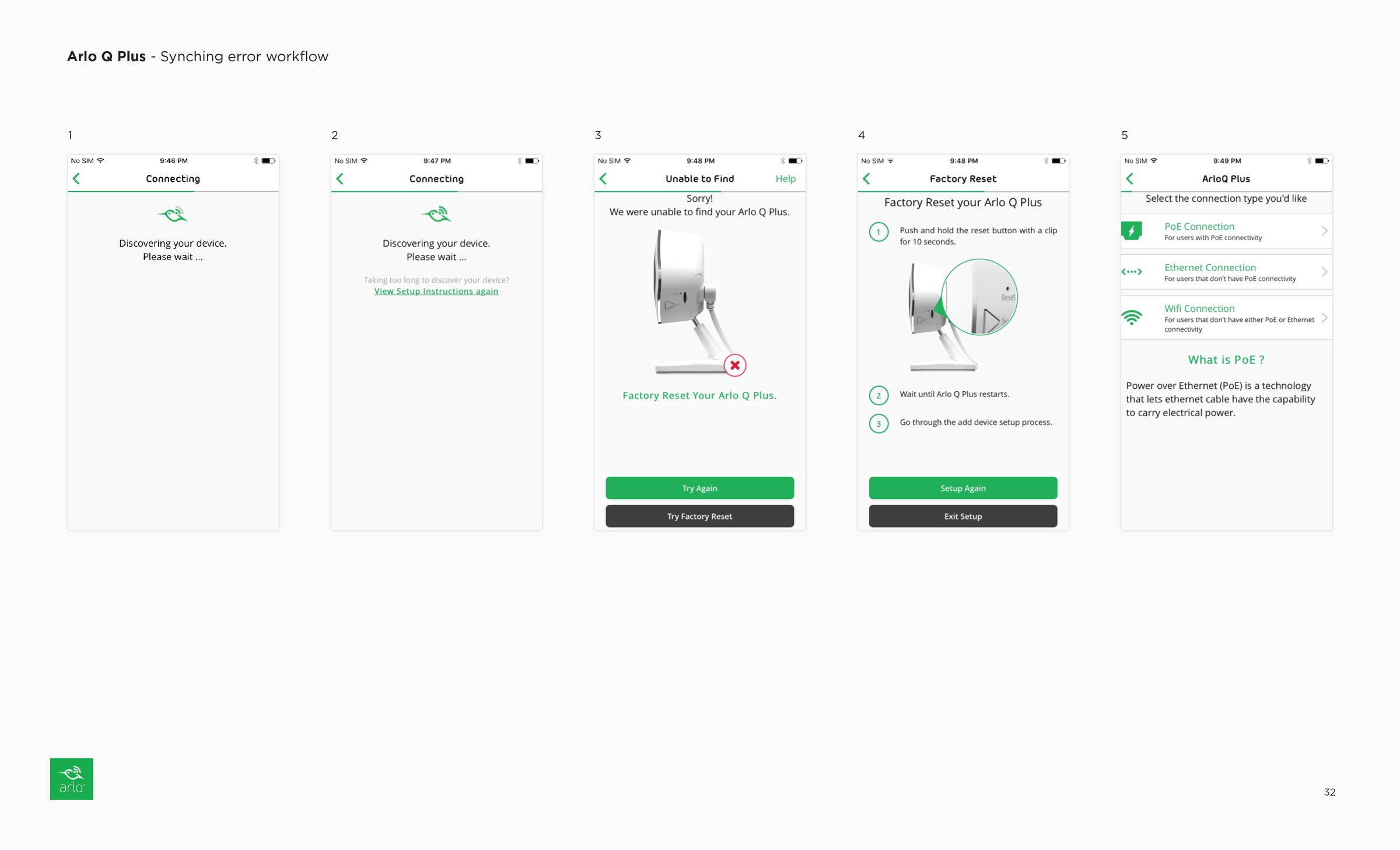
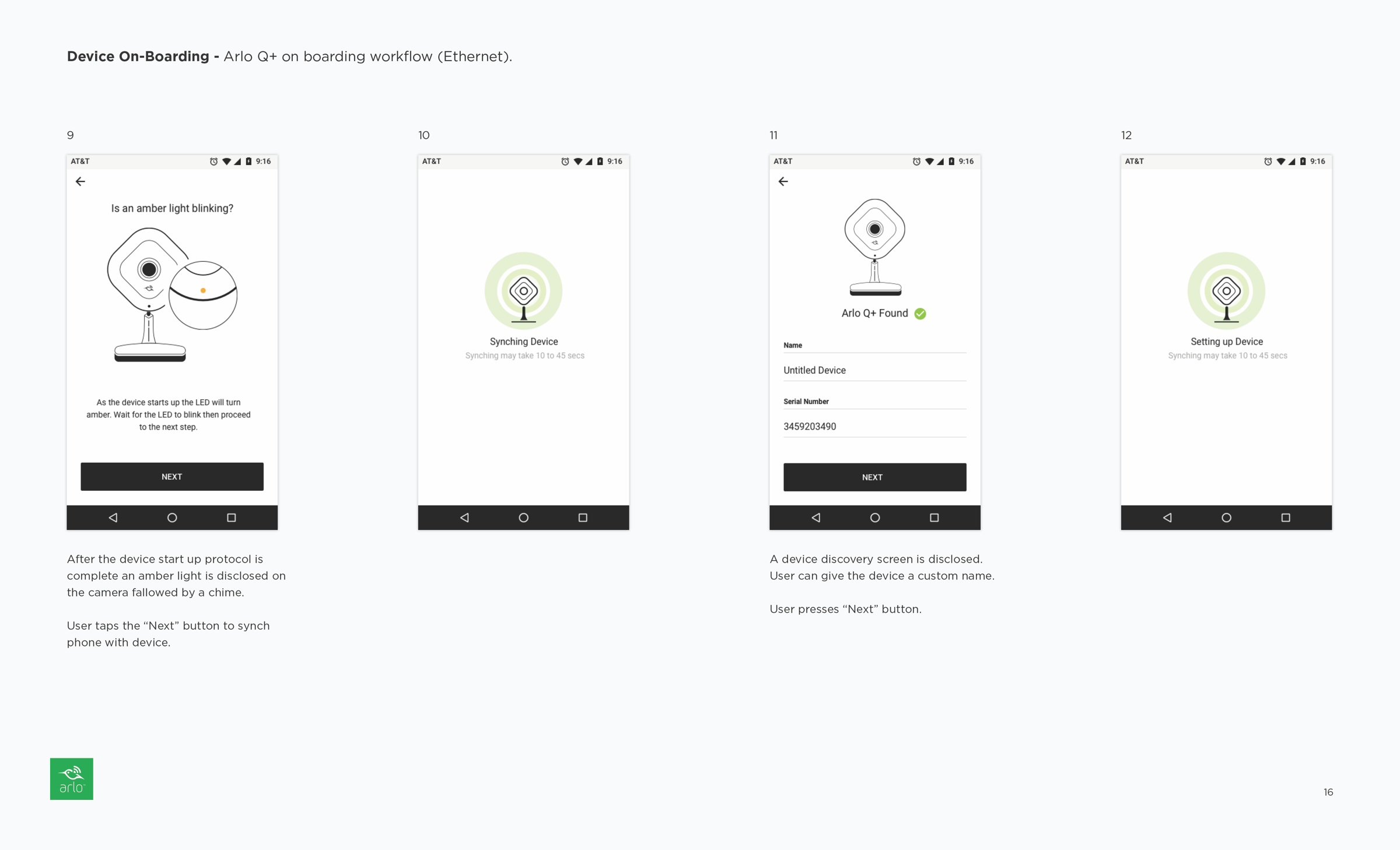
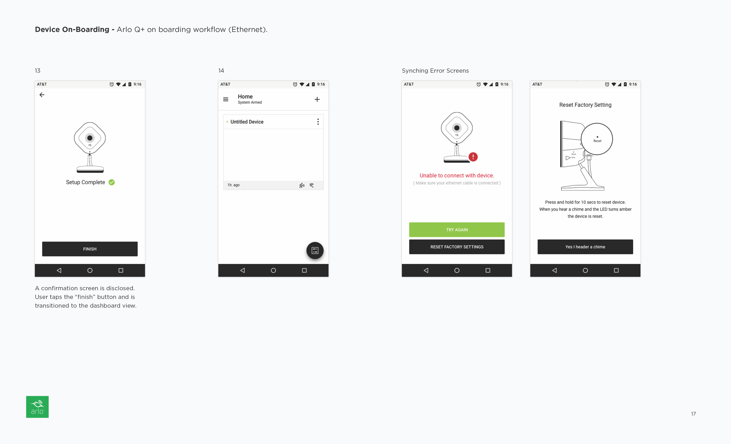
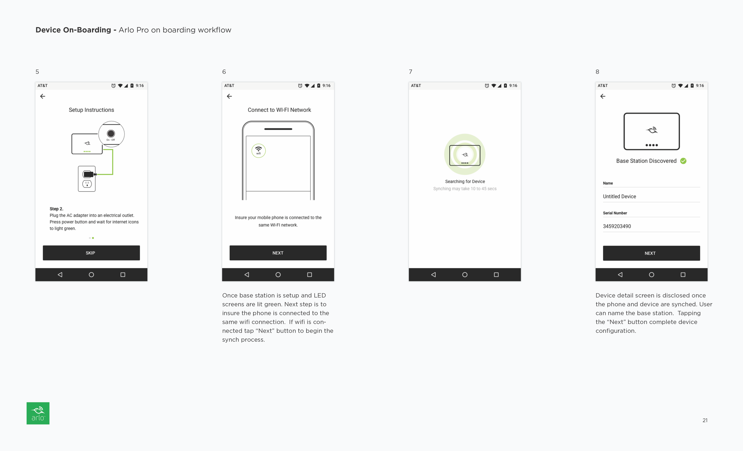
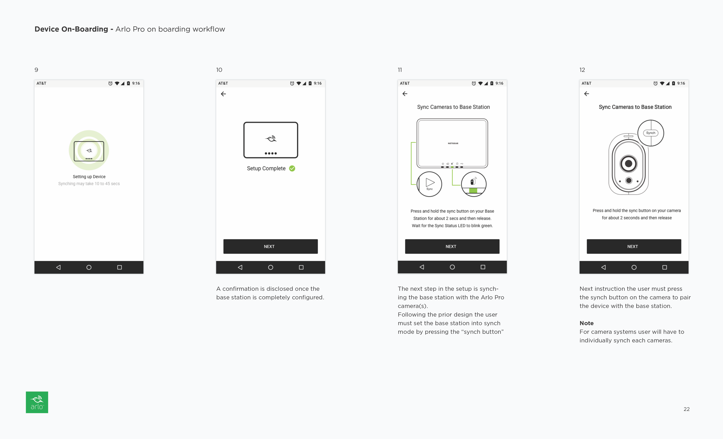
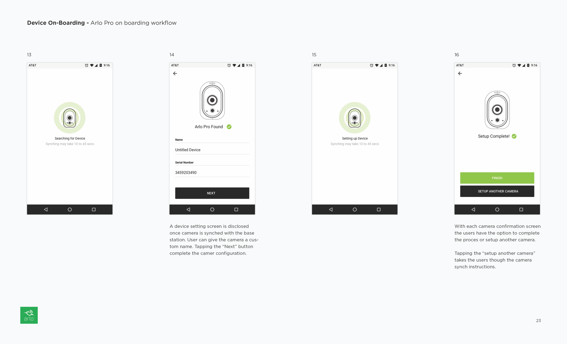
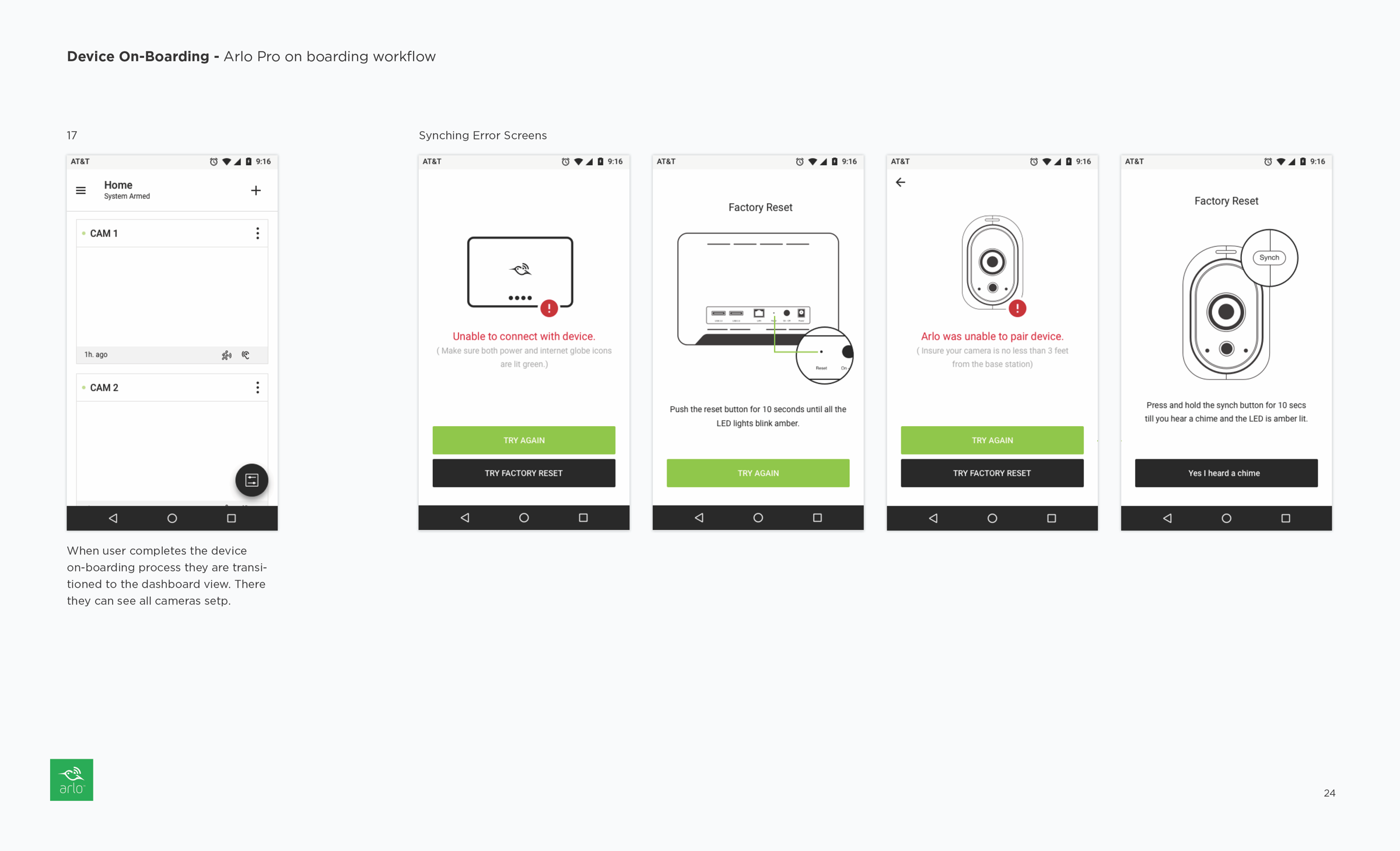
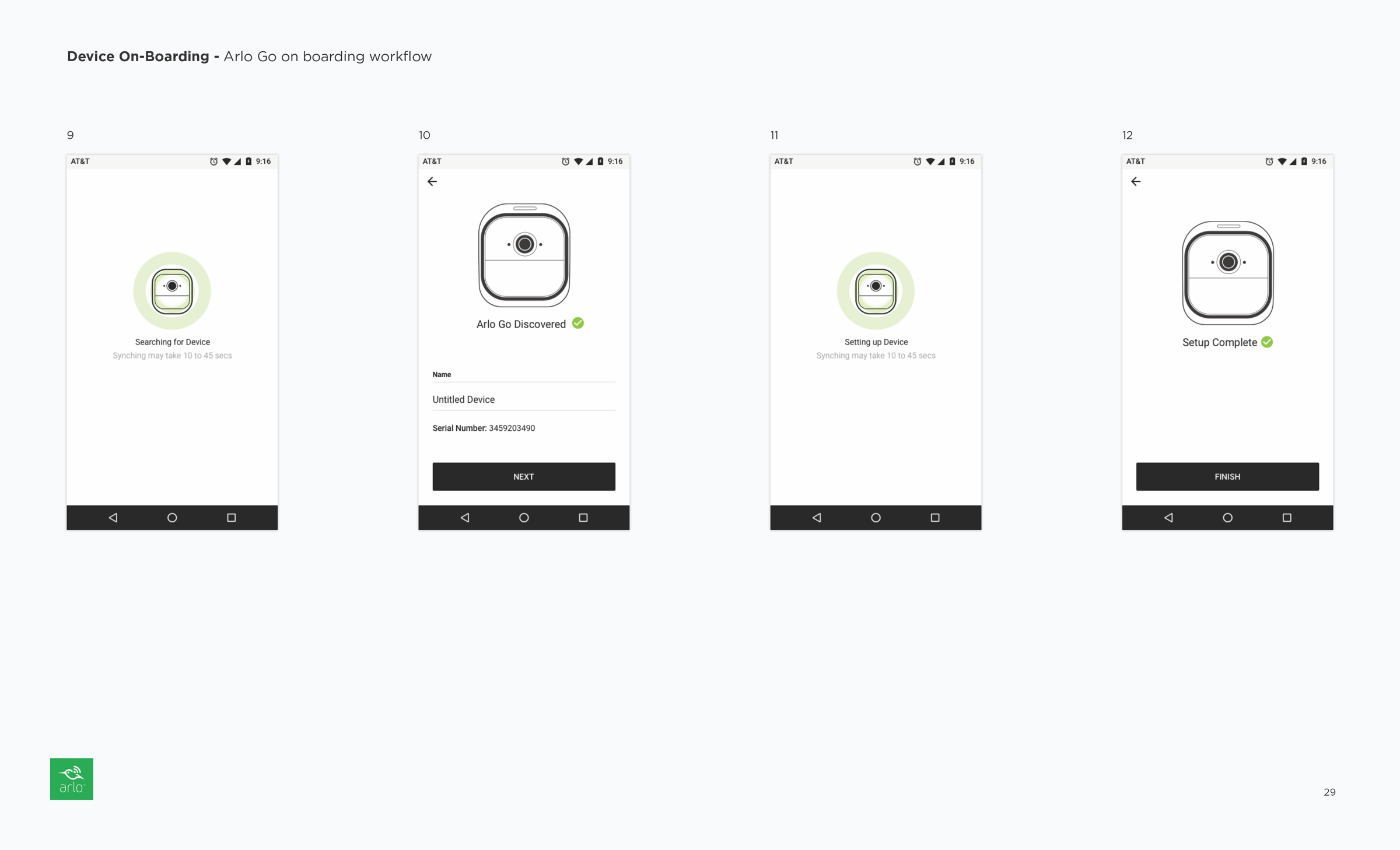
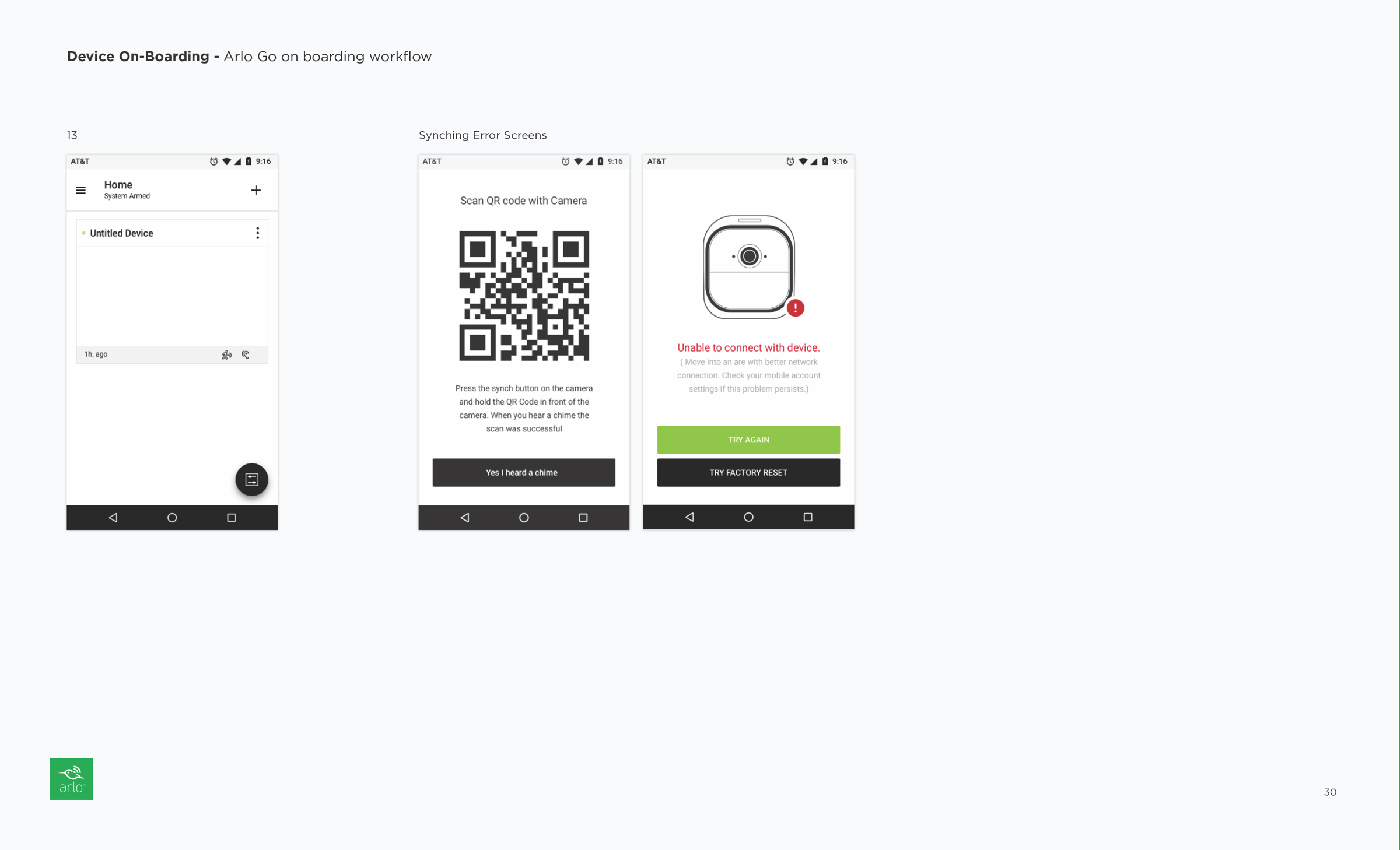
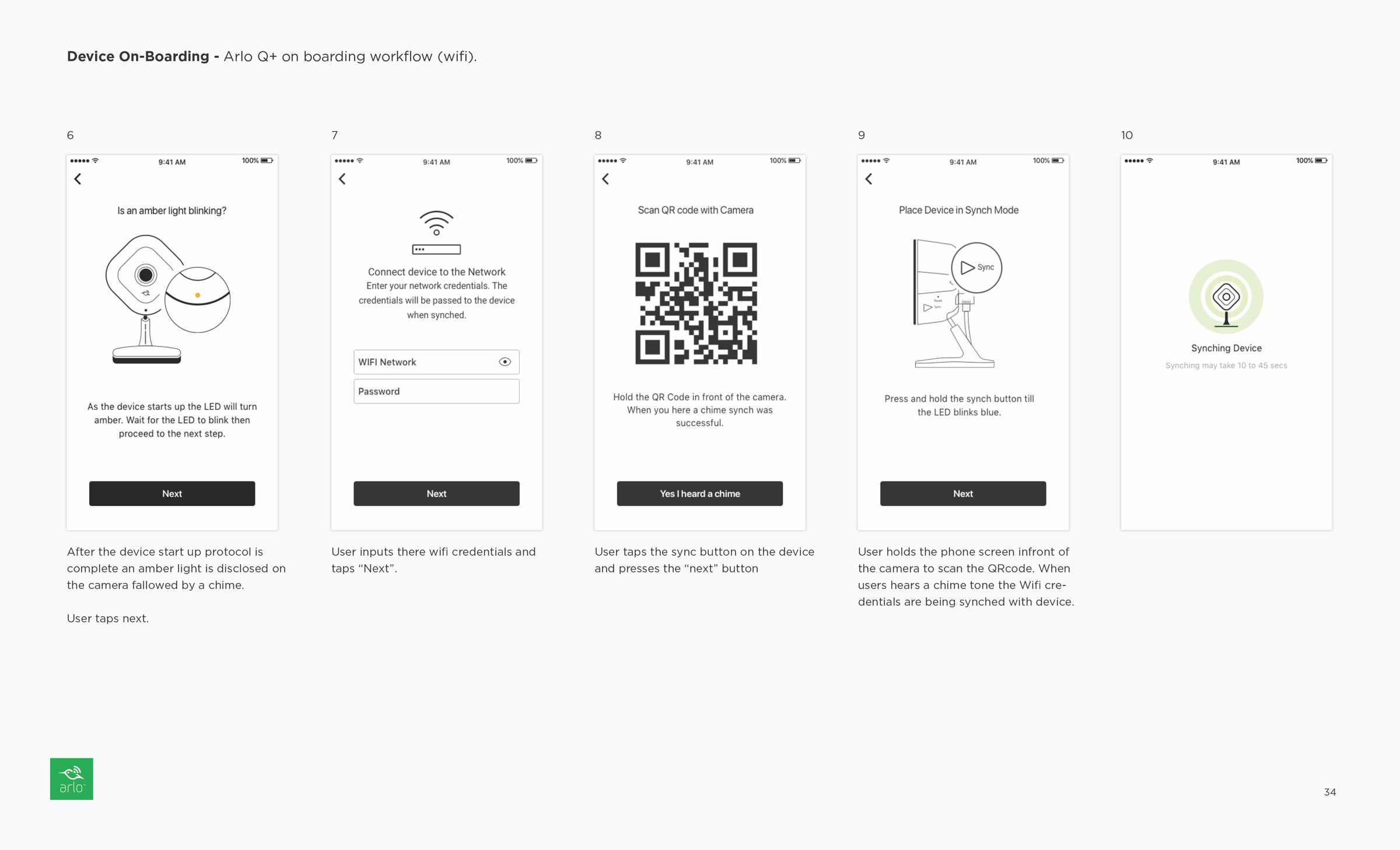
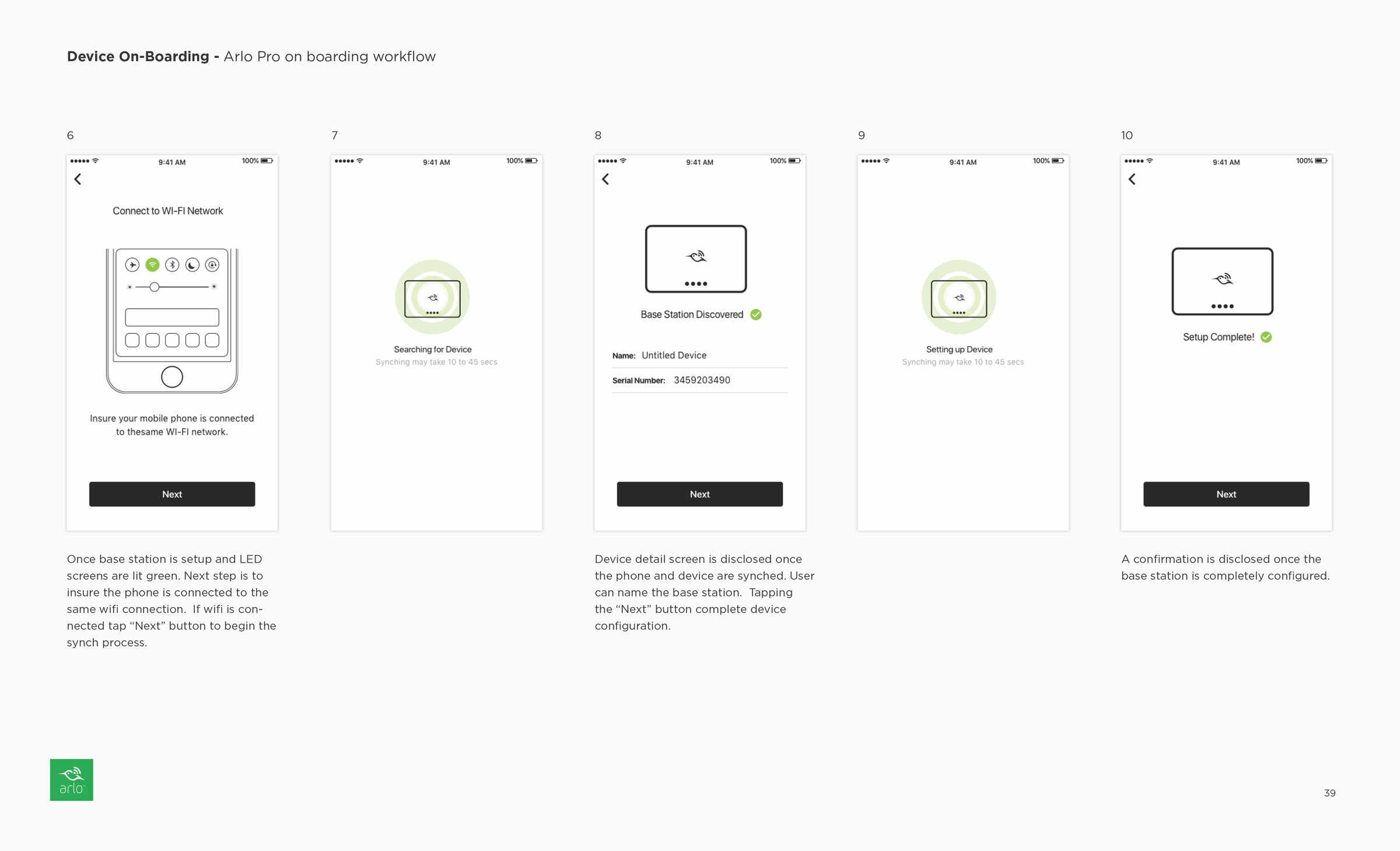
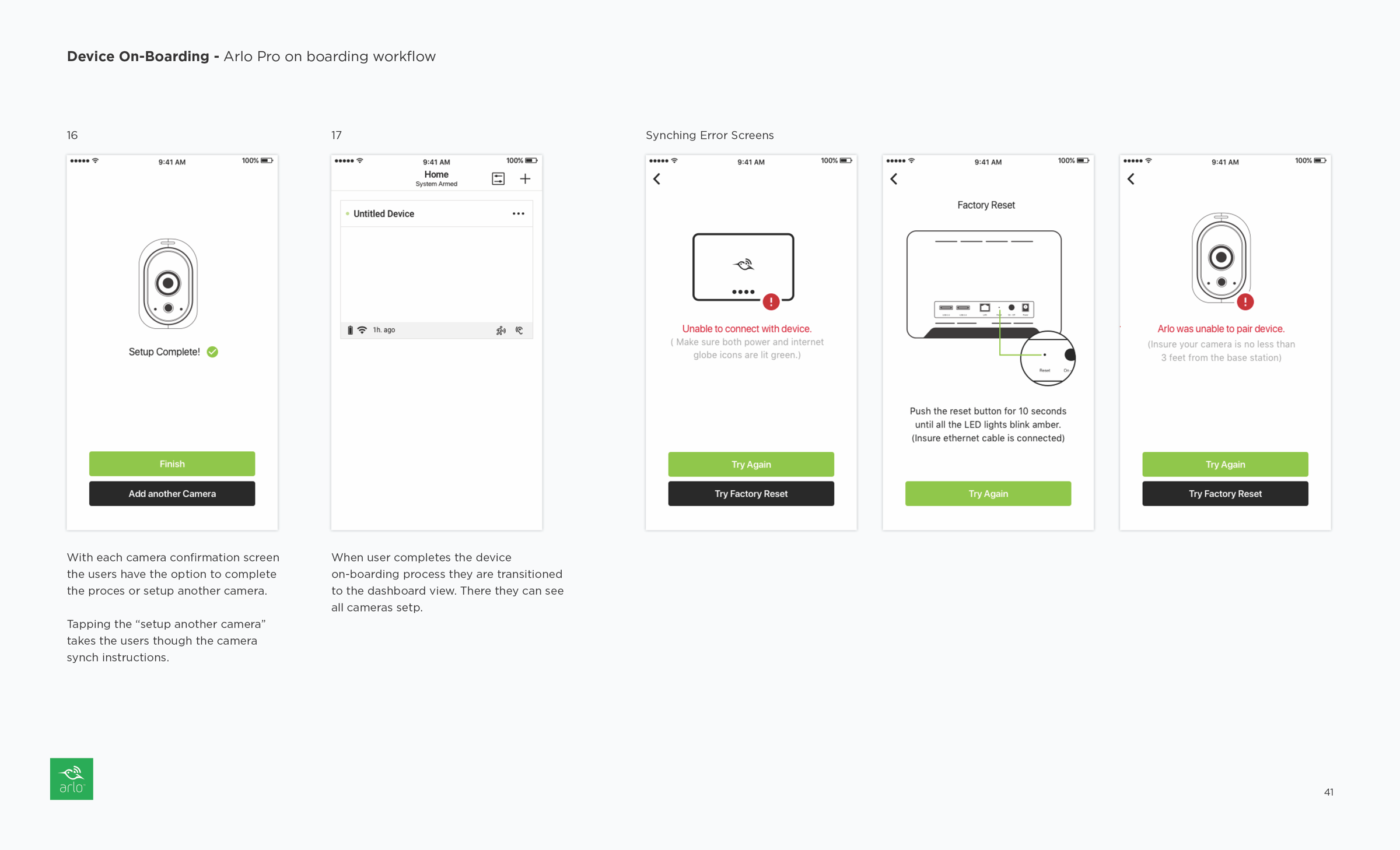
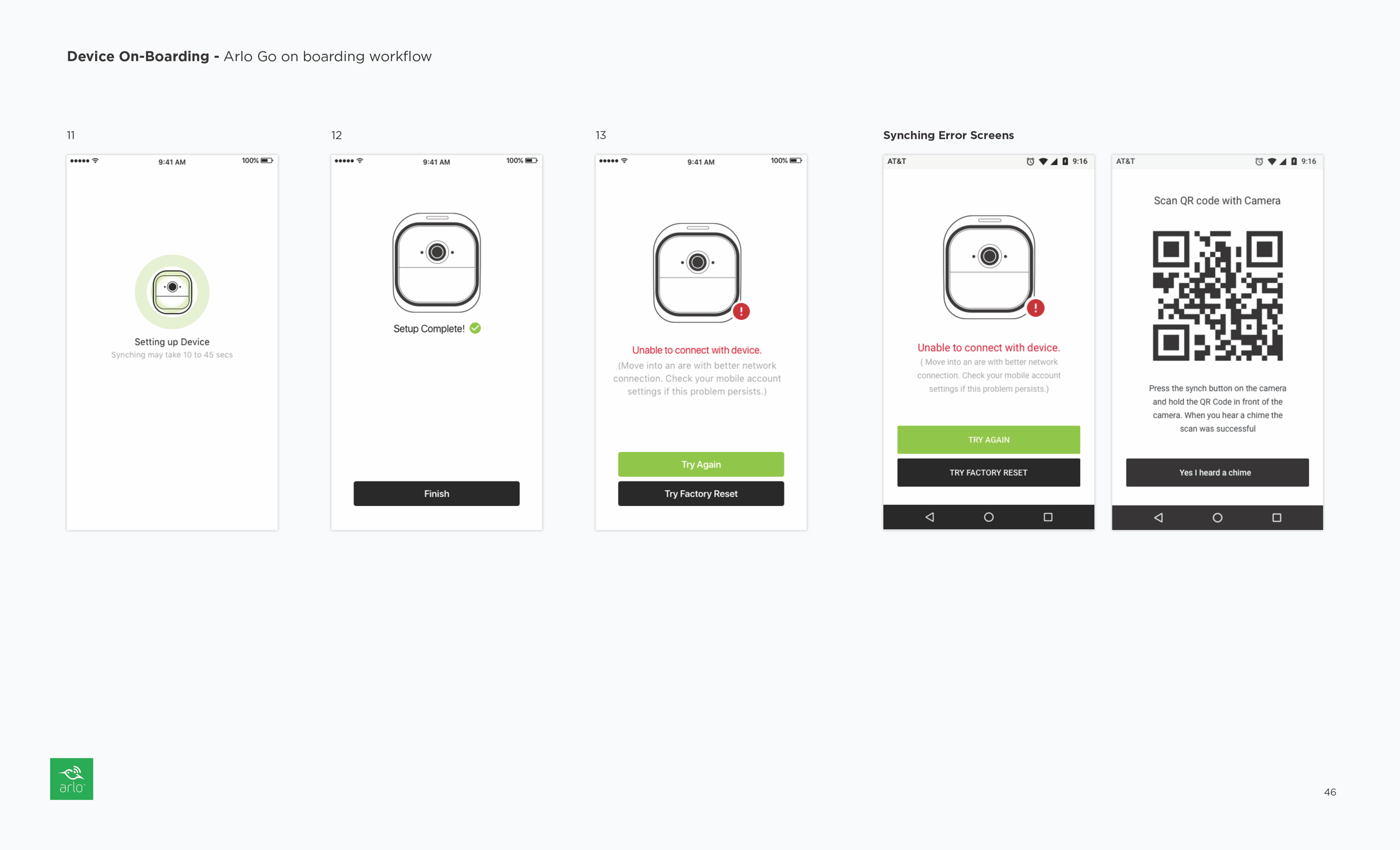
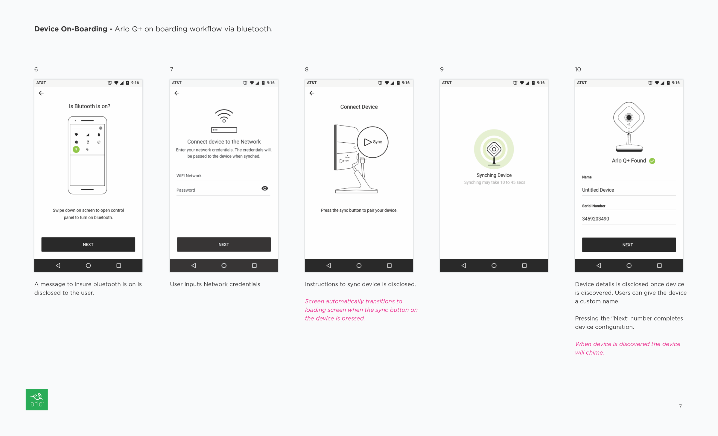
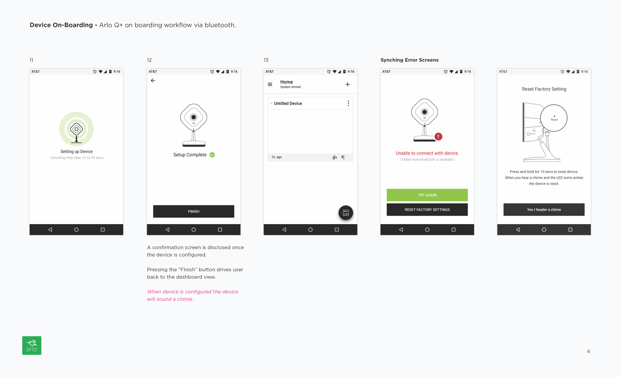
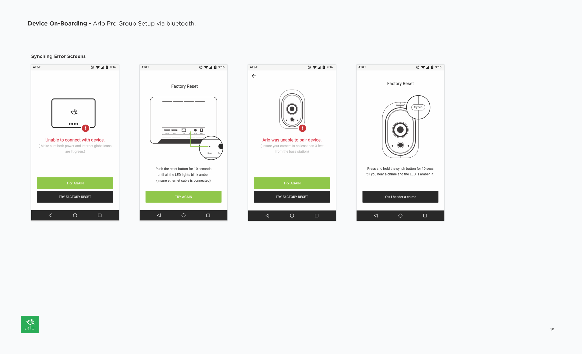
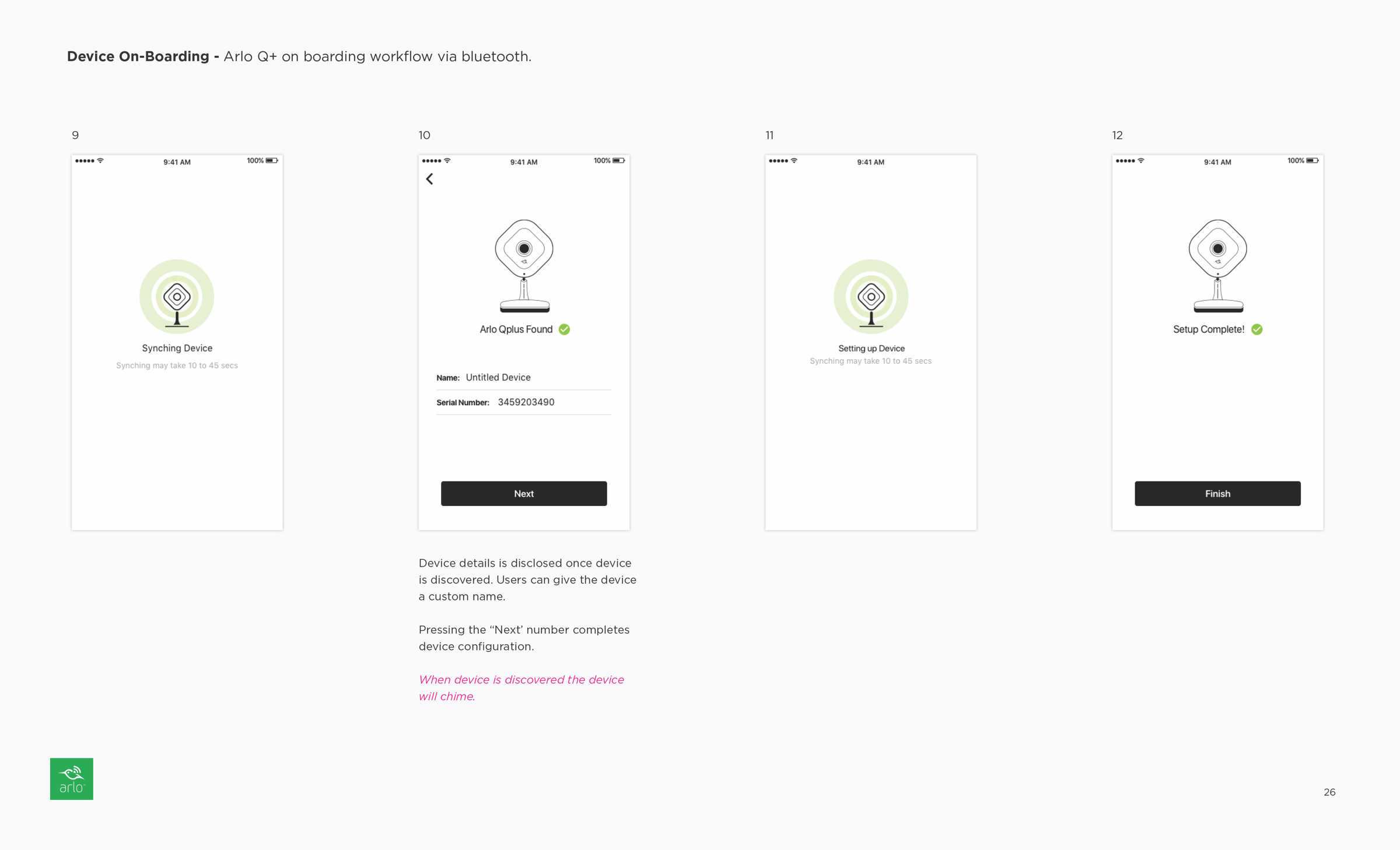
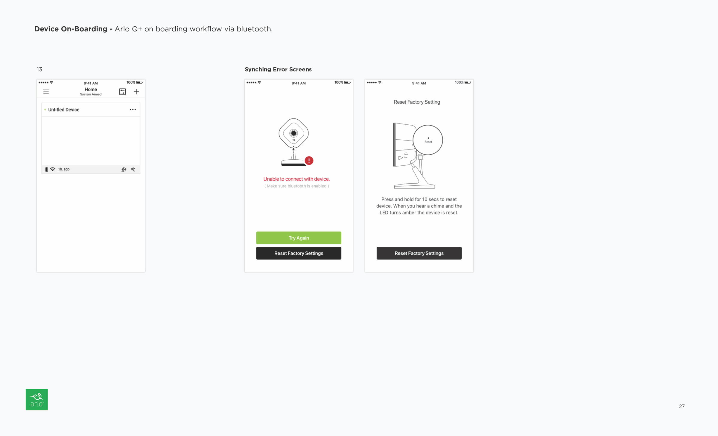
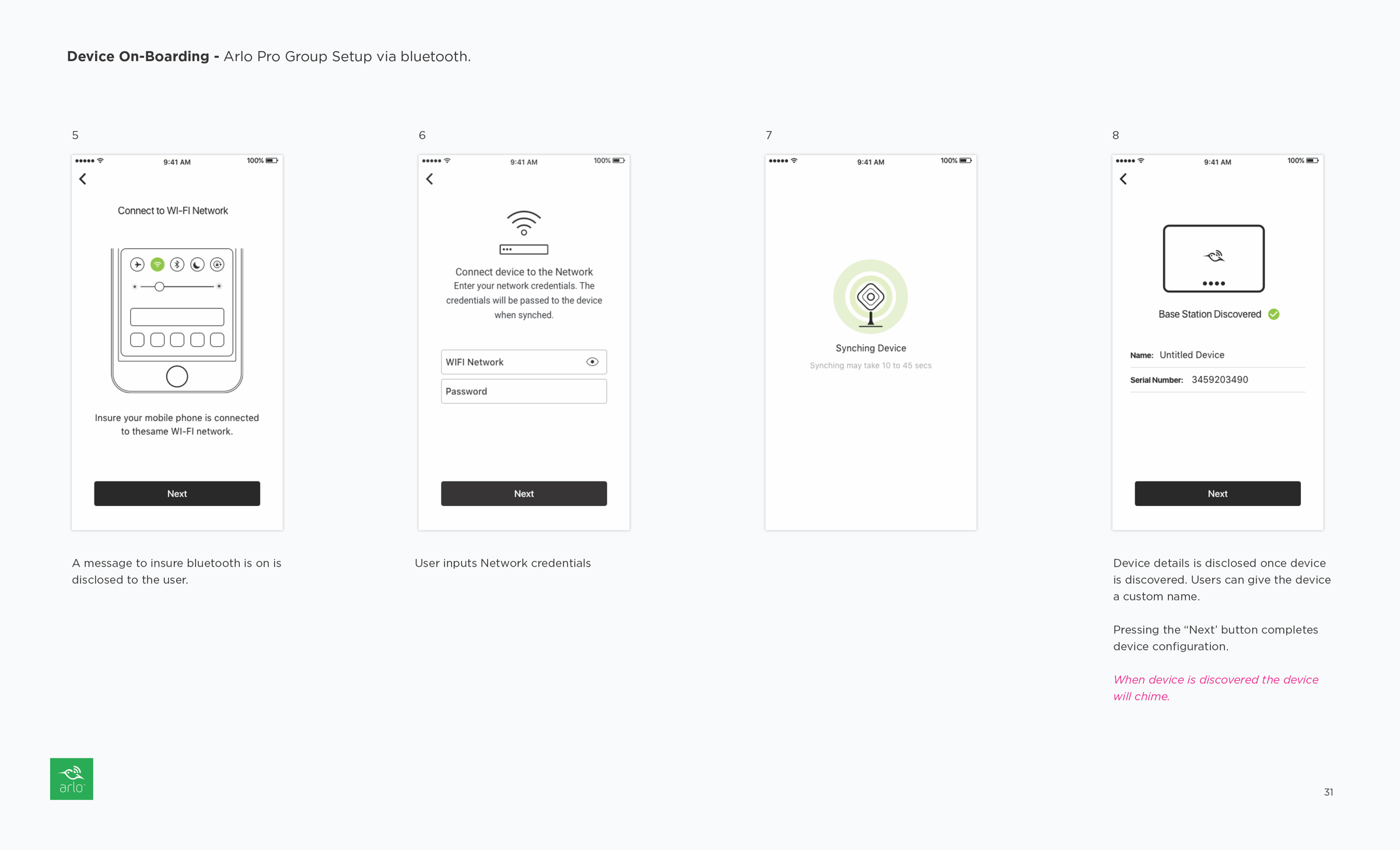
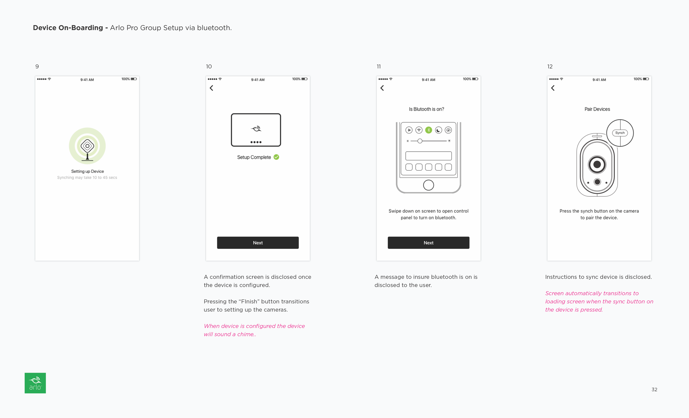
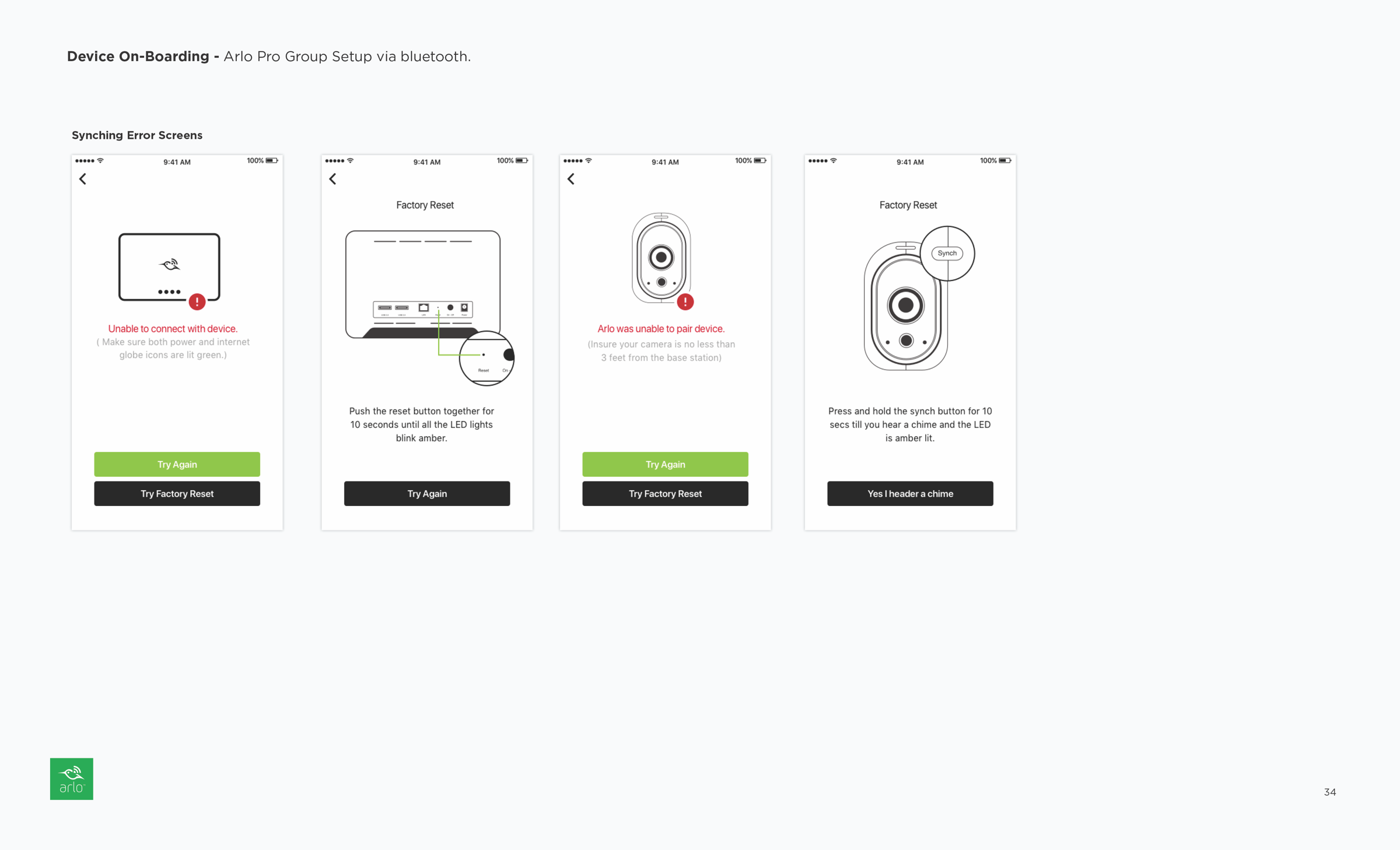
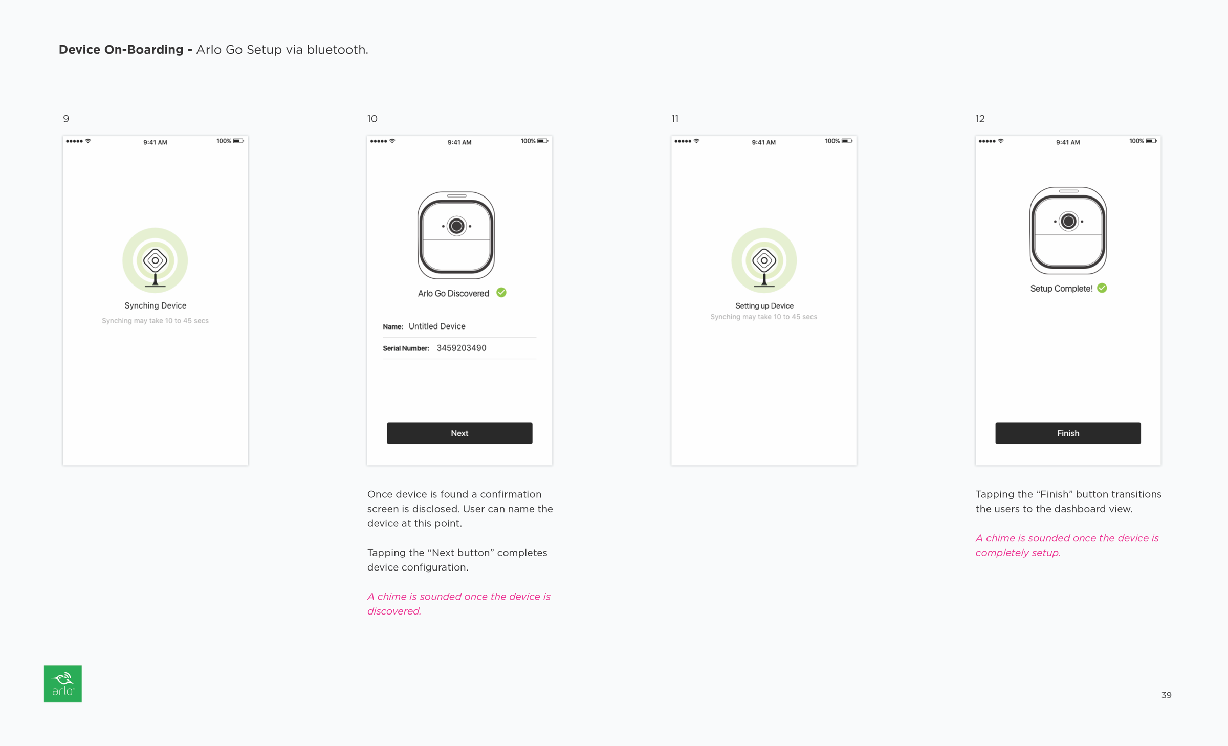
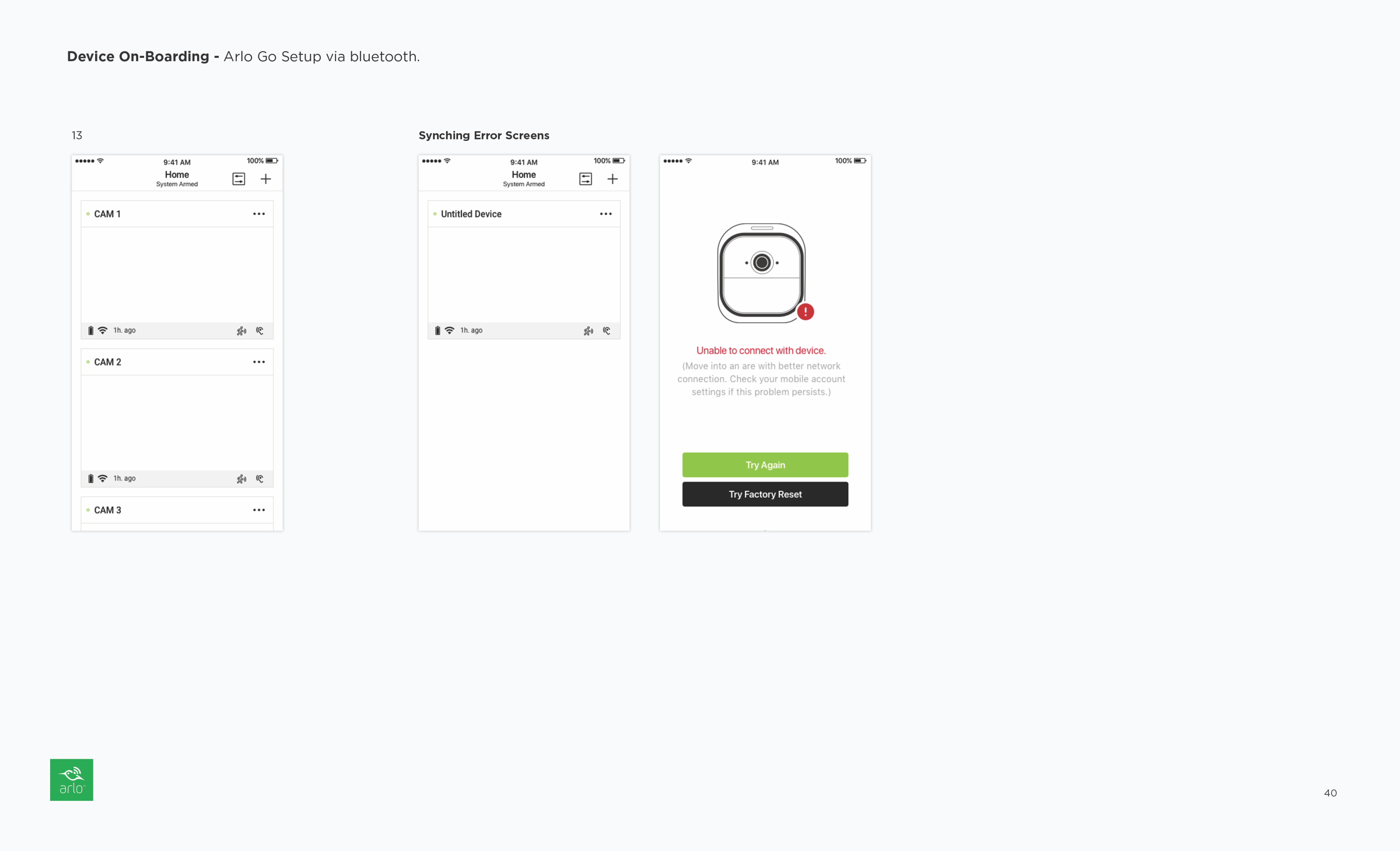
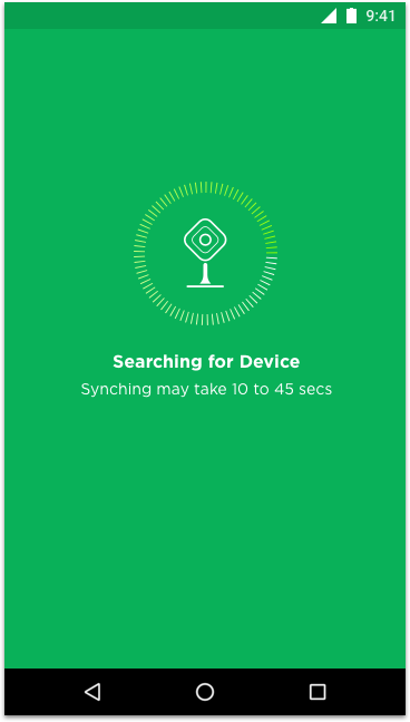
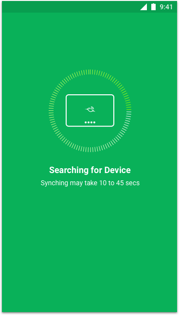
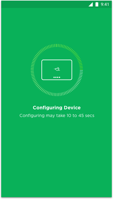
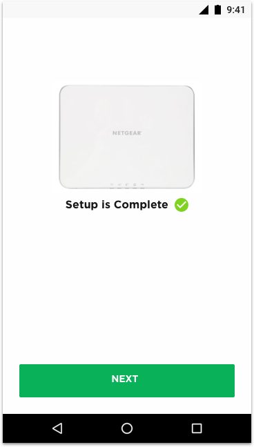
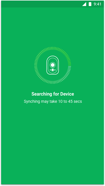
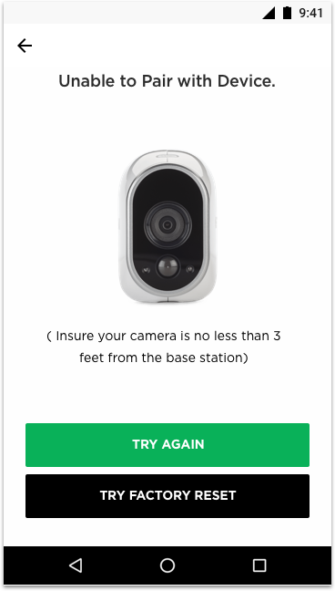
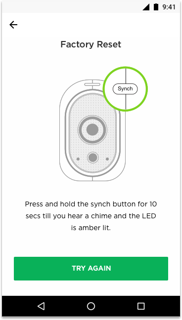
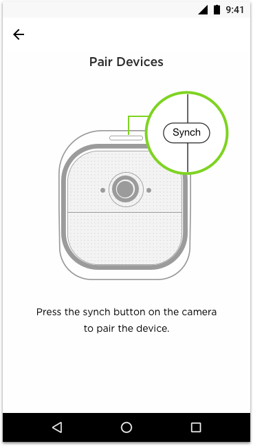
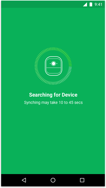
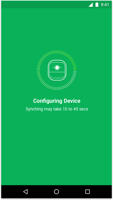
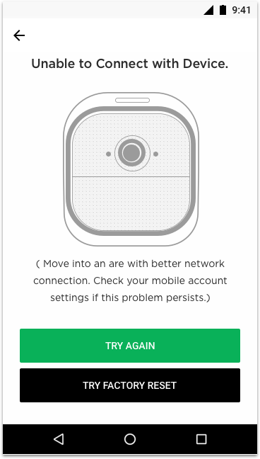
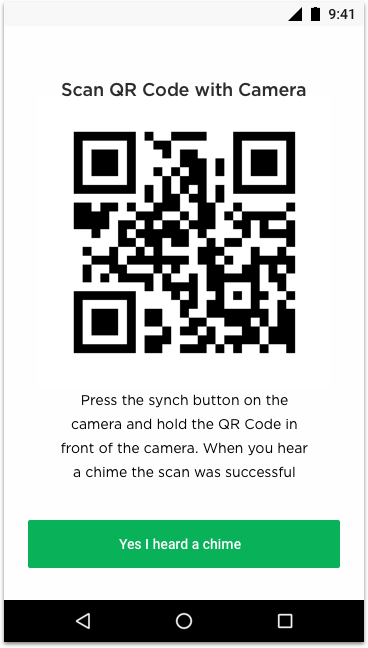
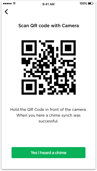
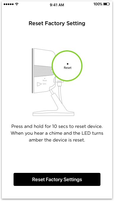
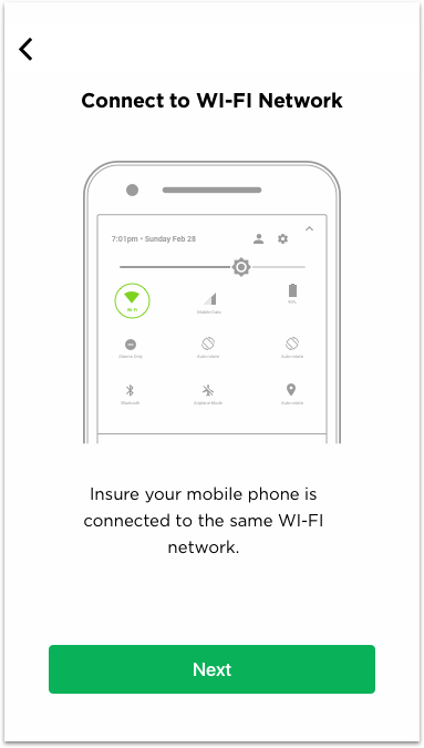
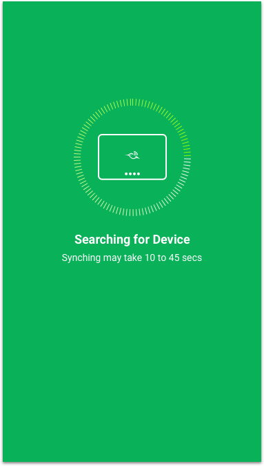
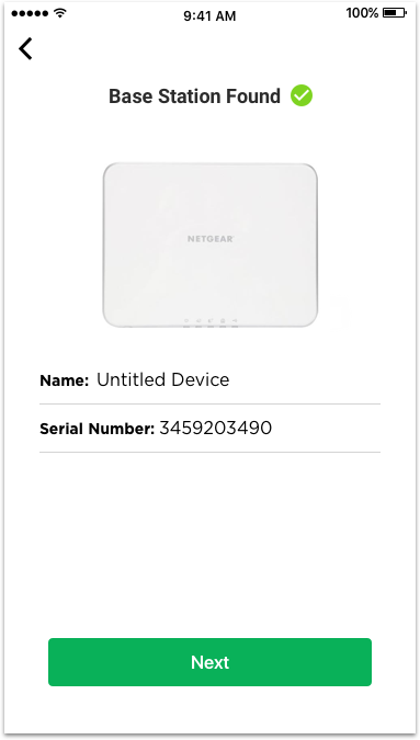
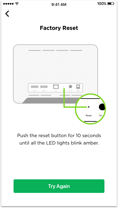
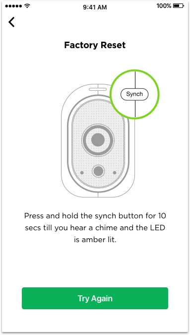
Use audio and LED feedback more effectively to insure context through the on-boarding process.
The on-boarding experience lacked sufficient feedback in the following areas:
Indicate when a device is ready for pairing.
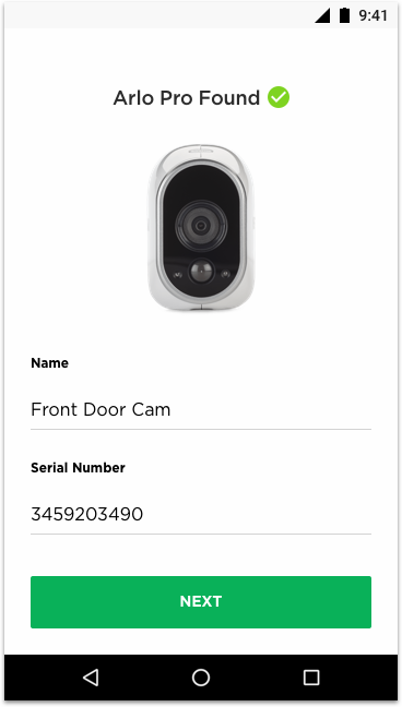
Provide clear feedback when a device is successfully synced to the network.
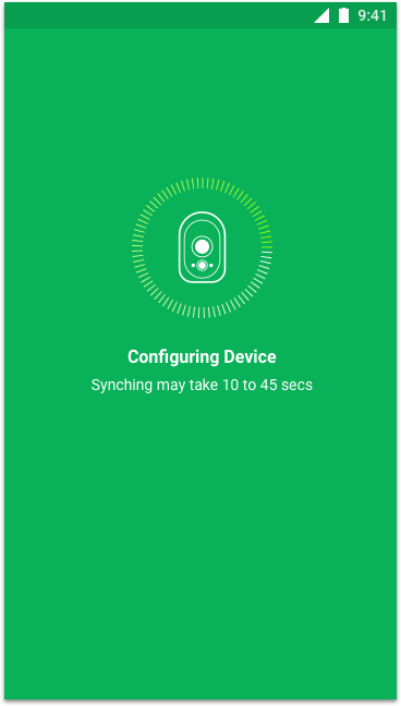
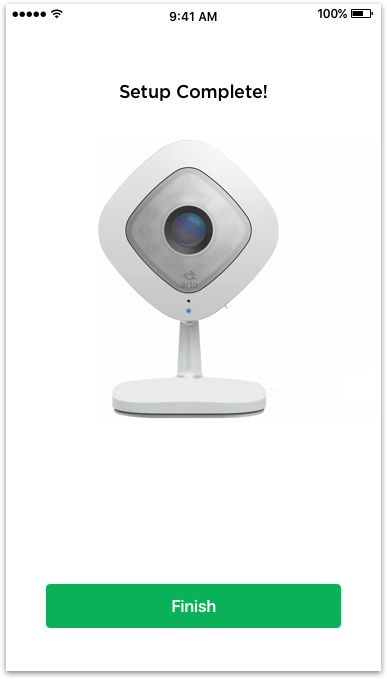
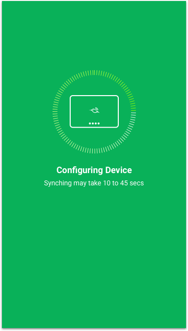
Clearly communicate when device configuration is complete.
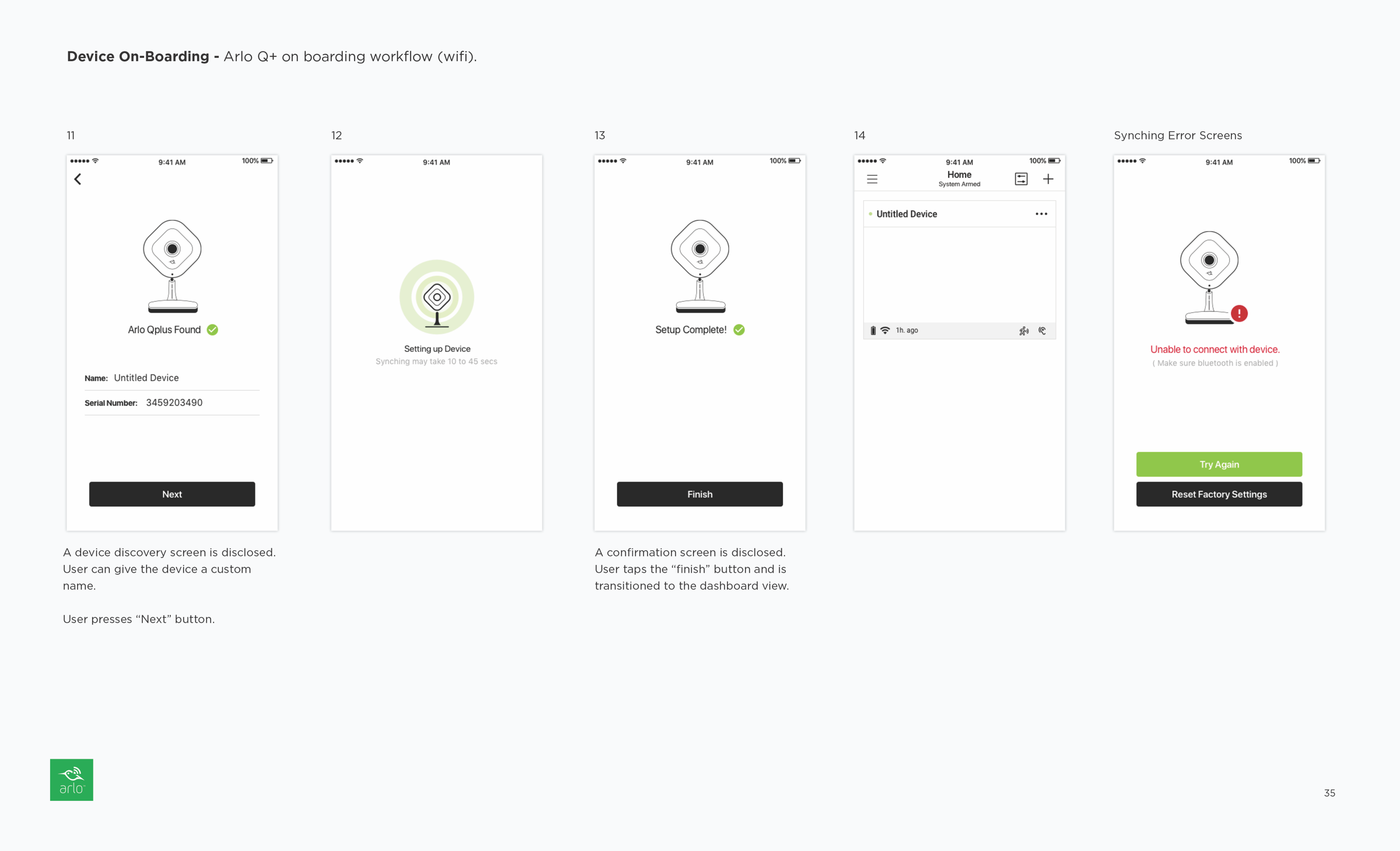
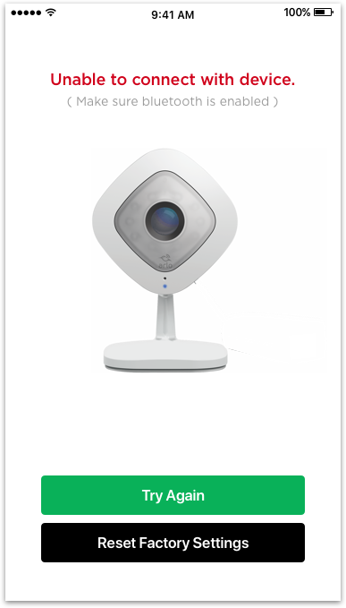
Provide appropriate feedback when a device fails to sync.
During the device startup protocol, a cycling loading pattern could be used while powering on the base hub. Once the protocol is complete, the LEDs could turn green followed by a chime sound, providing a more comprehensive and satisfactory feedback mechanism.
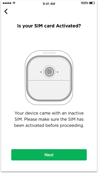
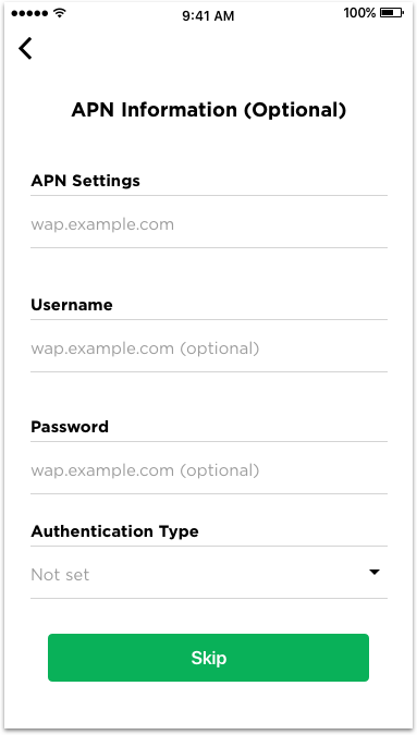
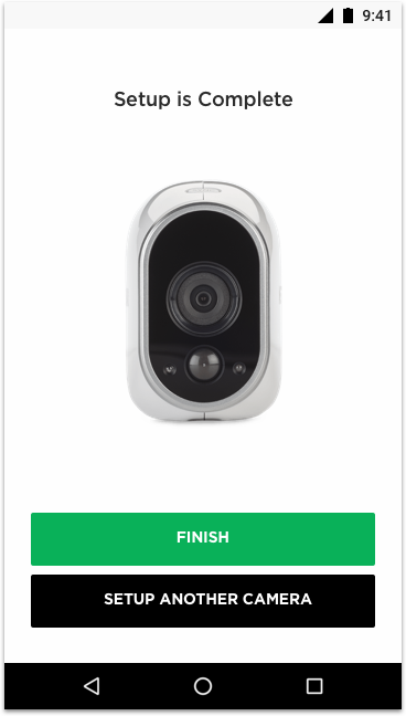
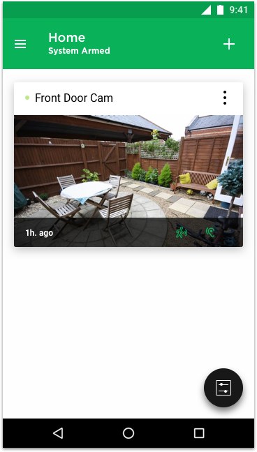
Redesign On-boarding Experience - Phase 1


Redesign On-boarding Experience - Phase 2

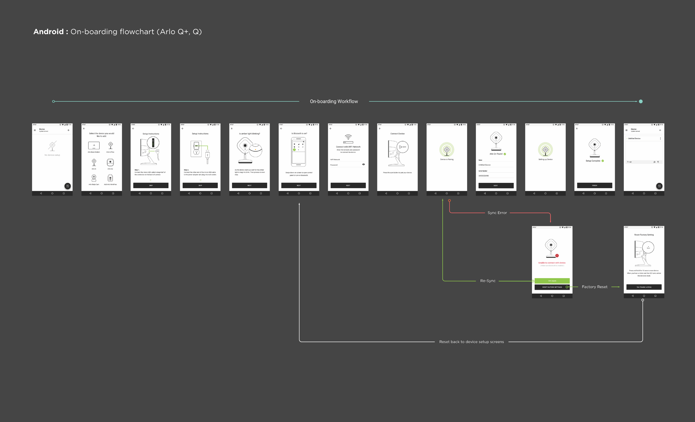


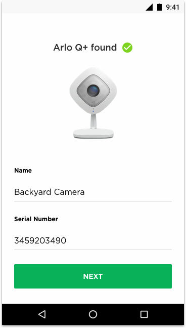
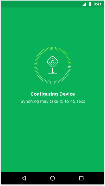
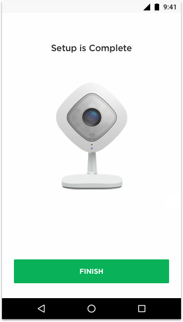
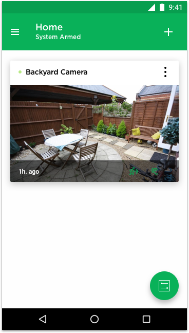
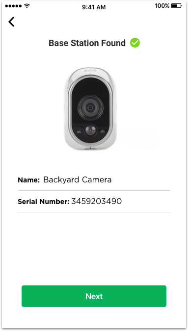
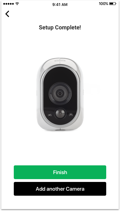
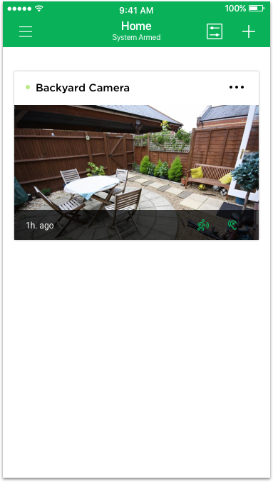
Design Comps - Phase 1
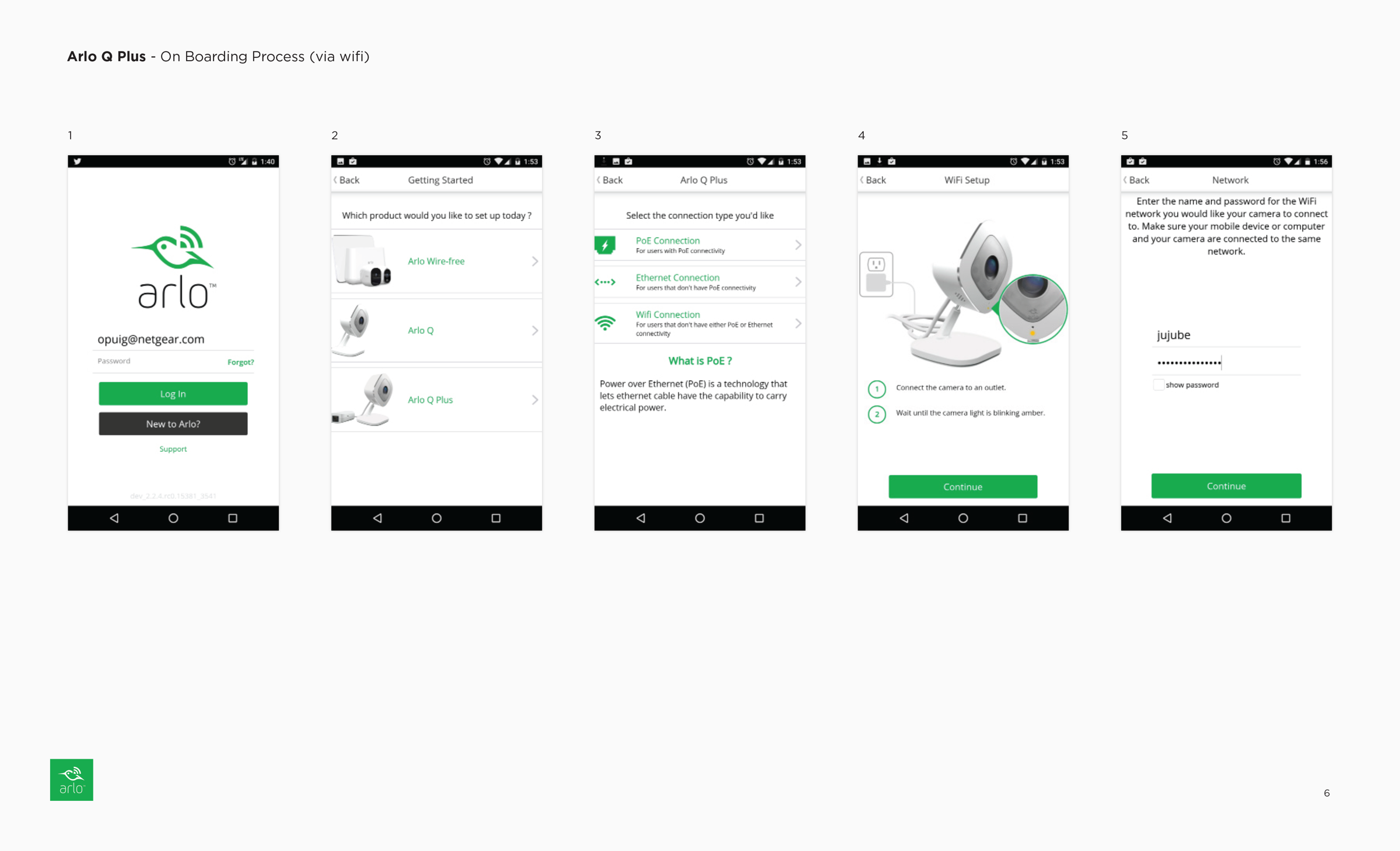
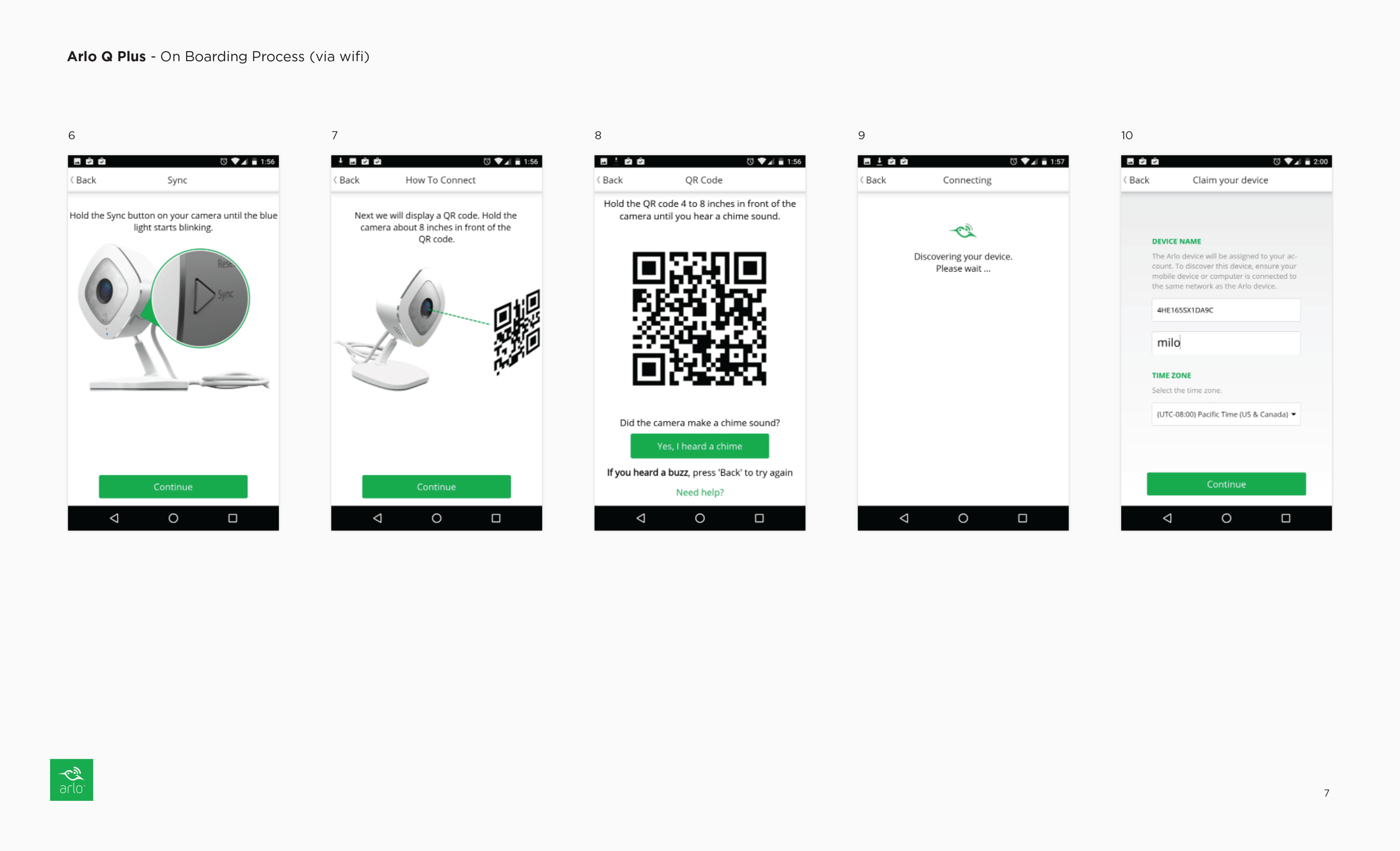
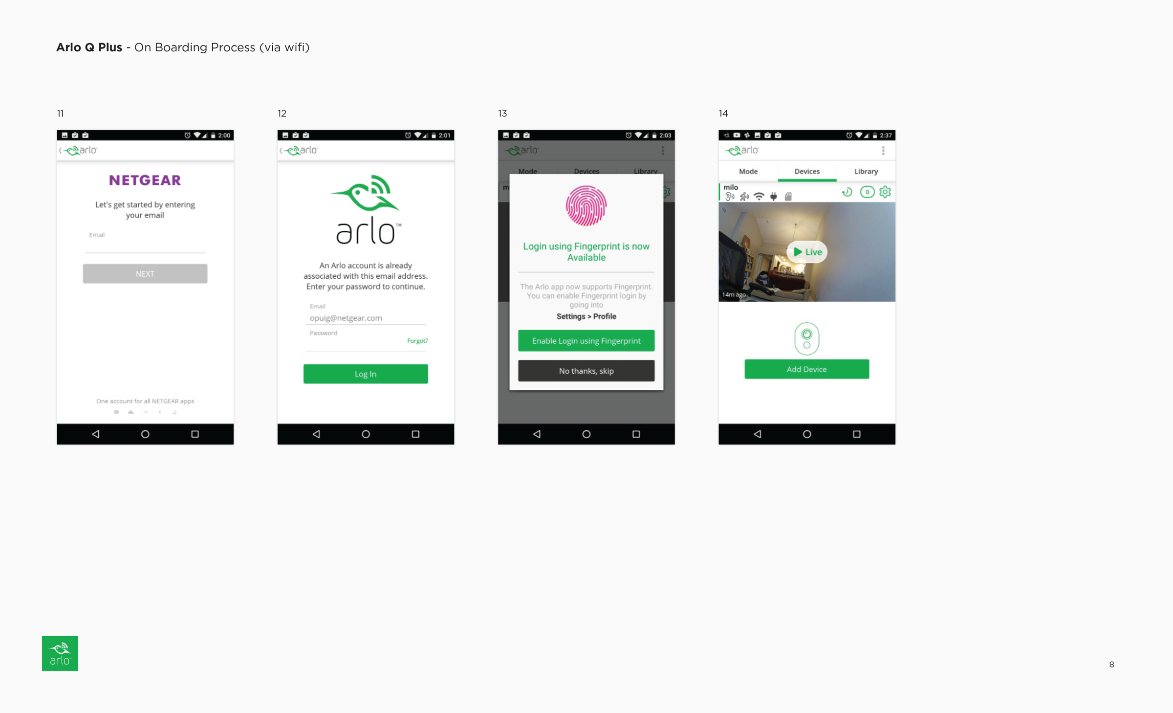
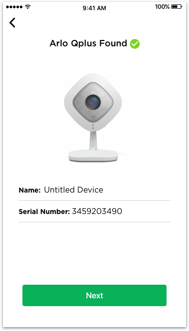
Android: Arlo Q+. Q

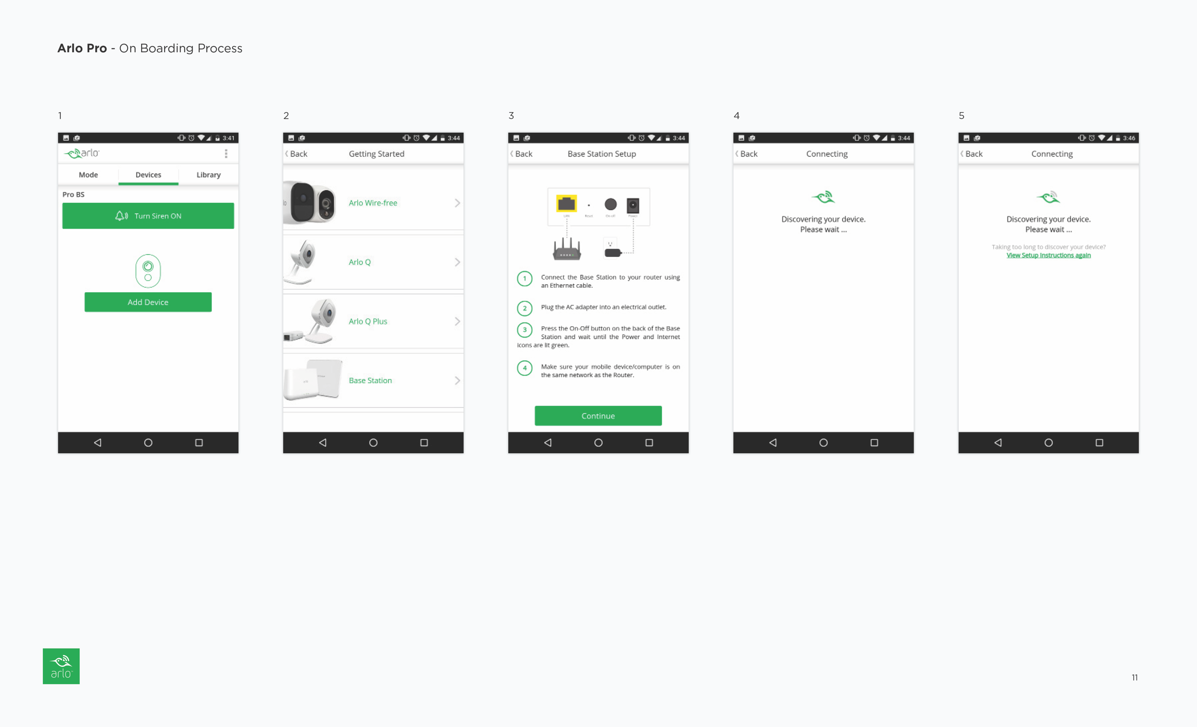
Android: Arlo Pro

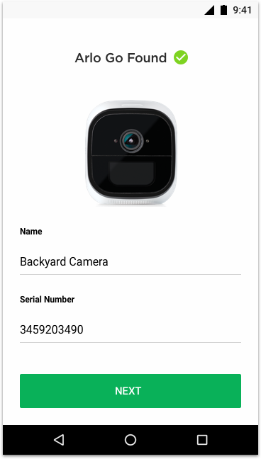
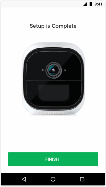
Android: Arlo Go


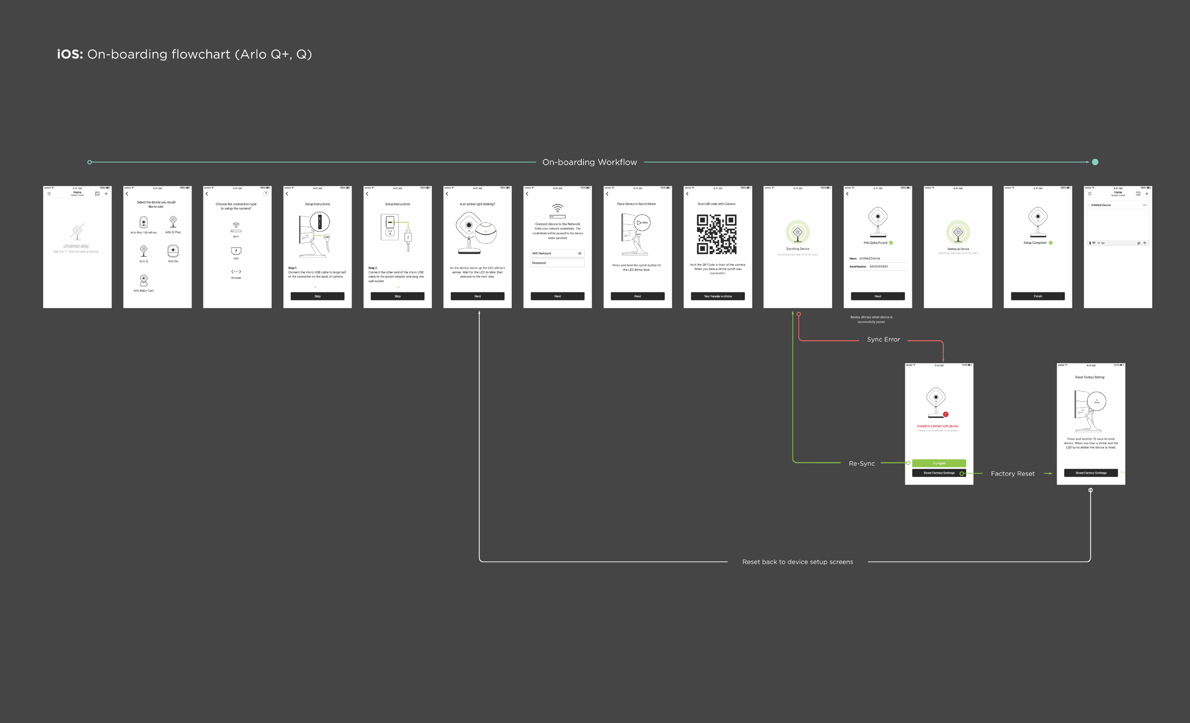
iOS: Arlo Q+. Q

iOS: Arlo Pro


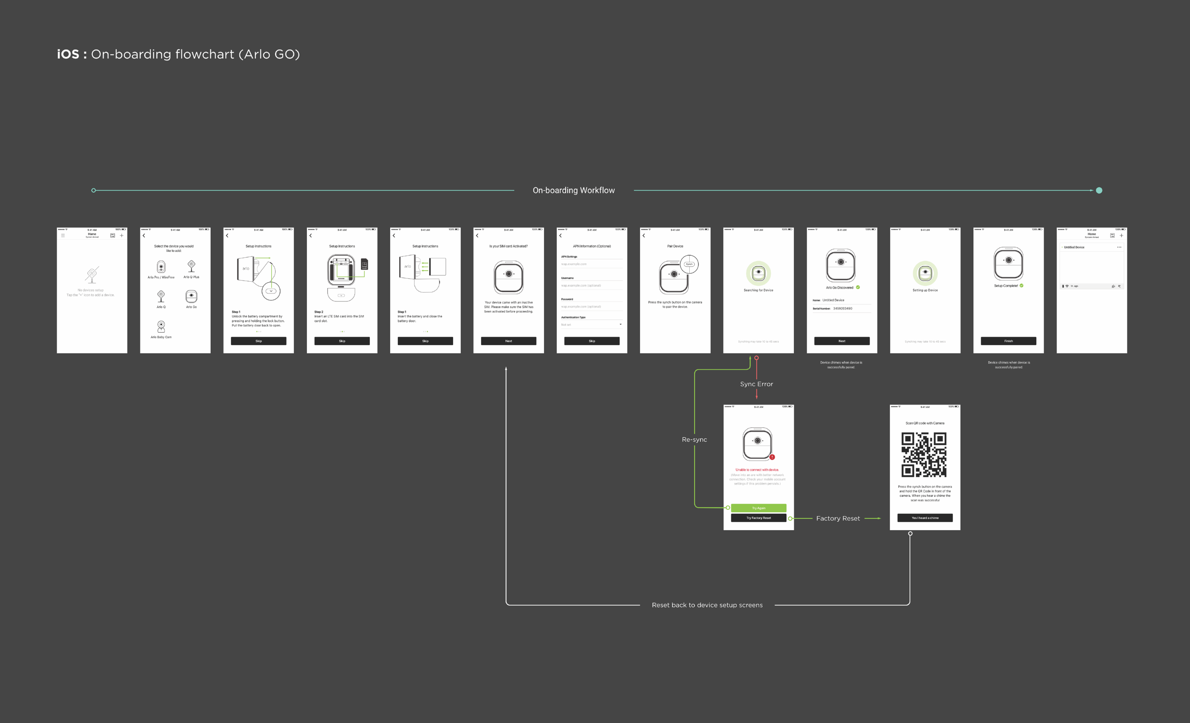
iOS: Arlo Go