Netgear/Arlo: pART 1
Netgear introduced to the market an affordable, wireless security camera system branded as Arlo. The Arlo system is sold along with a monthly subscription service providing storage and notifications. Today Netgear is the market leader in wireless home security systems. The introduction of the Arlo line also expanded Netgear into the Smart Home space.
Project
In this project, my focus was on gathering user feedback on the core features of our Android app, which include modes, device rules, and app taxonomy. Our main objective was to optimize and simplify the user experience, while also creating a scalable app structure that can accommodate the integration of other IoT and Netgear devices in the future.
My Role
As a member of the Arlo team, I collaborated closely with both product management and the user research team to identify and address various issues with the Arlo Android app. Our overarching goal was to optimize and simplify the user experience of the app, while also creating a scalable app structure that would be able to accommodate future integration of other IoT and Netgear devices..
Discovery
To address the usability and performance issues of the Arlo Android app, I conducted an audit that revealed a majority of the experience was based on iOS patterns. It became apparent that the current main navigation was not suitable for scaling with additional smart home products.
In collaboration with the product management and user research team, we set out to implement new business objectives and improve the user experience. To gather additional feedback, we conducted a survey with the help of our in-house user researcher, Lu Yu. The survey focused on navigation, modes, geofencing, and device rules. The results of the survey provided valuable insights that aligned with my findings from the app audit and helped to identify key user pain points.

KEY INSIGHTS & ISSUES
Unconventional Design Patterns
The Android app's audit revealed that replicating iOS native behavior led to an unintuitive and difficult-to-use experience for Android users. The custom code emulating iOS functionality also frequently caused crashes, negatively impacting the app's performance.

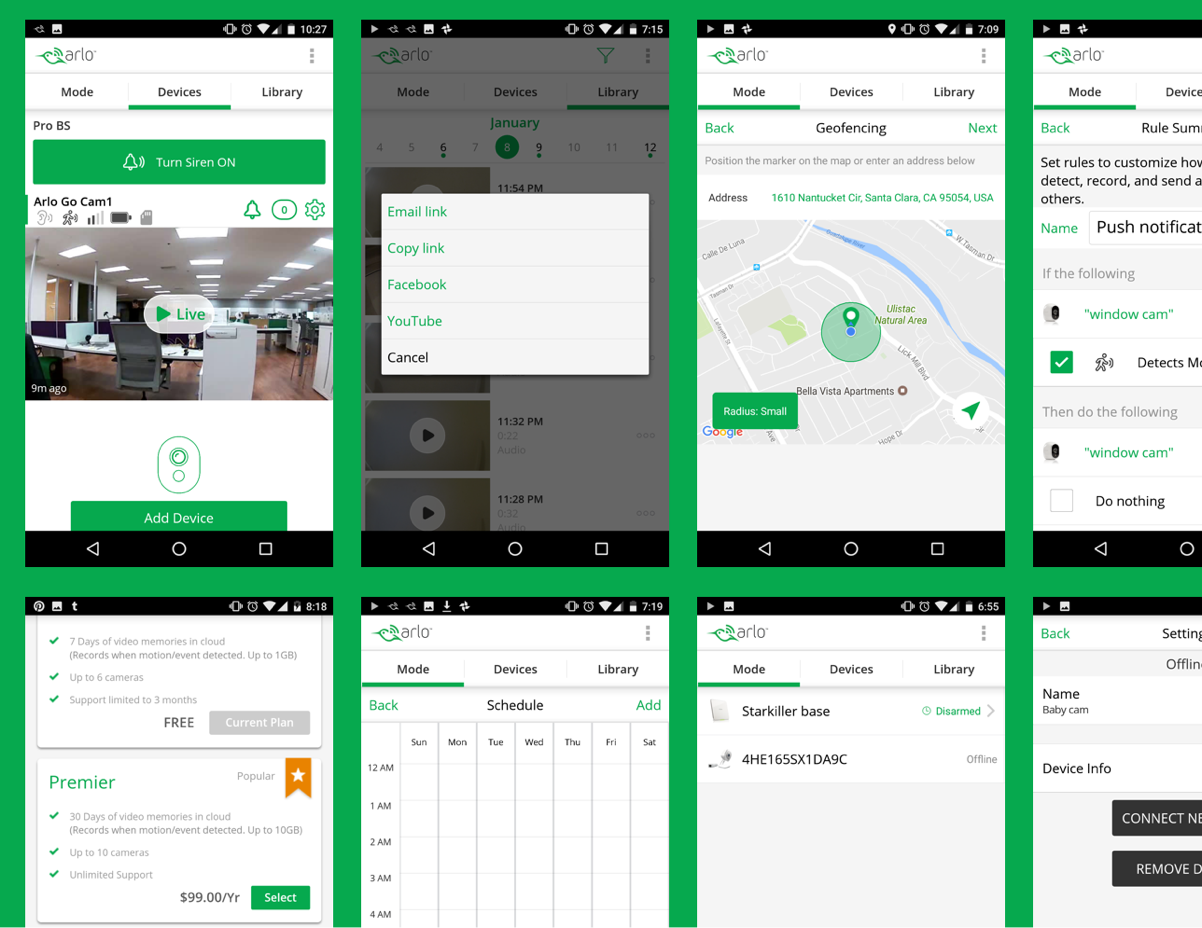
Geofencing as a mode
Our in-house user researcher, Lu Yu, conducted a survey that revealed users struggled to understand the geofence feature, despite being marketed as a key feature. Feedback from those who used the feature indicated inconsistency when multiple people utilized it. Upon analyzing usage metrics, we found that only 5% of users utilized geofence as a mode.

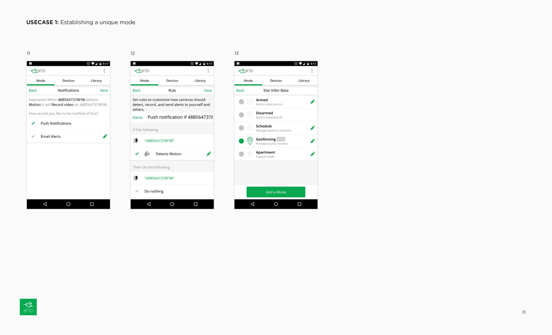
Modes
The user survey showed that most security system users preferred to use arm and disarm modes to control their security system, while a minority used custom modes. Users found setting up modes confusing due to unclear messaging and complicated interactions, especially with the addition of device rules. The default modes (Arm, Disarm, Schedule, Geofence) were confusing, with Schedule seeming like an outlier. The survey also revealed that users had an unclear understanding of the concept of modes.
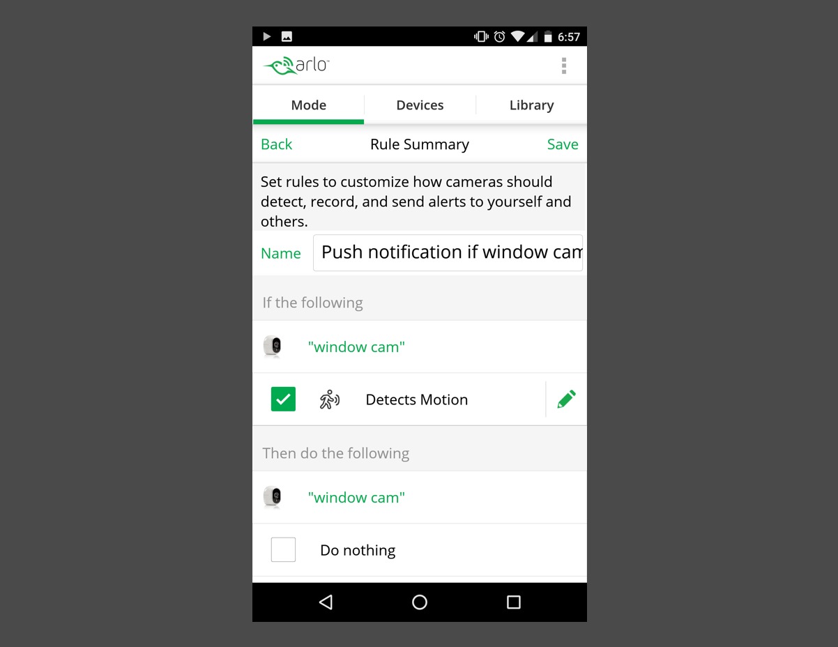
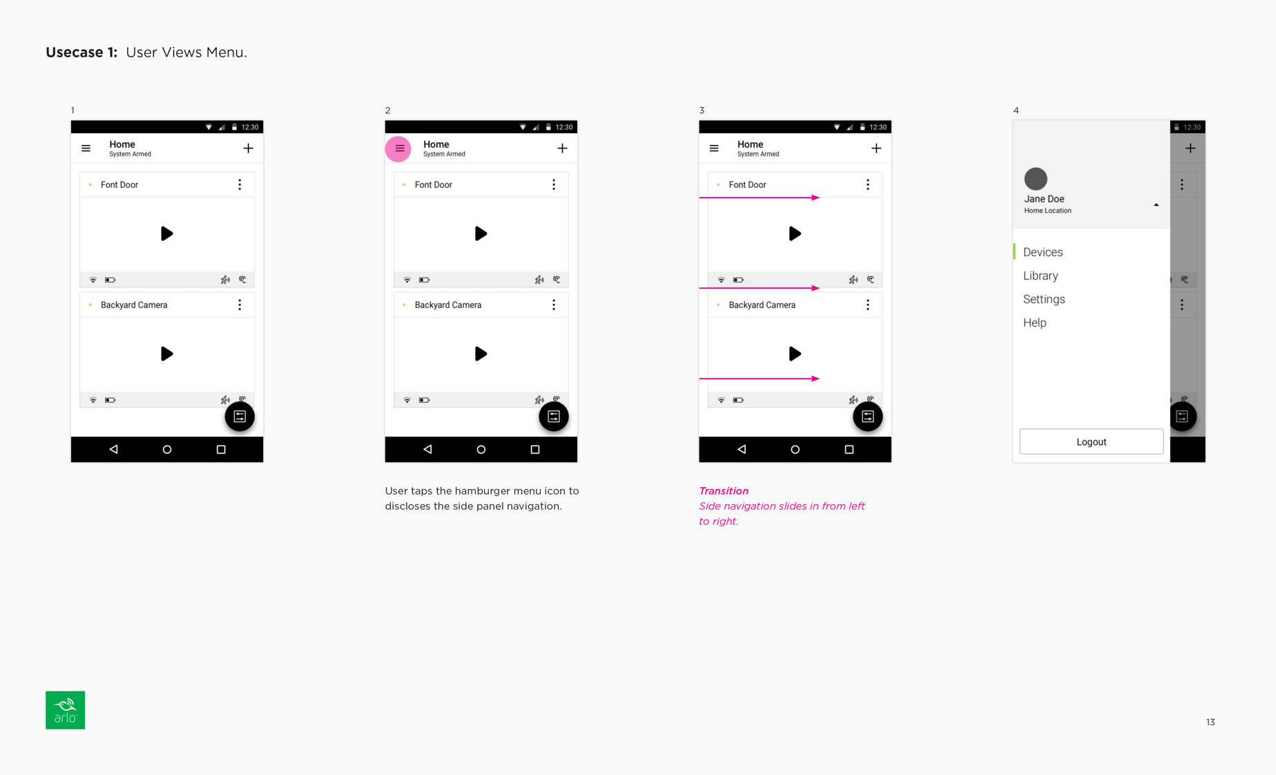
Device Rules
The existing flow did not effectively communicate the device rules feature to users, leaving them with an unclear understanding of its purpose and when to use it. The feature was presented in a way that catered more towards power users, causing most users to rush through the setup process when configuring a custom mode

Poor Visual design
The product's visual design was subpar, resulting in poor usability. The iOS-inspired approach caused inconsistencies in color usage, varied icon sizes, unclear type hierarchy, and a lack of a baseline grid for establishing vertical rhythm. This led to a compromised user experience.

Technical Nomenclature
The survey results showed that the technical language used for features like modes, rules, geofence, and schedule could be intimidating for most users. This highlighted the need to simplify the language used to describe these features and make them more user-friendly.
REDESIGN OBJECTIVES
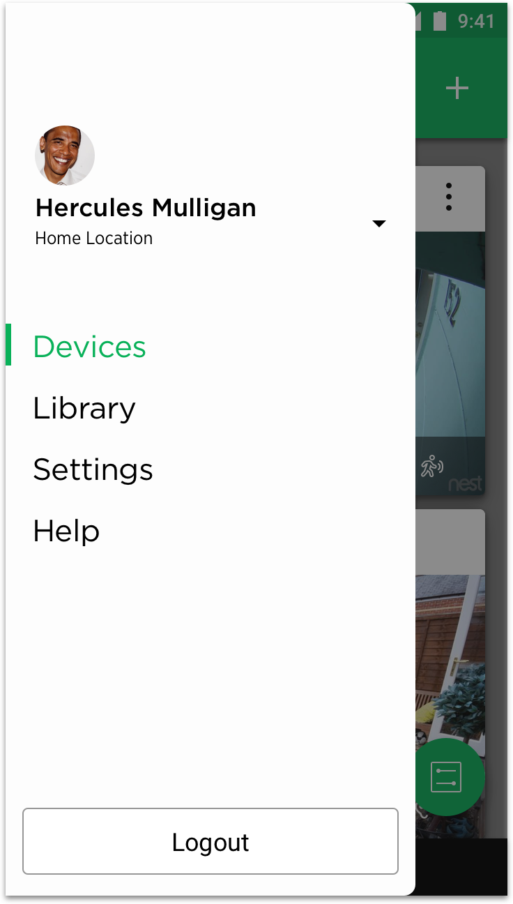
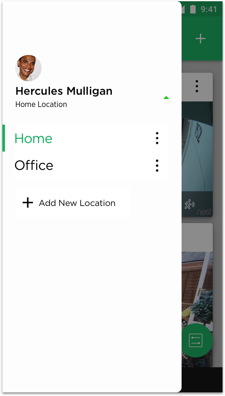
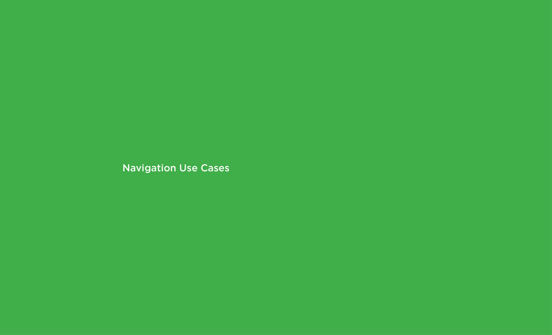
Revised Navigation
With the use of the Android navigation drawer pattern, the navigation can now perform the following:
The navigation drawer behavior can be used to enable scaling of the main navigation items.
Channels can be introduced to differentiate future product offerings.
Improving usability and reducing UI density can be achieved by removing irrelevant features from the context and enabling users to focus on tasks.
Using navigation patterns already familiar to Android users can improve learnability.
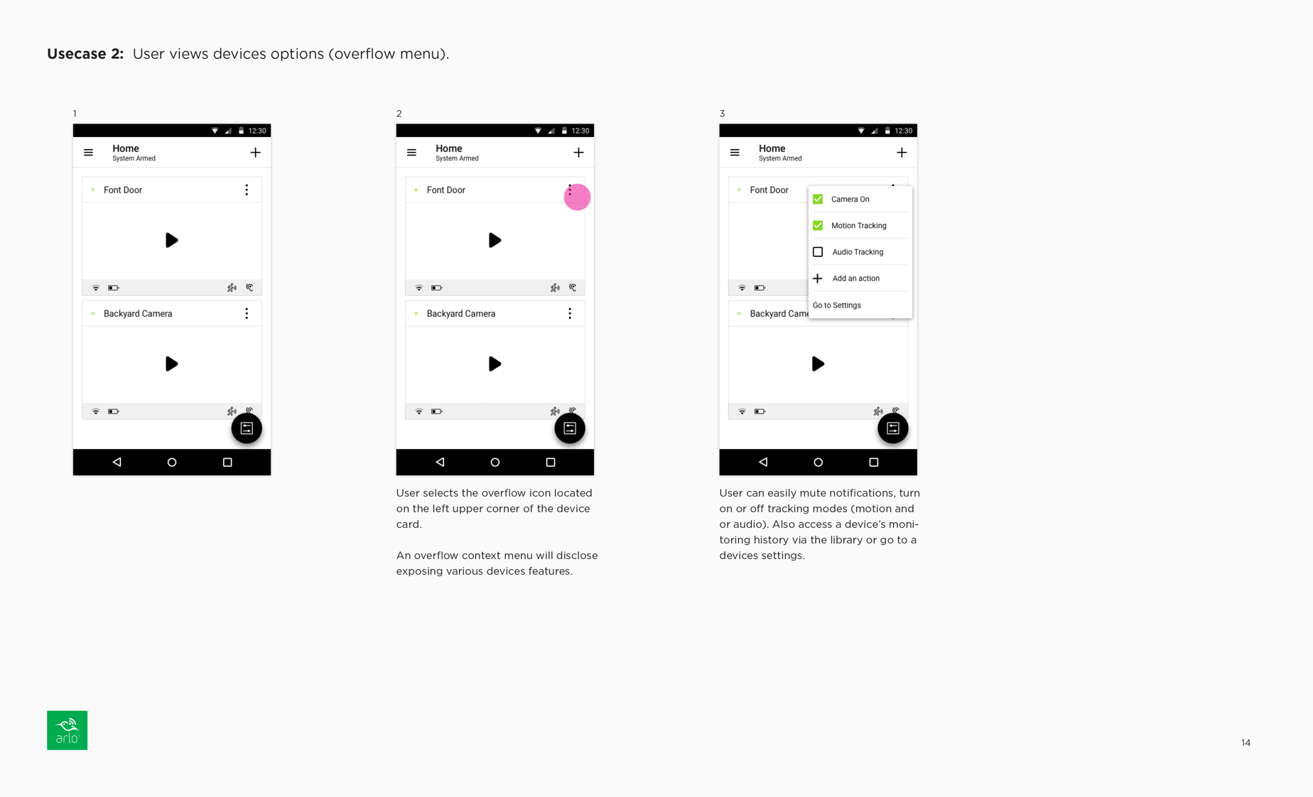
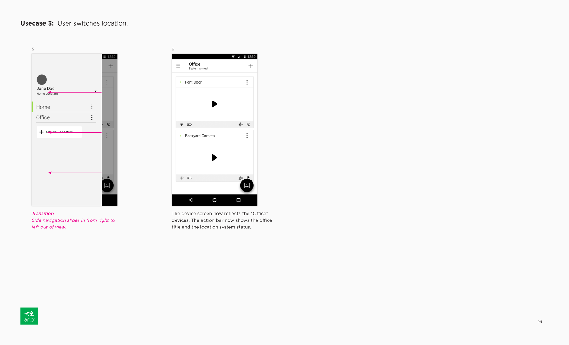
A locations access point can enable users to toggle between multiple security systems (e.g. home and office).
Redesigned Main Navigation Workflows
MODES MENU REDESIGNED
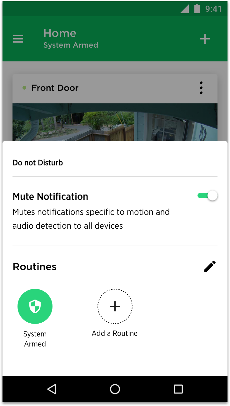
Redesigned Modes Menu
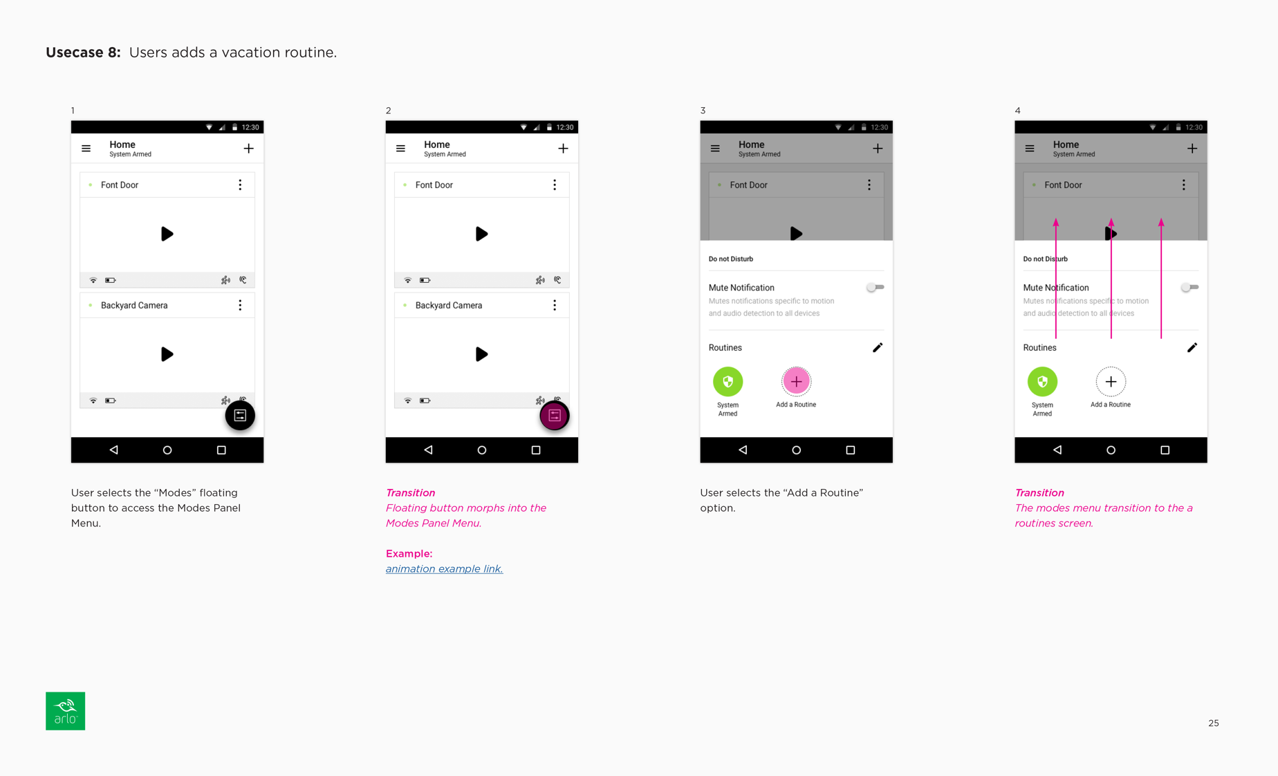
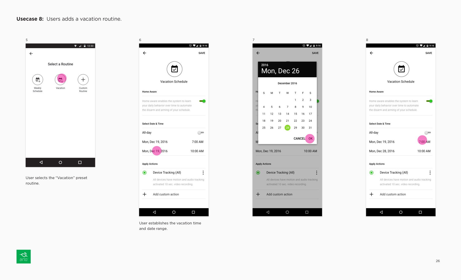
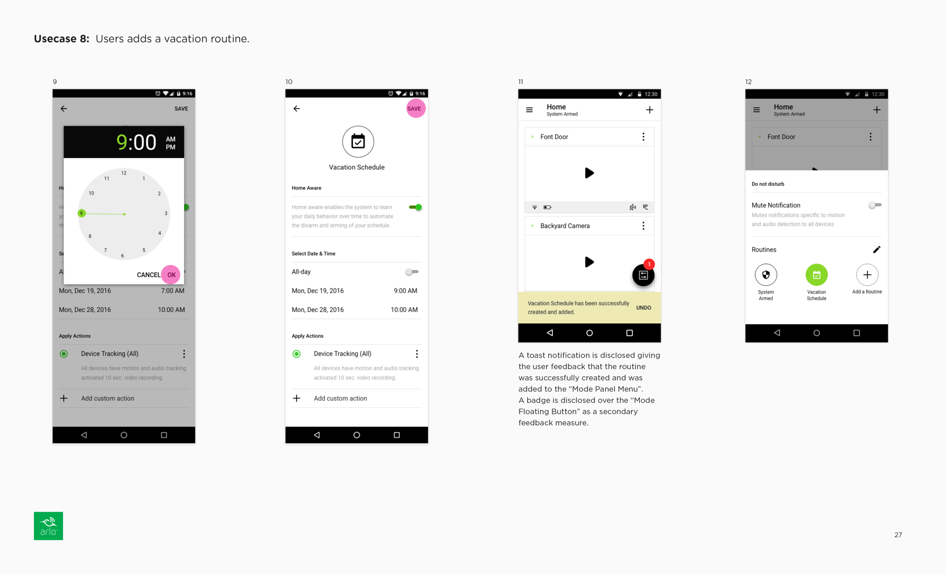
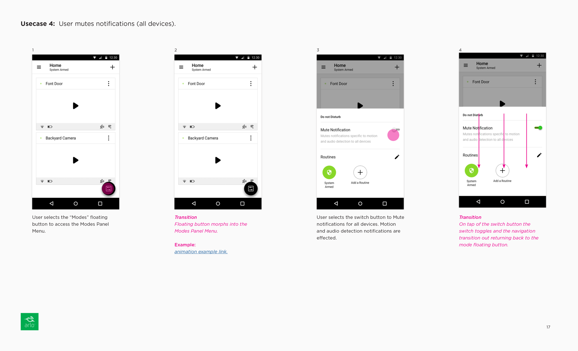
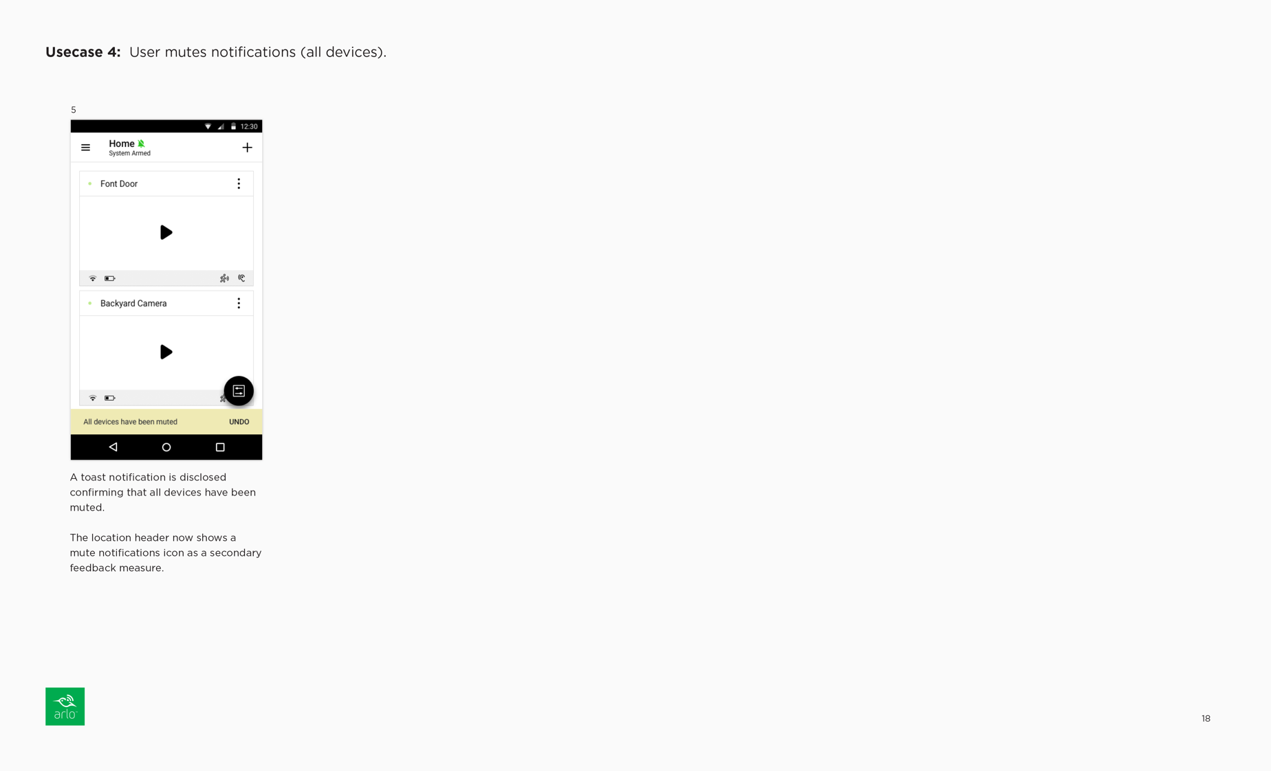
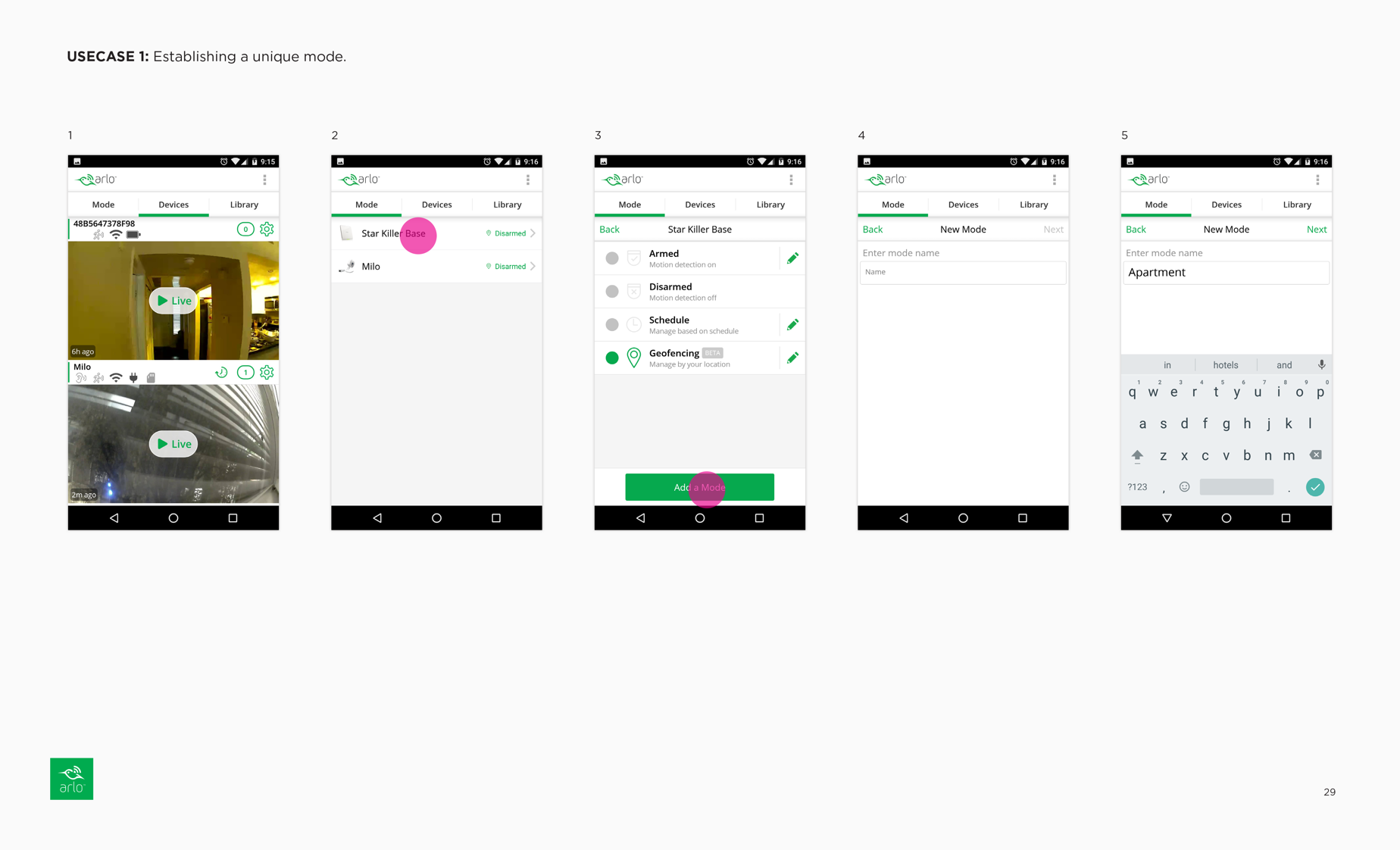
The app redesign simplified the modes menu and made it more accessible with a floating button, featuring only the arm/disarm mode and an option to add a mode. The geofence and schedule modes were removed to streamline the concept, and the modes were renamed to "Routines" for greater user-friendliness. A new mute notifications feature was added to prevent unnecessary notifications for recurring scenarios, and all routines can be toggled on or off with ease.
Modes Menu Workflows
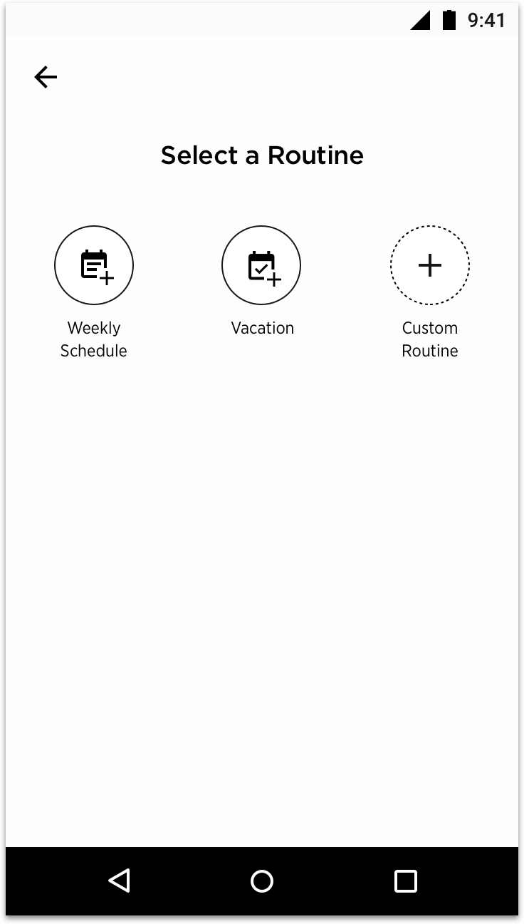
REVISED MODES AND DEVICE RULES WORKFLOWS
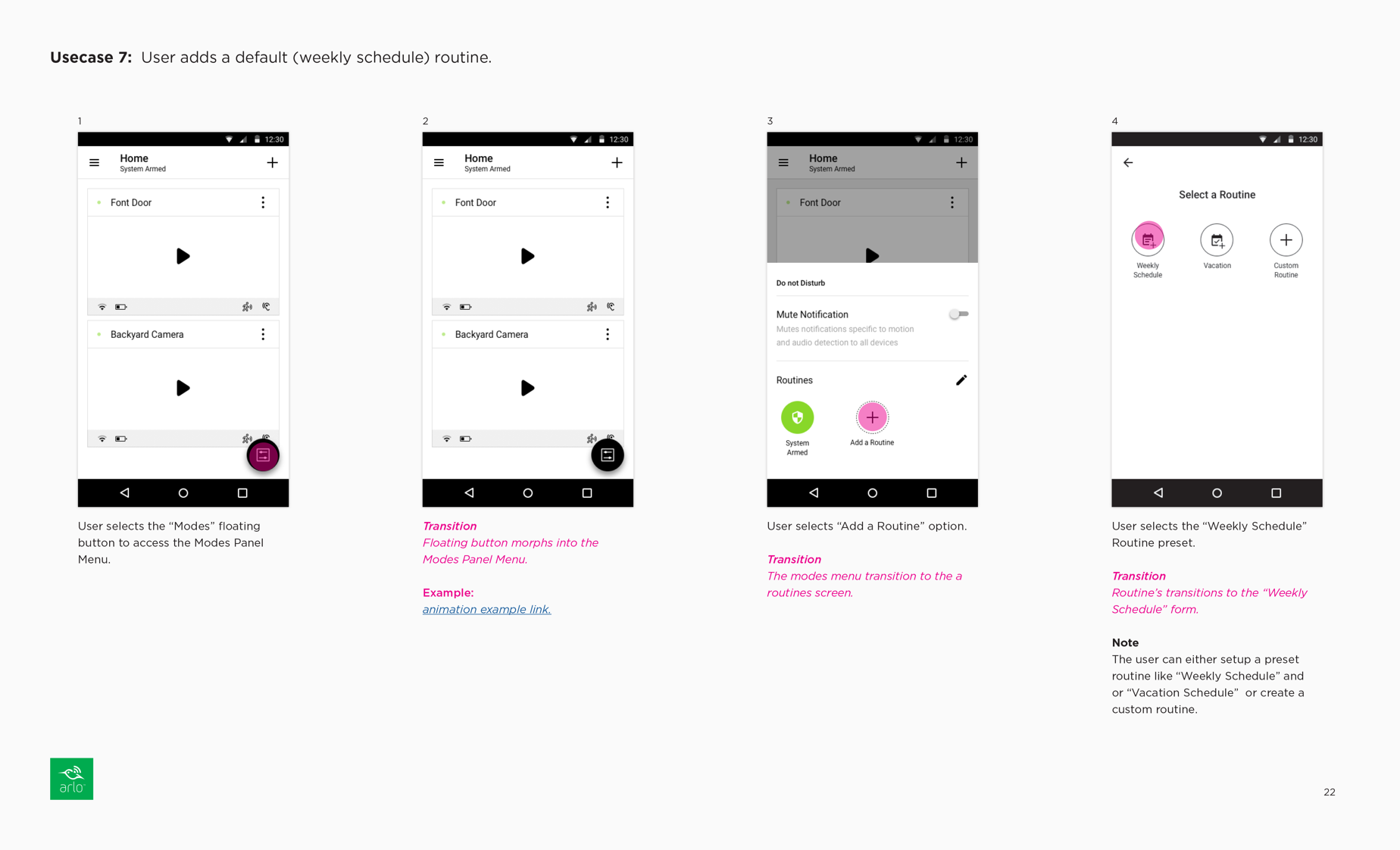
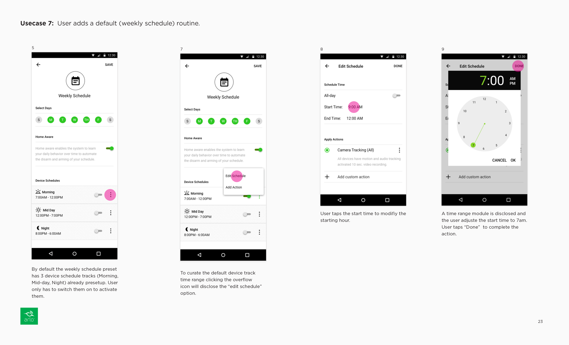
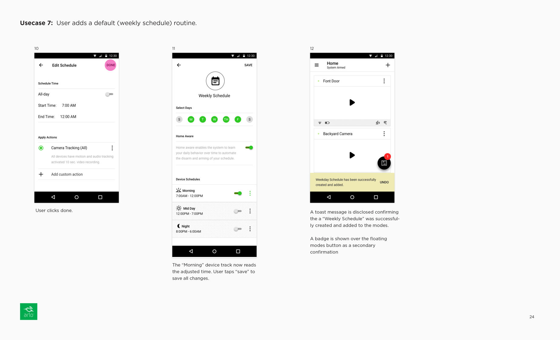
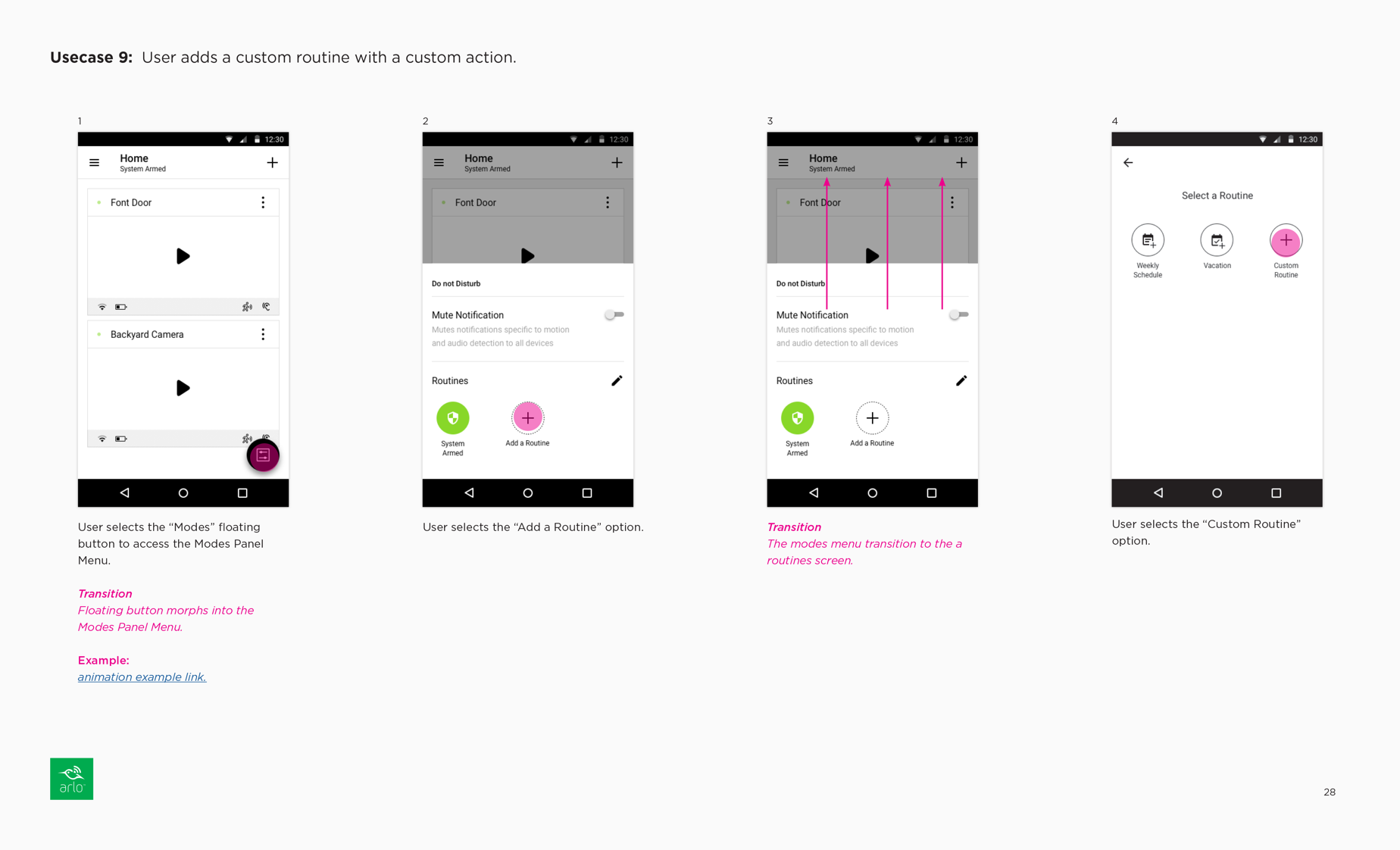
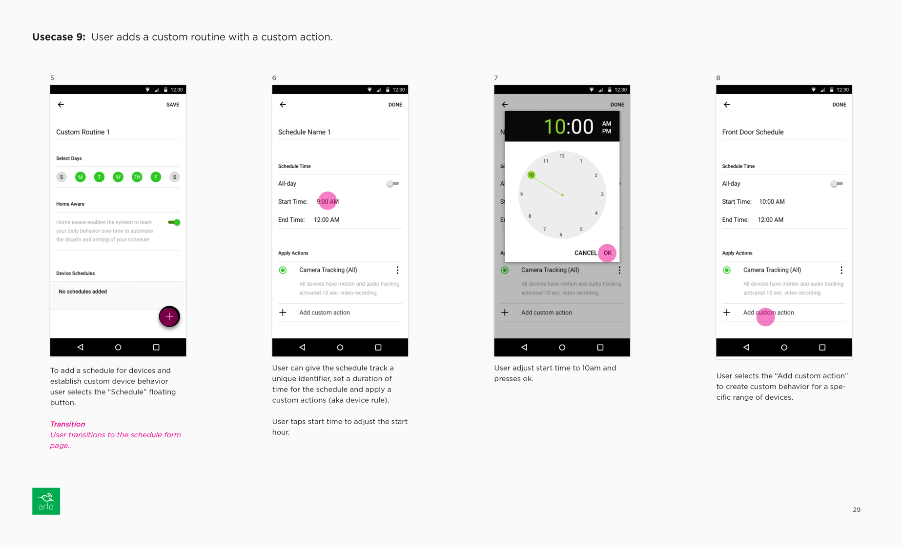
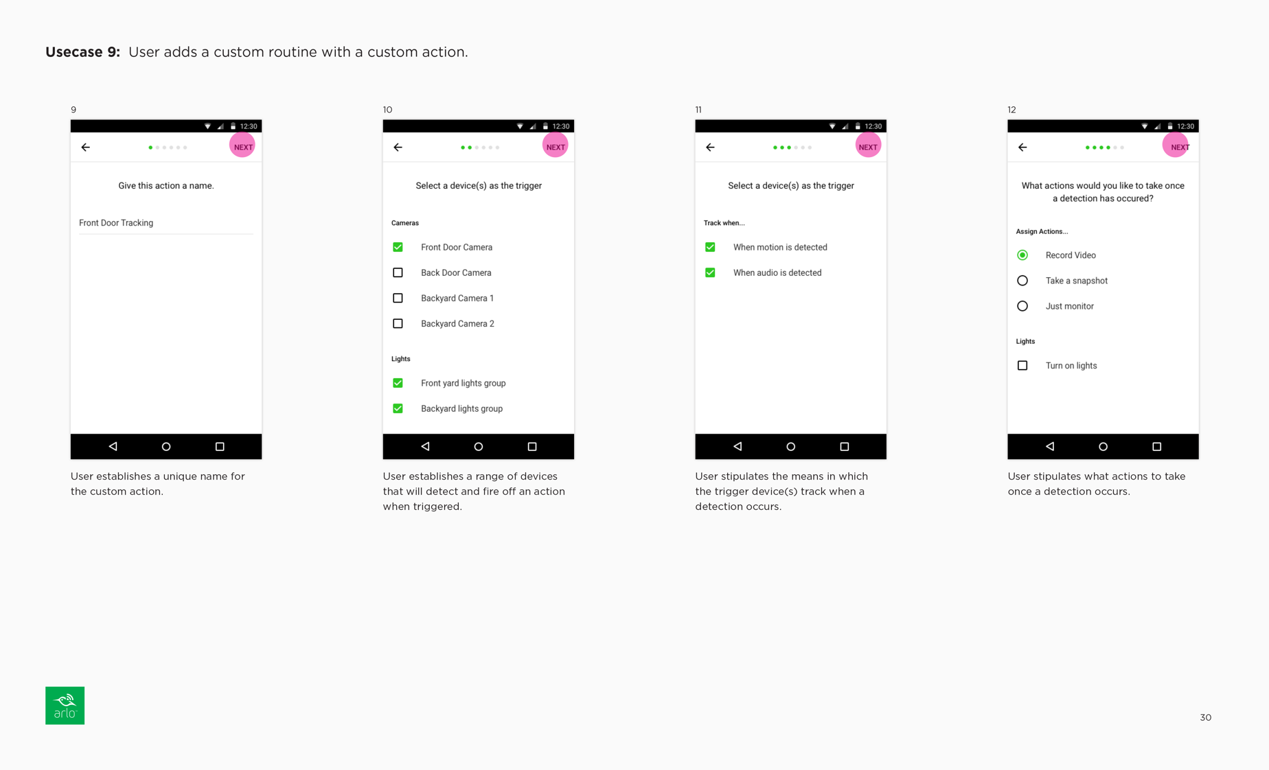
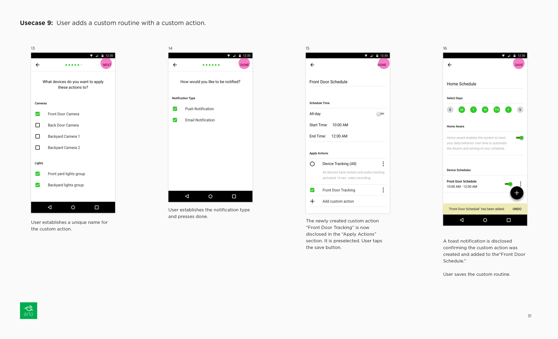
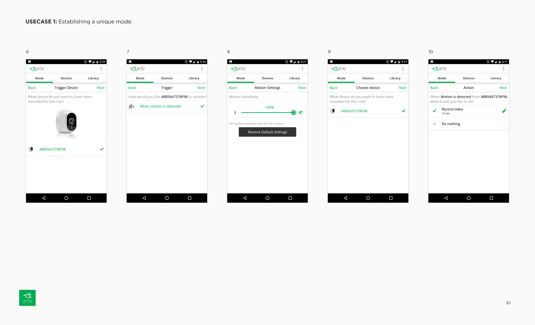
To improve user-friendliness, we renamed modes to "Routines" and device rules to "Actions." We simplified the routine creation process by offering two presets, "Weekly Schedule" and "Vacation," and providing time slots for flexibility within a routine. Device actions were now associated with time slots, conveying the idea that device rules were scheduled rather than device-specific. This simplified the workflow and removed complexity associated with managing unique device rules.
Current Modes Workflow
Redesigned Modes Worflows